40 Best Fonts for Logo Design
What should your logo say about your business before anyone reads the name?
It might sound like a simple question, but choosing a font can get surprisingly difficult. You find one that looks elegant, another that feels modern, and a third that seems perfect for your industry. Then you put your actual business name in them, and somehow, none of them look quite right.
That’s because a good logo font isn’t just about looking attractive. It needs to match your brand personality, keep your business name easy to read, and still work when the logo appears on a website header, business card, storefront, product label, or tiny social media profile.
This guide brings together 40 of the best fonts for logo design, from clean sans-serifs and sophisticated serifs to bold display faces and expressive scripts.
If you’re starting a business and aren’t sure which direction to take, this list gives you a practical place to start.
Key takeaways:
- Start with personality: The right font should reinforce how you want customers to perceive your brand.
- Test the actual name: A font can look great on its own, but feel completely different once you use it in your actual logo.
- Think beyond the logo: Choose typography that works across your broader visual identity.
- Check the license: A font being free to download doesn’t necessarily mean every commercial use is permitted.
- Test at different sizes: A professional logo should remain recognizable whether it’s displayed on a storefront or a social media profile.
What makes a font good for logo design?
There are thousands of typefaces to choose from, but not every font is suited to logo design. The strongest choices balance personality with practical considerations such as:
Legibility
A logo needs to be recognizable quickly. If customers have to squint or decipher unusual letterforms to understand the business name, the font is working against the brand.

Helvetica is a useful real-world example. Its straightforward letterforms have helped it appear across many highly recognizable identities, including The North Face.

American Airlines is another example of Helvetica being used with legibility in mind. Designer Massimo Vignelli used Helvetica for the airline’s 1967 identity, choosing the typeface specifically to help make the wordmark clear and readable.
When testing a font, pay particular attention to letters such as a, e, g, r, s, and t. These can become difficult to distinguish when a typeface is highly stylized or reduced in size.
Tip: Check out these powerful letter A logos for ideas
Brand personality
Typography has a personality of its own.
A refined serif can suggest tradition, luxury, or authority. A geometric sans-serif can feel modern and precise. A rounded display font can make a business feel playful or approachable.
Didot is a strong example of typography carrying a brand’s personality. Its high contrast and elegant proportions have long been associated with fashion and editorial design, including the recognizable Vogue wordmark.
Before choosing a font, describe your business in three words. Then ask whether the typeface communicates those qualities.
Distinctiveness
A professional font doesn’t necessarily make a distinctive logo.
Some typefaces are so common that using them without customization can make a brand feel interchangeable with others in the same industry. That doesn’t mean you need an unusual or decorative font. Letter spacing, weight, capitalization, color, and the relationship between the wordmark and an icon can all create distinction.
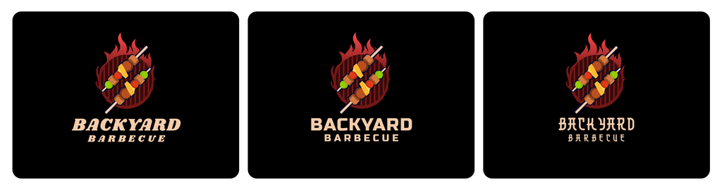
Try this: Put your business name into three competing fonts and view them side by side. Which version has the most recognizable silhouette?
Example:
Scalability and versatility
Your logo won’t always appear at the same size.
It may be printed on packaging, displayed on a website, embroidered on merchandise, used as a social media avatar, or printed on signage.
A typeface that works well at a large size may lose important details when reduced. Test your logo in several sizes and applications before committing.

FedEx is a good example of this principle. Its simple wordmark remains recognizable across everything from delivery vehicles and storefronts to digital platforms and shipping labels. The clean letterforms give the logo enough clarity to work across different sizes and formats.
Font family and available weights
A font with multiple weights gives you more room to experiment.
Regular may look too light. Bold might feel too aggressive. Medium or Semibold could provide the balance you need.
Having multiple weights also helps when you build the rest of the brand around the logo. The same type family can potentially be used for headings, body text, packaging, and other communications.
Commercial licensing
Don’t assume that a font is commercially usable simply because you found it online for free.
Font licenses can specify how the typeface may be used, embedded, distributed, or modified. Google Fonts, for example, provides licensing information for individual typefaces, with many using the SIL Open Font License.
Before using a font in a commercial identity, check the license attached to the specific font and version you’re using.
40 best fonts for logos at a glance
Refer to the table below for a quick reference of the list of fonts:
| Font | Category | Best For | Overall Impression |
| Helvetica | Sans-serif | Corporate and professional brands | Clean and dependable |
| Futura | Geometric sans-serif | Technology and architecture | Modern and precise |
| Avenir Next | Geometric sans-serif | Technology, lifestyle, and contemporary brands | Refined, modern, and approachable |
| Gotham | Geometric sans-serif | Corporate and lifestyle brands | Confident and contemporary |
| Proxima Nova | Sans-serif | Digital and technology brands | Versatile and modern |
| Montserrat | Geometric sans-serif | Startups and online businesses | Bold and accessible |
| Poppins | Geometric sans-serif | Creative and digital brands | Friendly and contemporary |
| Raleway | Sans-serif | Fashion and lifestyle brands | Refined and minimalist |
| Rubik | Sans-serif | Technology, digital products, and casual brands | Rounded, friendly, and contemporary |
| Inter | Sans-serif | Digital-first brands | Functional and highly legible |
| Bebas Neue | Display sans-serif | Fitness, sports, and entertainment | Tall and impactful |
| Franklin Gothic | Sans-serif / gothic | News, sports, advertising, and established businesses | Strong, direct, and authoritative |
| League Spartan | Geometric sans-serif | Modern and bold brands | Direct and confident |
| Garamond | Old-style serif | Publishing and heritage brands | Classic and sophisticated |
| Baskerville | Transitional serif | Professional and luxury brands | Trustworthy and elegant |
| Bodoni | Didone serif | Fashion and beauty brands | Dramatic and luxurious |
| Didot | Didone serif | Luxury and editorial brands | Refined and fashionable |
| Playfair Display | Display serif | Beauty, hospitality, and editorial | Elegant and expressive |
| Cormorant Garamond | Display serif | Premium and artistic brands | Sophisticated and distinctive |
| Cinzel | Display serif | Luxury, history, and entertainment | Classical and commanding |
| Libre Baskerville | Serif | Consulting and professional services | Credible and readable |
| Georgia | Transitional serif | Publishing, education, and established businesses | Familiar, readable, and dependable |
| Rockwell | Slab serif | Industrial and heritage brands | Strong and dependable |
| Roboto Slab | Slab serif | Technology and education | Structured and approachable |
| Cooper Black | Display serif | Food, entertainment, and retro brands | Friendly and nostalgic |
| Trajan | Roman-style serif | Luxury, entertainment, and formal institutions | Monumental, prestigious, and timeless |
| Lobster | Script | Cafés, food brands, and creative businesses | Expressive, retro, and friendly |
| Brush Script | Brush Script | Restaurants, personal brands, and creative businesses | Casual, fluid, and expressive |
| Satisfy | Script | Food, craft, and hospitality brands | Casual and handcrafted |
| Pacifico | Script | Leisure, food, and playful brands | Relaxed and energetic |
| Whitney BC | Script | Professional services, education, technology, organizations | Clean, professional, approachable |
| Gold Coast BC | Script | Fashion, lifestyle, creative brands, entertainment | Stylish, expressive, distinctive |
| Coach BC | Decorative | Sports, fitness, entertainment, bold consumer brands | Strong, bold, attention-grabbing |
| Urban two BC | Decorative | Streetwear, music, entertainment, and youth-focused brands | Edgy and expressive |
| Modulo BC | Decorative | Gaming, technology, entertainment, and digital brands | Futuristic and distinctive |
| Apricot BC | Decorative | Retro brands, food, fashion, and lifestyle businesses | Playful and nostalgic |
| Hope BC | Serif | Luxury, beauty, fashion, and professional brands | Elegant and refined |
| Hawkins BC | Serif | Professional services, publishing, heritage, and lifestyle brands | Classic and trustworthy |
| Copper BC | Serif | Sports, entertainment, food, and bold consumer brands | Strong and commanding |
| Bayview BC | Script | Fashion, beauty, lifestyle, and personal brands | Graceful and handcrafted |
Best sans-serif fonts for logos
Sans-serif fonts are a natural starting point for logo design because they tend to look clean, readable, and adaptable. They can make a brand feel modern and professional without adding too much visual detail.
That does not mean every sans-serif font creates the same impression. Some feel corporate and established, while others are playful, technical, bold, or fashion-forward.
Font 1: Helvetica

Font type: Sans-serif
Helvetica is the typography equivalent of a well-tailored suit. It does not try to be flashy, which is part of its appeal. Its clean shapes and balanced proportions can make a wordmark feel established and professional.
Best for: Corporate brands, professional services, retail, finance, and businesses that want a dependable visual identity.
Logo tip: Helvetica is familiar enough that customization matters. Experiment with weight, spacing, capitalization, and the relationship between the wordmark and any icon.
Font 2: Futura
Font type: Geometric sans-serif
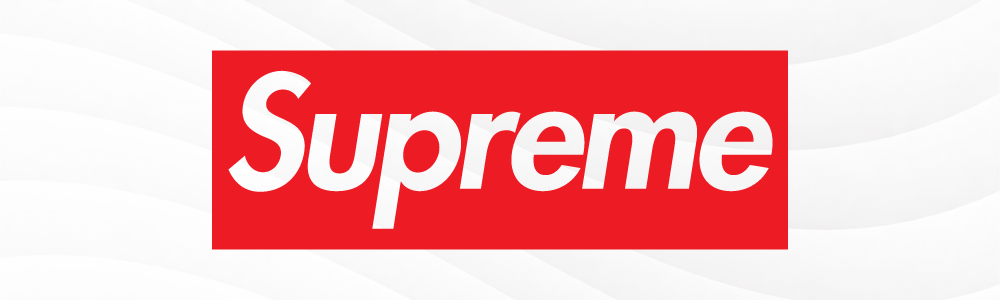
Futura builds its personality from geometry. Circles, clean lines, and simple forms give it a precise, forward-looking appearance. It can make a business name feel architectural or technological without relying on decorative details.
Best for: Technology companies, architecture firms, fashion brands, sports businesses, and modern consumer brands.
Logo tip: If your business name already contains distinctive letters, Futura can give those shapes room to become part of the visual identity.
Font 3: Avenir Next

Font type: Geometric sans-serif
Avenir Next combines geometric shapes with smooth, balanced letterforms. Its clean appearance makes logos feel modern and polished while remaining approachable and easy to read.
Best for: Technology, lifestyle, fashion, and contemporary business brands.
Logo tip: Experiment with different weights to find the right balance between a light, refined look and a stronger, more prominent wordmark.
Font 4: Gotham

Font type: Geometric sans-serif
Gotham has a strong, straightforward appearance that gives wordmarks plenty of presence. Its geometric construction can make a business name feel confident without becoming overly decorative.
Best for: Corporate brands, lifestyle companies, real estate, media, and modern professional services.
Logo tip: Try Gotham in uppercase for a stronger visual presence, or use a lighter weight when you want something more understated.
Font 5: Proxima Nova

Font type: Sans-serif
Proxima Nova balances geometric structure with softer proportions. It has enough personality to avoid feeling completely generic while remaining easy to read across different applications.
Best for: Digital businesses, technology companies, startups, agencies, and modern service brands.
Logo tip: Test different weights before settling on one. A lighter version can feel polished, while heavier weights can give a short business name more impact.
Font 6: Montserrat

Font type: Geometric sans-serif
Montserrat has become a popular choice for brands that want bold, contemporary typography. Its clear letterforms make it easy to use in both wordmarks and supporting brand graphics.
Best for: Startups, online businesses, creative companies, retail, and modern services.
Logo tip: Montserrat’s heavier weights can work particularly well for short business names, while lighter weights create a cleaner and more refined look.
Font 7: Poppins
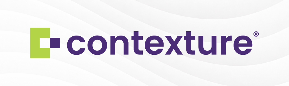
Font type: Geometric sans-serif
Poppins has a rounded, friendly character that gives modern branding a little more warmth. Its geometric shapes keep it looking clean while the rounded forms make it feel approachable.
Best for: Creative businesses, apps, startups, education, lifestyle brands, and digital services.
Logo tip: Pair a heavier Poppins wordmark with a simple icon if you want the typography to carry most of the logo’s visual weight.
Font 8: Raleway

Font type: Sans-serif
Raleway has a more elegant personality than many straightforward sans-serifs. Its refined letterforms can give a logo a lighter and more sophisticated appearance.
Best for: Fashion, beauty, lifestyle, hospitality, creative services, and premium brands.
Logo tip: Raleway can work well with generous letter spacing, particularly when creating a minimalist wordmark.
Font 9: Rubik

Font type: Sans-serif
Rubik features slightly rounded corners and a clean, modern design. Its friendly letterforms give logos a relaxed, approachable feel while keeping the overall look professional.
Best for: Technology, digital products, startups, and casual lifestyle brands.
Logo tip: Try Rubik in a medium or bold weight to create a logo that feels friendly and easy to recognize at smaller sizes.
Font 10: Inter

Font type: Sans-serif
Inter was designed with digital interfaces in mind, so clarity is one of its biggest strengths. That makes it useful for brands whose logos will appear frequently on websites, apps, and other digital products.
Best for: Technology companies, apps, SaaS products, online services, and digital-first businesses.
Logo tip: Keep the design simple. Inter’s strength is its clarity, so you do not need to add lots of decorative elements to make the logo work.
Bold display fonts for logos
Some brands need more visual impact than a standard sans-serif provides. Display fonts can give a logo a stronger voice, especially when the business name is short enough for the typography to take center stage.
The tradeoff is readability. The more distinctive the font, the more carefully you need to test it at different sizes.
Font 11: Bebas Neue

Font type: Display sans-serif
Bebas Neue is tall, condensed, and built to attract attention. Its narrow proportions make it especially useful when you want a strong wordmark without taking up too much horizontal space.
Best for: Fitness, sports, entertainment, fashion, and bold consumer brands.
Logo tip: Its uppercase letters create a strong visual rhythm, making it a good choice for short brand names and initials.
Font 12: Franklin Gothic

Font type: Sans-serif
Franklin Gothic has bold, sturdy letterforms that make a logo feel strong and straightforward. Its solid appearance works well for brands that want to communicate confidence and authority without looking overly formal.
Best for: News, sports, advertising, retail, and established businesses.
Logo tip: Use Franklin Gothic for short, prominent business names, and adjust the spacing to keep the letters clear and balanced.
Font 13: League Spartan

Font type: Geometric sans-serif
League Spartan has a strong, uncomplicated look. Its heavy forms give short names plenty of presence and can make a logo feel confident without relying on decorative details.
Best for: Modern brands, fitness, technology, creative businesses, and bold consumer products.
Logo tip: Give the letters enough breathing room. A heavy typeface can quickly become difficult to read if the spacing is too tight.
Font 14: Coach BC
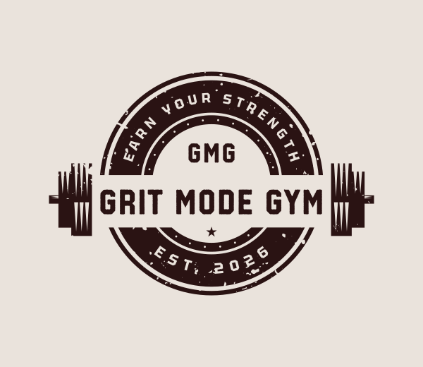
Font type: Decorative
Coach BC is exclusive to Design.com and has a bold, sporty personality that can make a logo feel energetic and active. Its distinctive lettering is designed to stand out, making it useful when a business wants its name to have a strong visual presence.
Best for: Sports, fitness, lifestyle, entertainment, and youth-focused brands.
Logo tip: Coach BC works well when paired with a simple icon or graphic. Avoid adding too many decorative elements that could compete with the lettering
Font 15: Urban BC
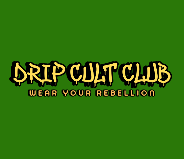
Font type: Decorative
Urban BC is another Design.com exclusive. It has an expressive, street-inspired appearance that gives a logo a youthful and unconventional edge. Its strong visual personality can help a brand stand apart from more traditional wordmarks.
Best for: Streetwear, music, entertainment, creative businesses, and youth-focused brands.
Logo tip: Use Urban BC when the typography itself is meant to make a statement. Keep the layout simple so the lettering remains the main focus.
Font 16: Modulo BC
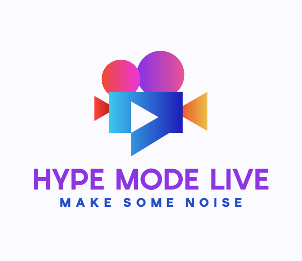
Font type: Decorative
Modulo BC has a distinctive, digital-inspired character that can give a logo a futuristic feel. Its unusual letterforms make it more visually prominent than a standard typeface, which can work particularly well for brands built around technology or entertainment.
Best for: Gaming, technology, entertainment, digital products, and creative brands.
Logo tip: Pair Modulo BC with a straightforward icon and limited visual elements. This gives the unusual letterforms enough space to stand out without making the logo feel crowded.
Font 17: Apricot BC
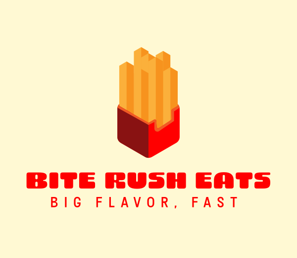
Font type: Decorative
Apricot BC has a playful retro personality that can give a business name a sense of nostalgia. It is a good option when you want the typography to feel distinctive and fun rather than strictly modern or corporate.
Best for: Food brands, fashion, lifestyle businesses, entertainment, and retro-inspired brands.
Logo tip: Experiment with color when using Apricot BC. A carefully chosen palette can strengthen the vintage or playful character without requiring additional decorative elements.
Best serif fonts for logos
Serif fonts bring a different kind of personality to logo design. Their small finishing strokes can make a business feel established, refined, traditional, or editorial.
They are especially useful when the brand needs to communicate craftsmanship or sophistication, but the right choice depends heavily on the specific serif style.
Font 18: Garamond

Font type: Old-style serif
Garamond has a classic character that has remained useful across publishing, editorial design, and branding. Its elegant letterforms can give a logo a sense of history without making it feel overly formal.
Best for: Publishing, education, luxury goods, heritage brands, and professional services.
Logo tip: Garamond works particularly well when the brand wants an established, literary feel rather than a highly modern appearance.
Font 19: Baskerville

Font type: Transitional serif
Baskerville combines traditional serif details with a more refined and structured appearance. It can make a wordmark feel trustworthy while still having enough contrast to stand out.
Best for: Professional services, consulting, publishing, luxury, education, and established businesses.
Logo tip: Try Baskerville with moderate letter spacing to give the wordmark a cleaner, contemporary feel.
Font 20: Bodoni
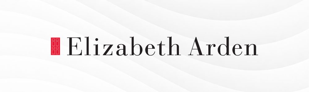
Font type: Didone serif
Bodoni is known for its dramatic contrast between thick and thin strokes. That contrast gives it an unmistakably elegant and fashion-oriented personality.
Best for: Fashion, beauty, luxury, editorial, jewelry, and premium brands.
Logo tip: Bodoni tends to work best when the logo has room to breathe. Avoid squeezing the letters together.
Font 21: Didot
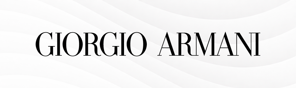
Font type: Didone serif
Didot has a similarly high-contrast appearance, but its refined proportions give it a particularly polished feel. It is a natural fit for brands that want typography to become a major part of their visual identity.
Best for: Fashion, beauty, magazines, luxury services, and editorial brands.
Logo tip: Keep the surrounding design simple. Didot already brings plenty of character to the wordmark.
Font 22: Playfair Display
Font type: Display serif
Playfair Display combines traditional serif details with a more expressive display style. It can add elegance without making a logo feel overly formal.
Best for: Beauty, hospitality, fashion, food, lifestyle, and editorial businesses.
Logo tip: Use it when you want a serif logo with more personality than a conventional corporate typeface.
Font 23: Cormorant Garamond
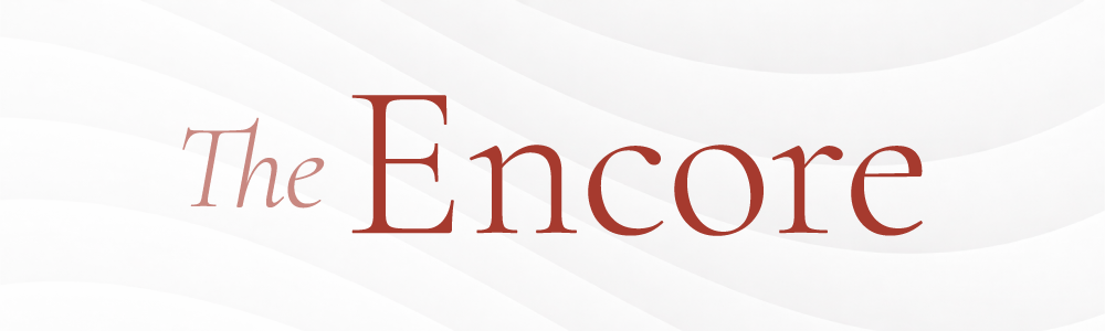
Font type: Display serif
Cormorant Garamond has a graceful, high-contrast appearance that gives it a more artistic quality. It can make a simple business name feel distinctive without needing a complicated graphic.
Best for: Luxury, fashion, arts, beauty, publishing, and boutique businesses.
Logo tip: Experiment with lowercase lettering for a softer, more contemporary result.
Font 24: Cinzel
Font type: Display serif
Cinzel draws from classical Roman letterforms, giving it a formal and commanding presence. It can make a logo feel prestigious or historical, particularly when used in uppercase.
Best for: Luxury brands, entertainment, history-related businesses, hospitality, and premium services.
Logo tip: Cinzel is visually strong, so pair it with a simple layout rather than competing graphics.
Font 25: Libre Baskerville

Font type: Serif
Libre Baskerville offers a more restrained serif style that remains highly readable. It can bring traditional character to a logo without feeling excessively decorative.
Best for: Consulting, professional services, education, publishing, and established businesses.
Logo tip: Consider using a bold weight for the main wordmark and keeping supporting text smaller and simpler.
Font 26: Georgia

Font type: Transitional serif
Georgia has distinctive serifs and well-defined letterforms that make it both classic and readable. It gives logos a familiar, dependable appearance without losing their visual character.
Best for: Publishing, education, professional services, and established businesses.
Logo tip: Pair Georgia with a simple icon or clean sans-serif font to balance its traditional style with a more contemporary look.
Related: Check out the top Serif logos for more ideas!
Font 27: Hope BC
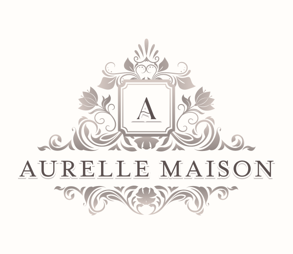
Font type: Serif
Hope BC has a refined serif style that can make a logo feel elegant and polished. Its thinner appearance gives the lettering a lighter presence, which can work well for brands looking for a more sophisticated visual identity.
Best for: Beauty, fashion, luxury, professional services, and lifestyle brands.
Logo tip: Test Hope BC at smaller sizes before committing to it. Thin lettering can lose some of its detail when a logo is reduced.
Font 28: Hawkins BC
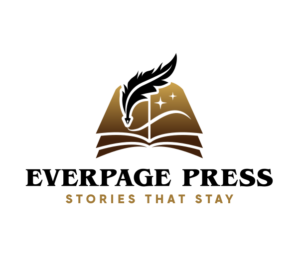
Font type: Serif
Hawkins BC has a traditional serif character that gives a wordmark a sense of familiarity and reliability. Its classic appearance can suit businesses that want their identity to feel established without looking overly formal.
Best for: Professional services, publishing, heritage brands, education, and lifestyle businesses.
Logo tip: Try Hawkins BC in uppercase and title case. The difference in capitalization can noticeably change the personality and visual balance of the wordmark.
Font 29: Copper BC
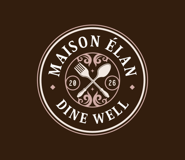
Font type: Serif
Copper BC uses tall letterforms to create a strong, noticeable presence. Its proportions can make a business name feel commanding while giving the logo a more distinctive look than a conventional serif.
Best for: Sports, entertainment, food, retail, and bold consumer brands.
Logo tip: Give Copper BC enough breathing room. Adjust the spacing between letters if the wordmark starts to feel too narrow or visually heavy.
Slab-serif and heavy display fonts
Slab serifs and heavy display fonts are useful when you want the typography to make a stronger statement. Their thicker forms can communicate strength, confidence, nostalgia, or personality.
These fonts can be especially effective for logos with short names, but they need careful spacing to avoid looking crowded.
Font 30: Rockwell

Font type: Slab serif
Rockwell has thick, sturdy serifs that give it a solid and dependable appearance. Its straightforward construction makes it particularly useful for brands that want a strong heritage feel.
Best for: Industrial businesses, construction, food, retail, and heritage brands.
Logo tip: Rockwell can carry a wordmark on its own, so a simple icon is often enough if you want to include one.
Font 31: Roboto Slab
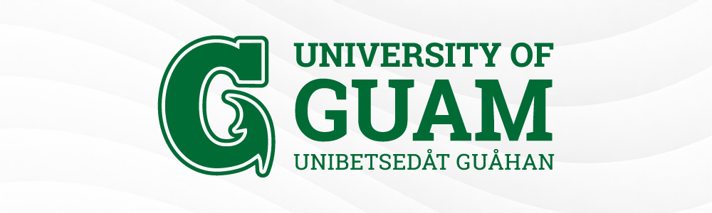
Font type: Slab serif
Roboto Slab brings the sturdy appearance of a slab serif into a more contemporary design language. It can provide a business-name structure without feeling as traditional as some classic slab fonts.
Best for: Technology, education, professional services, publishing, and modern businesses.
Logo tip: Use a heavier weight for the logo and a simpler sans-serif for supporting brand text.
Font 32: Cooper Black
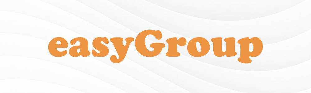
Font type: Display serif
Cooper Black is immediately recognizable for its rounded, heavy letterforms. It has a playful retro quality that can make a brand feel friendly and memorable.
Best for: Food brands, restaurants, entertainment, children’s businesses, and retro-inspired brands.
Logo tip: Cooper Black has a lot of personality on its own. Let the typeface do the work instead of adding too many visual elements.
Font 33: Trajan

Font type: Roman-style serif
Trajan draws inspiration from classical Roman lettering, with elegant proportions and distinctive capital letters. It gives logos a formal, prestigious appearance that can make a brand feel established and timeless.
Best for: Luxury brands, entertainment, hospitality, and formal institutions.
Logo tip: Trajan works especially well for uppercase wordmarks. Give the letters enough spacing to emphasize their elegant shapes without making the name difficult to read.
Script and handwritten fonts for logos
Script and handwritten fonts can give a logo an immediate sense of personality. They can suggest elegance, creativity, craftsmanship, or a more relaxed approach.
The challenge is making sure the personality does not come at the expense of readability. These fonts are often better suited to carefully chosen words than long business names.
Font 34: Lobster

Font type: Script
Lobster features bold, connected letterforms with a retro-inspired style. Its flowing shapes give logos personality and warmth, making it a good choice for brands that want to feel expressive and memorable.
Best for: Cafés, restaurants, food brands, and creative businesses.
Logo tip: Keep the business name short when using Lobster, as its decorative letterforms can be harder to read in longer names or at small logo sizes.
Font 35: Brush Script

Font type: Brush script
Brush Script has flowing, handwritten letterforms that create a casual and expressive look. Its brush-like strokes can give a logo a personal touch, making it suitable for brands that want to feel creative rather than overly corporate.
Best for: Restaurants, personal brands, creative studios, and businesses with a handcrafted feel.
Logo tip: Pair Brush Script with a simple sans-serif font for supporting text so the main wordmark stands out without making the overall design feel too busy.
Font 36: Satisfy
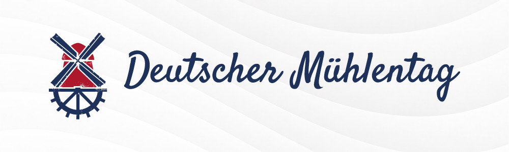
Font type: Script
Satisfy has a casual handwritten style that feels more relaxed than traditional calligraphy. It can give a logo a handcrafted quality without looking overly formal.
Best for: Food businesses, cafés, hospitality, craft brands, and lifestyle businesses.
Logo tip: Pair it with a simple symbol or supporting sans-serif to keep the overall logo balanced.
Font 37: Pacifico
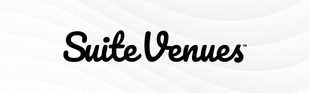
Font type: Script
Pacifico has a playful, relaxed personality. Its rounded strokes can make a business feel energetic and approachable rather than corporate.
Best for: Food, leisure, travel, entertainment, cafés, and playful consumer brands.
Logo tip: Pacifico works best when the rest of the logo stays relatively simple.
Font 38: Whitney BC
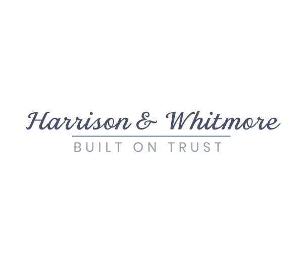
Font type: Sans-serif
Whitney BC has a clean, approachable look that works well when you want a logo to feel professional without becoming overly formal. Its balanced letterforms give a business name a polished appearance while keeping it easy to read.
Best for: Professional services, education, technology, organizations, and customer-focused businesses.
Logo tip: Try Whitney BC with different weights and spacing to find the right balance between a polished wordmark and a more approachable brand personality.
Font 39: Gold Coast BC
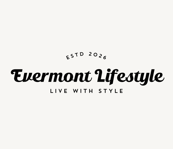
Font type: Script
Gold Coast BC brings a more expressive personality to a logo. Its flowing letterforms can give a business name a stylish, creative feel, making it a natural choice for brands that want their typography to become part of the visual identity.
Best for: Fashion, lifestyle, creative, beauty, and entertainment brands.
Logo tip: Keep the rest of the logo relatively simple when using Gold Coast BC. The lettering already provides plenty of visual character.
Font 40: Bayview BC
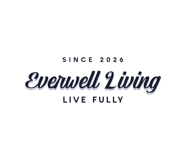
Font type: Script
Bayview BC has a handwritten quality that can make a logo feel personal and expressive. Its flowing style works particularly well when the brand wants to communicate creativity, warmth, or a more handcrafted character.
Best for: Fashion, beauty, lifestyle, personal brands, and creative businesses.
Logo tip: Use Bayview BC selectively, especially for longer business names. Check that every letter remains clear when the logo is viewed at smaller sizes.
How to choose the right font for your logo
Finding a font you like is easy. Finding one that works for your actual business takes a little more thought.
1. Define your brand personality
Start with the feeling you want customers to get.
Do you want to appear:
- Modern and innovative?
- Traditional and trustworthy?
- Friendly and approachable?
- Premium and luxurious?
- Bold and energetic?
- Creative and unconventional?
Use those qualities to narrow the font category before choosing an individual typeface.
A luxury skincare company and a neighborhood burger restaurant may both need attractive typography, but they have very different reasons for choosing it.
2. Consider your industry and audience
Your industry doesn’t have to dictate your font, but it provides useful context.
A law firm may benefit from typography that communicates authority and stability. A children’s brand has more freedom to use rounded or playful lettering. A technology startup may prefer a clean sans-serif, while a heritage food business could benefit from a serif or slab serif.
Think about what your audience expects and whether your typography should reinforce or challenge those expectations.
3. Type your actual business name
Never choose a font based solely on how the alphabet looks.
Type the actual business name into the font.
Some letter combinations will look dramatically better than others. A font that looks beautiful when displaying “Typography” might make your own business name feel cramped or awkward.
This is also where you can spot problematic letter combinations, awkward spacing, or letters that become difficult to recognize.
4. Test different weights and spacing
Don’t stop at the default setting.
Try Regular, Medium, Semibold, and Bold when available. Then experiment with letter spacing.
Sometimes the difference between a generic wordmark and a polished one is simply better spacing.
You can also try uppercase, lowercase, and title case. The same font can take on a completely different personality depending on capitalization.
5. Test the logo in real situations
Put your logo where customers will actually see it.
Try it on:
- A website header
- A social media profile
- A business card
- A storefront
- Product packaging
- A mobile screen
- A dark background
- A one-color version
If the logo only looks good in one carefully prepared presentation, keep testing.
6. Check the license
Before using the font commercially, read its license.
Look for information about commercial use, modifications, redistribution, embedding, and whether attribution is required.
This step is easy to skip when you’re excited about a font, but it matters once the typeface becomes part of your business identity.
Serif vs. sans-serif: Which is better for a logo?
Neither category is automatically better. Serif and sans-serif fonts simply create different starting points for a brand’s visual personality.
But between serif and sans-serif, which one is the better choice for your brand?
| Consideration | Serif Fonts | Sans-Serif Fonts |
| Typical impression | Traditional, authoritative, elegant | Modern, clear, approachable |
| Common industries | Law, finance, publishing, luxury | Technology, health, retail, services |
| Small-size performance | Depends heavily on stroke contrast | Often performs well digitally |
| Distinctive potential | Strong historical or editorial character | Flexible and easy to customize |
| Possible drawback | Can appear dated or overly formal | Can appear generic without customization |
The right choice depends on the business, audience, letterforms, and applications.
A modern law firm doesn’t have to use a serif. A luxury technology company doesn’t have to use a sans-serif. The goal is to understand what each category communicates and then decide whether that communication fits the brand.
How many fonts should a logo use?
For most logos, one primary font is enough.
A single typeface creates a clearer visual identity and makes the business name easier to recognize. If you use two fonts, make sure they have distinct roles rather than competing for attention.
For example, you could use a display serif for the business name and a simple sans-serif for a tagline.
Avoid combining several decorative fonts. If every word has a different personality, the logo can start to look like a collection of type samples rather than a cohesive brand.
A useful rule is to ask whether removing one of the fonts makes the logo stronger. If it does, keep the simpler version.
Common logo font mistakes to avoid
- Choosing a font because it looks good in isolation: A beautiful typeface isn’t automatically a good logo font. Always test it with your actual business name.
- Using too many fonts: Multiple fonts can make a logo feel busy and reduce recognition. Start with one and add another only when there’s a clear reason.
- Ignoring small-size readability: Thin strokes and elaborate details can disappear when a logo is reduced in size. Always check the smallest version customers will encounter.
- Picking a trend over a personality: Trendy typography can make a logo look current today, but dated later. Consider whether the style fits the business beyond the current design cycle.
- Forgetting about spacing: A good font can look mediocre with poor kerning. Adjust the spacing between letters until the wordmark feels balanced.
- Using a script just because it looks elegant: Script fonts can be beautiful, but elegance isn’t useful if customers can’t read the business name.
- Assuming free means commercially unrestricted: Check the license before using any font in a commercial logo or broader brand identity.
- Copying a famous logo too closely: A famous typeface or design can provide inspiration, but your logo should still develop its own visual identity. Look at what makes a recognizable wordmark work rather than trying to reproduce it.
Create and test your logo font with Design.com
After looking through 40 fonts, you may have a few favorites in mind. But seeing a font on its own only tells you part of the story. The better test is to see how it actually looks in use for your business.
For example, let’s say you’re creating a logo for a barbecue restaurant called Backyard Barbecue. Instead of choosing a font from a list and hoping it works, you can enter the business name into an AI logo generator like Design.com and explore different logo concepts built around it.
Here are some sample results after typing in the business name:
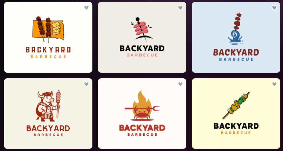
This gives you a chance to compare different typography styles in an actual logo. A bold display font might make Backyard Barbecue feel casual and energetic, while a cleaner sans-serif could give it a more modern restaurant feel. A heavier typeface might also make the name easier to spot on signage or packaging.
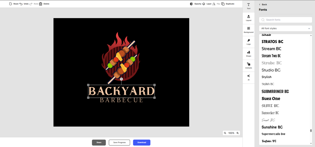
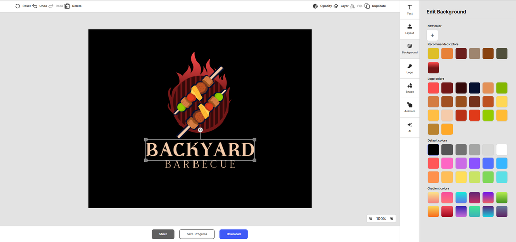
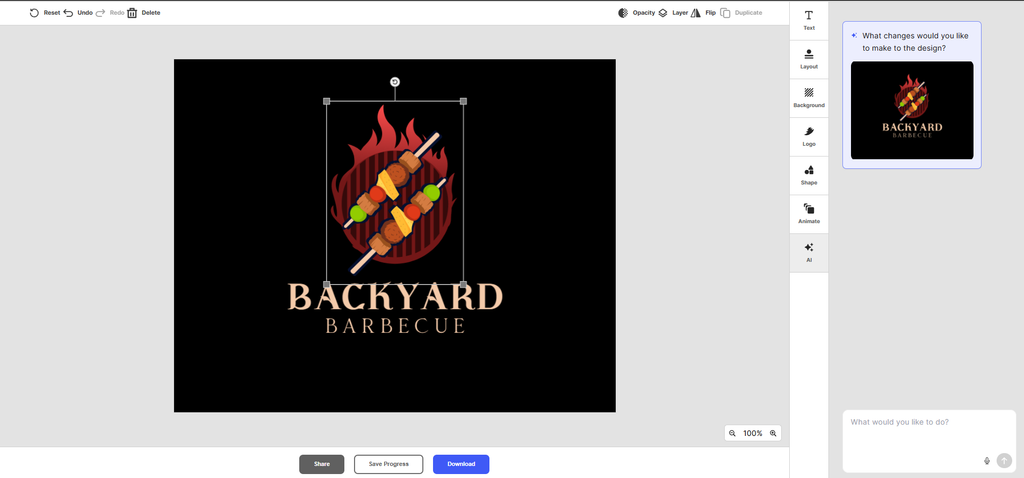
Once you find a concept you like, you can customize it rather than starting over.
Change the typography
Customize the colors
Or ask AI to do the changes you have in mind
You can also preview your logo in different applications and mockups before settling on a final direction. That gives you a better sense of whether the typography works across multiple screens.
You can preview your logo and see how it looks on small screens, business cards, and on your website.
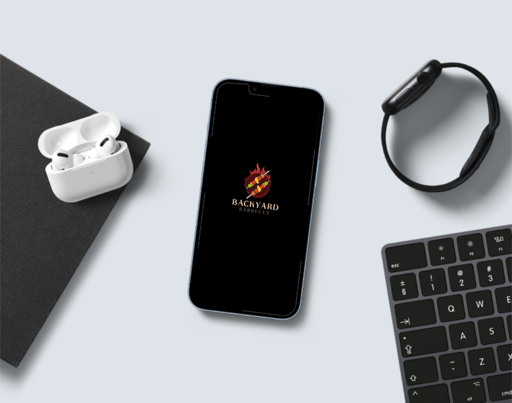
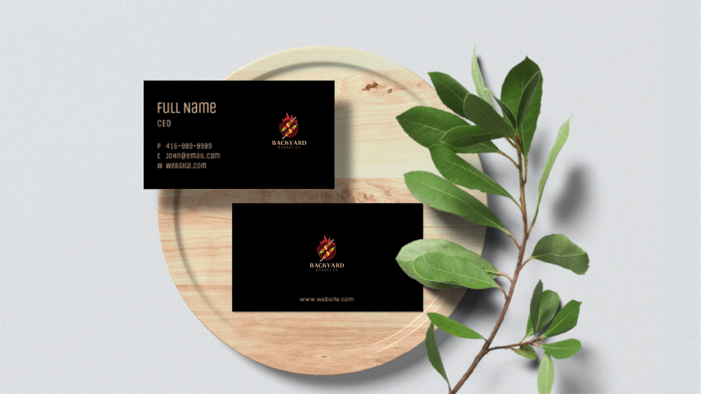
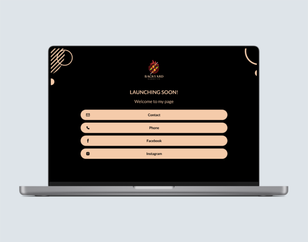
Once you’ve chosen a design, Design.com provides logo files suited to different uses, including high-resolution and different file formats.
Frequently asked questions
What are the best fonts for logo design?
The best fonts for logo design depend on your brand personality, audience, industry, and intended applications. Helvetica, Futura, Montserrat, Garamond, Baskerville, Didot, Playfair Display, Rockwell, and several script fonts are strong starting points. The most suitable choice is the one that keeps your business name readable while communicating the right personality.
What font should I use for my logo?
Choose a font that matches the personality you want your brand to communicate and remains readable at different sizes. Sans-serif fonts such as Montserrat or Inter can create a modern appearance, while serif fonts such as Baskerville or Garamond can feel more traditional. Always test the actual business name before making a final decision.
Which fonts make a logo look professional?
Professional-looking logos can use many different font categories. Clean sans-serif fonts such as Helvetica, Avenir Next, Inter, and Proxima Nova often create a polished appearance, while serif fonts such as Baskerville, Garamond, and Libre Baskerville can communicate authority. Professionalism comes from choosing appropriate typography and using it consistently, not from one particular font.
What are the best free fonts for logos?
Many high-quality free fonts can work well for logos, including Montserrat, Poppins, Inter, Rubik, Manrope, Space Grotesk, Libre Baskerville, Georgia, Playfair Display, and Roboto Slab. Always check the current license before using a font commercially, because free availability and commercial usage rights are not necessarily the same thing.
How do I choose a font that matches my brand?
Start by defining three to five words that describe your brand personality, then look for fonts that communicate those qualities. Consider your industry and audience, type your actual business name, and test different weights and spacing. Finally, view the logo at different sizes and in realistic applications to make sure the font works beyond a font preview.
Can I use any font commercially in a logo?
No. Commercial font use depends on the font’s license. Some fonts permit commercial logo use freely, while others may have restrictions on modification, distribution, embedding, or other uses. Check the license supplied with the specific font before using it in a business logo. If the licensing terms are unclear, contact the font creator or foundry.