100 Cool Logo Ideas for Every Business
Sports teams have jerseys. Employees have uniforms. A business has a logo, and it functions the same way, telling everyone at a glance which side of the field you’re on before anything else gets explained.
Below is a breakdown of what that signal looks like across 10 different industries, a hundred businesses in total, each with a direction worth considering and the reasoning behind it.
The goal isn’t to hand you a finished answer. It’s to narrow a hundred possibilities down to the ones that actually make sense for what you’re building, before you ever open a logo maker and start second-guessing every font.
What makes a logo look modern and memorable?
A modern, memorable logo is simple enough to recognize instantly and flexible enough to work anywhere you place it. It should also feel specific to your brand rather than interchangeable with a competitor’s.
Look for these traits in any strong logo, including your own.
- Simplicity. Recognizable at a glance, even shrunk down to a tiny app icon.
- Relevance. Visually connected to the industry or the brand’s story.
- Versatility. Works in full color, in black and white, and on a phone screen.
- Timelessness. Avoids trends that will look dated within a year or two.
- Color psychology. Colors chosen with intention rather than picked at random.
Current logo design trends worth knowing include minimalist line-art icons, monoline badges, soft gradients paired with flat color, retro-inspired serif wordmarks, and abstract geometric symbols that hint at an idea rather than illustrating it literally.
How do you choose the right logo for your business?
The right logo style depends on your industry, your audience, and the personality you want your brand to project.
Use the table below as a fast reference for matching style, type, color, and icon direction to your industry.
| Category | Recommended style | Typography | Color palette | Icon suggestions |
| Food and beverage | Handcrafted, warm, or bold, ranging from rustic to playful to vibrant | Rounded serif, script, or friendly bold sans-serif | Warm reds, browns, mustard, and cream base with brighter accents allowed | Cups, wheat, flames, utensils, or a bold badge shape |
| Retail and e-commerce | Clean, trend-forward, versatile | Modern sans-serif | Black/white with one accent color | Bags, tags, monograms |
| Technology | Minimal, geometric, futuristic | Geometric sans serif | Blue, purple, black, neon accent | Circuits, nodes, abstract shapes |
| Health and wellness | Calming, soft, organic | Light sans-serif or humanist serif | Green, soft blue, sand, white | Leaves, waves, lotus, cross |
| Professional services | Trustworthy, structured, classic | Serif or clean sans-serif | Navy, charcoal, gold, deep green | Shields, columns, monograms |
| Creative businesses | Expressive, bold, artistic | Custom or hand-lettered type | Vibrant or high contrast | Brushes, lenses, abstract marks |
| Home and local services | Sturdy, dependable, direct | Bold sans-serif | Blue, orange, gray, red, with yellow and black specifically for electricians | Houses, tools, shields |
| Lifestyle and entertainment | Fun, energetic, social | Display or script type | Bright, saturated tones | Stars, confetti, abstract icons |
| Education and nonprofits | Approachable, hopeful, clear | Friendly sans serif or serif | Blue, green, warm yellow | Books, hands, globes |
| Personal brands | Distinct, personal, flexible | Signature style or clean sans serif | Brand-specific, often monochrome | Initials, portraits, abstract marks |
The 100 cool logo ideas
Below are cool logo concepts for each of the ten industries, for a total of 100 ideas. Each entry lists the style direction, why it works, and a takeaway you can apply to your own brand.
Food and beverage
Food and beverage logos are indulgent since the goal is to make someone hungry before they’ve read a word. Warm color and handmade texture tend to do more work here than restraint ever could.
1. Coffee shop
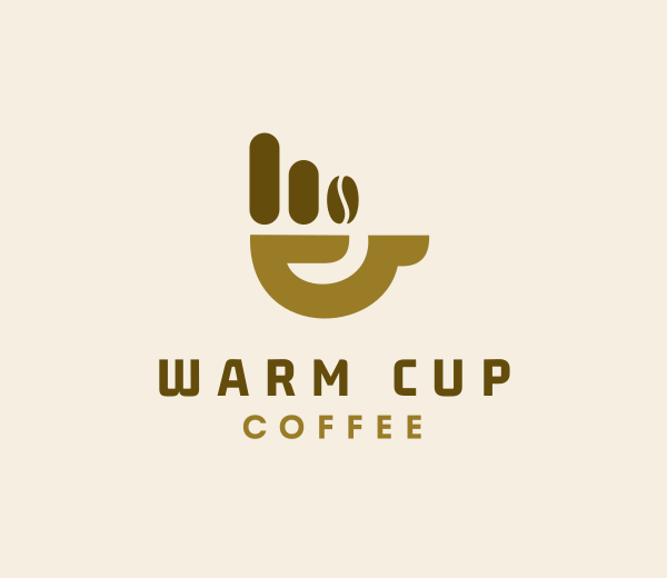
Try building the cup from negative space, with a bean or steam detail tucked inside rather than drawn separately. It keeps things warm and simple while giving people a small surprise to notice in your cafe logo.
Something like the sample below:
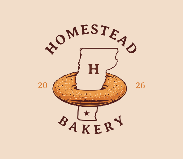
2. Bakery
A hand-drawn illustration, paired with warm, storybook-type feels, can look handmade rather than mass-produced, especially if one element stays bold while everything else uses loose linework.
Take a look at a bakery logo sample below:
Doughnut Snack Food by Design.com
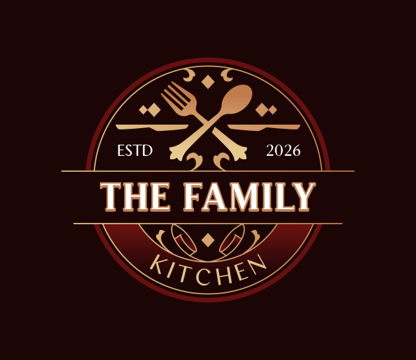
3. Restaurant
An ornate crest built around crossed utensils reads more formal and memorable than a plain icon ever could. A little extra detail in the frame is often what elevates an otherwise simple symbol to a cool restaurant logo.
Here’s an example below:
Luxury Eating Utensils by Design.com
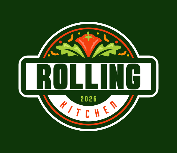
4. Food truck
A bold, circular badge with strong color and a banner detail matters here, since your food truck logo needs to be spotted quickly from a distance. Contrast and boldness do more work than subtlety in this case.
Check out the sample below:
Vegetable Salad Bowl by Design.com
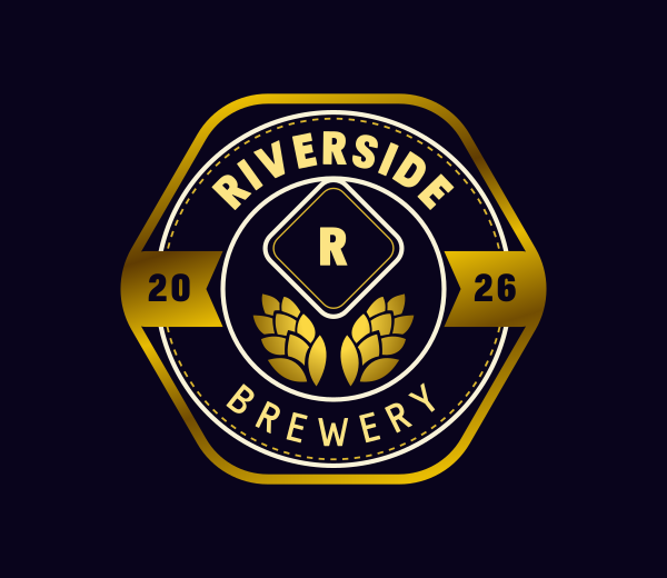
5. Brewery
A vintage badge with a wheat or barrel detail taps into heritage even for a brand-new business. Texture and a shield-shaped frame can add instant age and craft to the mark.
Here’s how your brewery logo could look:
Luxury Beer Brewery by Design.com
6. Ice cream shop
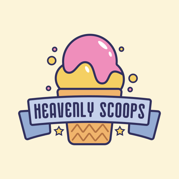
Playful lettering paired with a bright, dripping visual detail keeps things fun instead of polished or corporate. Let the shape feel a little bouncy rather than too rigid.
See the ice cream logo sample below:
Ice Cream Sundae by Design.com
7. Juice bar
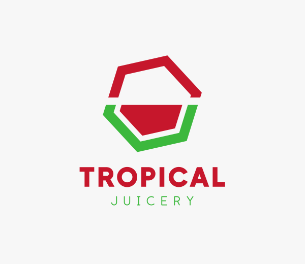
An abstract, colorful shape that suggests motion rather than a literal fruit tends to feel fresher and more distinct. Color and movement can replace literal imagery entirely here.
Take a look below:
Minimalist Icon Hexagon by Design.com
8. Wine shop
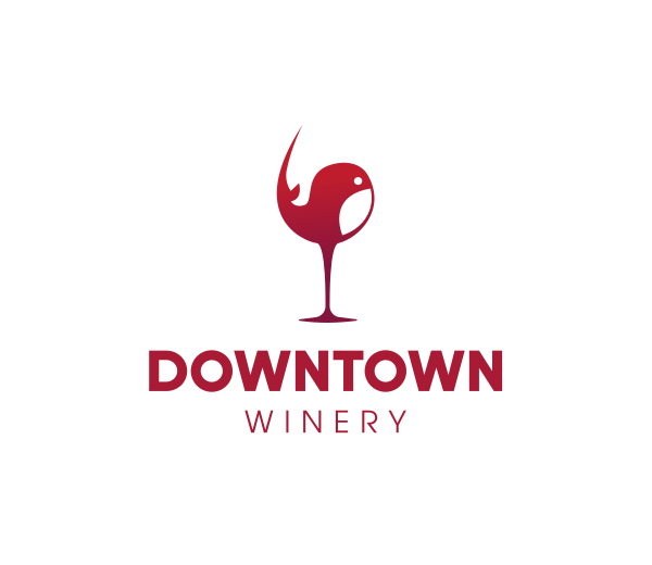
A simplified wine glass shape with something unexpected happening inside it feels more curated than expected. Simplify the outside and let the personality live on the inside.
Here’s an example of a wine shop logo:
Whale Wine Glass by Design.com
9. BBQ restaurant
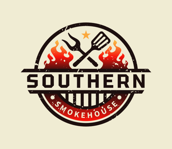
Bold color with a flame or crossed tool detail around the edge matches the theatrical, hearty feel of the food itself. This is one of the few categories where louder genuinely works better.
See the sample below for a BBQ logo below:
Grill Flame Restaurant by Design.com
10. Catering company
A wreath- or crest-style frame around a simple food-related icon adds formality without needing much else. Keeping one consistent color throughout is what makes a detailed mark still feel cohesive.
Here’s what that catering logo looks like:
Elegant Culinary Restaurant by Design.com
Retail and e-commerce
Retail logos have to hold up across more surfaces than almost any other category, including packaging, storefronts, apps, and ads, all at once. Clean and adaptable usually wins over clever.
11. Clothing brand
A bold custom wordmark can carry a clothing brand entirely on its own, no icon required. One small custom letter detail is usually what makes it feel like it’s owned rather than generic.
Something like the sample clothing brand logo below:
Generic Clothing Brand by Design.com
12. Jewelry shop
Thin, delicate linework paired with a small monogram mirrors the product’s fragility. Less line weight tends to read as more premium.
Take a look at the sample jewelry shop logo below:
Luxury Elegant Art Deco by Design.com
13. Cosmetics brand
Clean type with generous open space feels editorial rather than cluttered, letting the wordmark carry most of the identity on its own.
Here’s an example of a cosmetics logo:
Cosmetics Beauty Brand by Design.com
14. Pet shop
A friendly, rounded icon in a simple palette adds warmth to what could otherwise feel like a generic retail logo. Keeping the color simple lets the icon stay the focus.
Check out the sample pet shop logo below:
Veterinary Animal Pets by Design.com
15. Furniture store
A clean geometric shape, rather than a detailed illustration, mirrors the same design sensibility customers expect from the product. Simplicity signals quality more than detail does.
Here’s how furniture store logos could look like:
Modern Wood Chair by Design.com
16. Gift shop
A small playful detail tucked into an otherwise simple icon already conveys celebration without trying too hard. One small, surprising detail is usually enough.
See the sample gift shop logo below:
Party Shopping Bag Product by Design.com
17. Toy store
Bright color and a bold, friendly shape suit a toy store more than restraint does, one of the few retail categories where more energy actually helps.
Take a look at the toy store logo below:
Colorful Sun Kite by Design.com
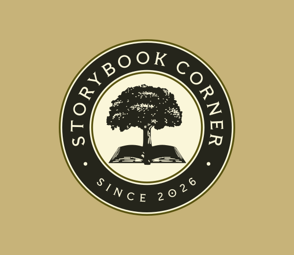
18. Bookstore
A classic icon paired with more traditional type makes a bookstore feel established, even if it just opened. Leaning slightly, a traditional approach works better here than an ultra-modern one.
Here’s an example of a bookstore logo:
Book Library Pages Tree by Design.com
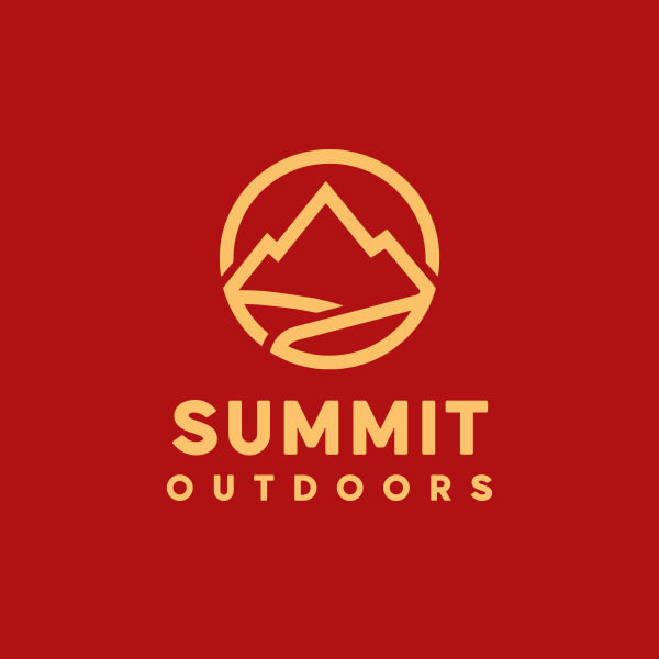
19. Outdoor gear shop
Strong, angular shapes suit an outdoor brand better than anything soft. The mark should feel rugged before anyone even reads the name.
See the sample below:
Outdoor Gear Brand by Design.com
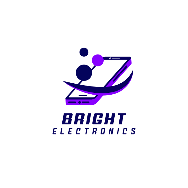
20. Electronics boutique
A precise, geometric icon in cool tones signals the same precision customers expect from the products themselves. Sharp shapes read as technical and modern.
Here’s what a sample electronics boutique logo looks like:
Cellphone Phone Gadget by Design.com
Technology
Technology logos live or die on restraint, since a cluttered mark reads as dated the moment it ships. Geometry and simplicity carry more credibility than any amount of detail.
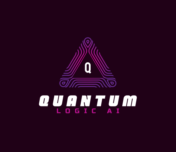
21. AI startup
An abstract shape, like connected points or a small burst, suits AI branding better than anything literal, like a robot. Keeping it simple enough to work as a tiny app icon matters most.
Something like the sample startup logo below:
Digital Triangle Geometry by Design.com
22. SaaS
A clean geometric shape inside a rounded container reads well as software since it’s built to shrink down into an app icon from day one. Design for the smallest size first.
Take a look at the sample SaaS logo below:
Generic Window Petals by Design.com
23. Cybersecurity
A shield made from minimal, clean lines signals protection without needing anything extra layered on top. Simpler shapes tend to feel more trustworthy.
Here’s an example cybersecurity logo below:
Lock Shield Security by Design.com
24. App developer
A small abstract icon paired with lowercase type feels approachable rather than corporate. One bold color usually reads better than several competing for attention.
Check out the app developer logo below:
Geometric Tech App by Design.com
25. Web agency
A code-inspired detail, such as a bracket or a simple geometric shape, hints at the agency’s technical work without spelling it out directly. A subtle reference feels more intentional than an obvious one.
Here’s how that could look:
Programming Coding Geometric by Design.com
26. Fintech
An upward or interlocking abstract shape quietly suggests growth and stability, which matters more in finance branding than anything flashy. Understated tends to win here.
See the sample fintech logo below:
Trading Graph Arrow by Design.com
27. Robotics
Sharp, angular shapes suit robotics far better than anything rounded. The mark should feel engineered rather than organic. Avoid rounded edges entirely.
Take a look at the robotics logo below:
Futuristic Geometric Tech by Design.com
28. Cloud services
A flat, simplified cloud shape instantly communicates a cloud services company, as long as it avoids anything literal or fluffy-looking.
Here’s an example of a cloud service logo:
Cloud Digital Tech by Design.com
29. Gaming
Bold color paired with a confident abstract mark suits gaming’s high energy better than restraint does. This isn’t the place to play it safe with color.
See the sample gaming logo below:
Futuristic Tech Innovation by Design.com
30. IT Company
A clean geometric icon with confident type signals reliability, which matters more to B2B clients than anything clever. Simplicity reads as trustworthy.
Here’s what an IT company logo looks like:
Diamond Modern Agency by Design.com
Health and wellness
Wellness branding is one of the few places where doing less is actually the strategy. A calm logo builds more trust here than a bold one ever would.
31. Yoga studio
A fluid, curved shape, rather than anything angular, echoes the same movement that yoga itself is built around. Curves tend to read as calmer than straight lines.
Something like the yoga logo below:
Zen Stones Balance by Design.com
32. Nutritionist
A simple leaf or plate shape keeps the mark grounded in food and health without needing much else. One clear symbol is enough here.
Take a look at the nutritionist logo below:
Restaurant Food Leaf by Design.com
33. Spa
A soft, minimal icon, like a single wave or petal, mirrors the calm a spa is trying to sell before anyone walks in. Less detail feels more relaxing.
Here’s an example of a spa logo:
Beauty Flower Spa by Design.com
34. Therapist
A gentle abstract shape avoids feeling clinical while still staying professional, which is a harder balance than it sounds. Subtlety matters more than clarity.
Check out the sample therapist logo below:
Zen Yoga Meditation by Design.com
35. Dentist
A simple, friendly icon, rounded rather than sharp, softens what’s usually an intimidating category. Rounded shapes on dentist logos tend to reduce clinical coldness more than people expect.
Here’s how that could look:
Dental Tooth Orthodontics by Design.com
36. Medical clinic
A simple, universally understood symbol keeps a medical logo trustworthy without adding anything unnecessary. Restraint matters more than personality here.
See the sample below:
Health Medical Cross by Design.com
37. Massage therapy
Gentle, curved lines in massage logos reflect the relaxing nature of the service better than anything sharp or busy.
Take a look below:
38. Skincare
A minimal botanical detail with ample open space reads as premium rather than clinical when creating a skincare logo. The white space is doing more work than the icon.
Here’s an example:
Botanic Nature Leaf by Design.com
39. Mental health
An abstract shape suggesting balance works better here than anything literal. Subtlety wins over clarity in this category. Avoid clinical imagery entirely.
See a sample of a mental health logo below:
Mental Counseling Therapist by Design.com
40. Acupuncturist
A single continuous line curving into something organic can echo balance and flow without needing to be literal about needles. One flowing line can say more than a detailed icon.
Here’s what that an acupuncturist logo looks like:
Organic Acupuncture Wellness by Design.com
Professional services
Professional services is a category where trust matters more than personality, and the logo needs to look like it’s been around longer than it has. Structure beats cleverness almost every time.
41. Law firm
A classic monogram or column shape leans into tradition and authority, which still outperforms trends for new logos. Keep it structured, not decorative.
Something like the sample law firm logo below:
Laurel Wreath Luxury by Design.com
42. Accountant
A structured mark built from straight lines reflects accuracy at a glance. Grid-based shapes suit detail-oriented brands better than anything organic.
Take a look at the accountant logo below:
Bookkeeping Finance Accounting by Design.com
43. Consultant
A directional shape, like an arrow, implies forward movement without saying it outright. Keep it flexible enough to work in both digital and print use.
Here’s an example of a consultant logo below:
Generic Arrow Firm by Design.com
44. Real estate agency
A recognizable, simplified home shape builds instant trust, and clean lines feel more modern than detailed ones.
Check out the sample real estate logo below:
Hand House Realtor by Design.com
45. Insurance company
A protective shape, such as a shield or an umbrella, directly reflects the promise the business is making. Rounded edges feel more approachable than sharp ones.
Here’s how an insurance company logo could look:

Agency Consulting Company by Design.com
46. Financial advisor
An understated, structured mark tends to build more long-term trust than anything flashy. Restraint reads as stability in this industry.
See a sample finance logo below:
Asset Management Analytics by Design.com
47. Human resources company
A simple, rounded people-related shape softens what can otherwise feel like a cold, corporate industry. Friendly shapes matter more than formality here.
Take a look at a sample human resource logo below:
Charity Human Community by Design.com
48. Architect
Precise, minimal linework mirrors the discipline itself, since exact lines communicate skill better than decoration does.
Here’s an example of an architect logo:
Compass Measurement Tool by Design.com
49. Wedding venue
A thin architectural detail, like a simple archway, paired with refined type, reads as timeless rather than trendy. Restraint feels more upscale than ornamentation.
See the sample of a wedding logo below:
Bridal Wedding Ceremony by Design.com
50. Hotel
A monogram set inside a simple frame carries the same quiet confidence as the rest of this category. Understated tends to read as more luxurious than ornate.
Here’s what a hotel logo looks like:
Elegant Tower Building by Design.com
Creative businesses
Creative brands are one of the rare categories where the logo is allowed to show off a little. The mark itself can double as proof of the work.
51. Photographer
A minimal lens or aperture shape is instantly recognizable without needing extra styling. Simple circular icons hold up well at any size.
Something like the sample photographer logo below:
Lens Camera Letter by Design.com
52. Graphic designer
Letting a custom wordmark do all the work directly shows off typographic skill, no separate icon required.
Take a look at the graphic designer logo below:
Simple Creative Graffiti by Design.com
53. Interior designer
Clean, architectural linework mirrors the same sensibility clients expect from the actual design work. Negative space can even suggest a room or object.
Here’s an example of an interior designer logo:
Interior Designer Decorating by Design.com
54. Music producer
An abstract sound wave or a musical note shape is universally understood and requires no explanation. High contrast color keeps it versatile across different media.
Check out the music producer logo below:
Producer Music Equalizer by Design.com
55. Artist
A hand-drawn, slightly imperfect mark feels more authentic than anything too polished or vector-precise.
Here’s how that artist logo could look:
Artistic Hand Gesture by Design.com
56. Videographer
A simple symbol tied to motion or playback reads instantly, even at a small size, which matters more than detail here.
See the videographer logo below:
Film Strip Entertainment by Design.com
57. Fashion designer
A bold, distinctive wordmark can outperform an icon entirely in this category. Letting the lettering carry the identity is often enough.
Take a look at the fashion designer logo below:
Retro Modern Clothing by Design.com
58. Tattoo studio
Intricate detail is one of the few places it actually works well, reflecting the artistry of the craft itself. Keep a simplified backup version ready for small use.
Here’s an example of a tattoo logo:
Tattoo Machine Needle by Design.com
59. Podcast
A microphone or soundwave detail instantly signals the audio format without needing anything else. Bright, single-color icons work well as cover art.
See the podcast logo below:
Microphone Chat Podcast by Design.com
60. Marketing agency
Since this logo doubles as a portfolio piece, something bolder or more unexpected than usual is worth trying here.
Here’s what that a marketing logo looks like:
Scarlet Swoosh Marketing by Design.com
Home and local services
These logos need to work from a moving car, a printed flyer, and a small van door, often all in the same week. Legibility matters more than subtlety here.
61. Landscaping company
A simple leaf or tree shape immediately signals a landscaping company; no need to overthink a nature icon.
Something like the landscaping logo below:

62. Plumbing company
A tool-based icon, such as a wrench or a water drop, clearly communicates the trade at a glance. Blue naturally pairs with water-related trades.
Take a look at the sample plumbing logo below:
Plumbing Droplet Faucet by Design.com
63. Cleaning service
A light, minimal mark with plenty of open space reflects freshness better than anything heavy or dark. White space itself can suggest cleanliness.
Here’s an example of a cleaning service logo:
Cleaning Broom Sanitation by Design.com
64. Roof services
A simple roofline shape is immediately recognizable, and keeping the lines clean helps it feel current rather than dated.
Check out the roof services logo below:
House Roof Shingle by Design.com
65. Electrician
A bolt or spark shape is a near-universal symbol for this trade, and it tends to work best in yellow and black for visibility.
Here’s how an electrician logo could look like:
Electrical Lightning App by Design.com
66. HVAC company
An airflow or fan-inspired shape can visually explain the service without needing any text at all, as long as it stays simple.
See the sample HVAC logo below:
Fan Ventilation HVAC by Design.com
67. Paint company
A simple tool icon, like a roller or brush, instantly communicates the trade. A colorful accent stroke can double as a visual signature.
Take a look at the paint company logo below:
House Refinishing Paint Brush by Design.com
68. Locksmith
A minimal key or lock shape is understood immediately; a simpler one tends to stay more legible than an ornate one.
Here’s an example of a locksmith logo:
69. Pest control
A shield shape reframes the service as protection rather than the pest or insect itself, which tends to feel more professional.
See the pest control logo below:
Security Defense Shield by Design.com
70. Home inspection
Combining two simple shapes, like a magnifying glass and a house, can communicate the service without needing any words at all.
Here’s what a home inspection logo looks like:
Home Realty Search by Design.com
Lifestyle and entertainment
This is a category built for energy, and a quiet, minimal logo tends to undersell what the business is actually like. A little more color and movement usually helps.
71. Travel agency
An abstract compass or plane shape is recognizable across nearly any audience or culture.
Something like the travel agency logo below:
Air Travel Plane Transport by Design.com
72. Event planner
A small celebratory shape, kept minimal rather than literal, reflects the joy of the events the business helps create. One festive detail is enough.
Take a look at the event planner logo below:
Fiesta Star Fireworks by Design.com
73. Beauty salon
A minimal icon, such as scissors or a simple mirror shape, matches the clean, editorial feel most salons aim for.
Here’s an example of a beauty salon logo:
Hair Scissors Salon by Design.com
74. Barbershop
Traditional imagery, such as a pole or a razor shape, is enough to indicate a barbershop. A little vintage detail adds authenticity.
Check out the barbershop logo below:
Barber Grooming Razor by Design.com
75. Dance studio
A fluid, curved line shape captures motion and grace better than anything static or geometric. Let the line itself feel like it’s moving.
Here’s how a dance studio logo could look like:
Swoosh Motion Curve by Design.com
76. Sports club
A bold emblem or shield shape reflects team identity and tradition at a glance. Two color palettes tend to create stronger recognition.
See the sports club logo below:
Basketball League Sports by Design.com
77. Gaming cafe
A bold, blocky shape with vibrant color fits the niche and signals it instantly to the right audience.
Take a look at the gaming cafe logo below:
Gaming Console Play by Design.com
78. Escape room
An abstract lock or maze shape hints at the experience without giving too much away. A little mystery in the mark builds intrigue.
Here’s an example of an escape room logo:
Generic Saloon Door by Design.com
79. Gym
A bold, simplified shape, like a dumbbell reduced to its basic form, carries more energy in saturated color than the usual black and red. A bold display sans-serif suits it better than script.
See the gym logo below:
Dumbbell Fitness Gym Trainer by Design.com
80. Karaoke bar
A microphone with a small sound trail captures the karaoke bar’s energy, and the louder the color, the better it tends to fit.
Here’s what that karaoke bar logo looks like:
Microphone Singer Vocalist by Design.com
Education and nonprofits
Education and nonprofit logos need to feel approachable first and foremost, since trust and warmth matter more than polish. Nothing here should feel cold or overly corporate.
81. School
A traditional shield or open book shape builds instant institutional trust. This is one place where classic still works best.
Something like the school logo below:
Learning Open Book by Design.com
82. Tutor
A simple learning-related icon, like a pencil or lightbulb, communicates the service without needing extra explanation.
Take a look at the tutor logo below:

Pencil Light Bulb by Design.com
83. Charity
A human-centered shape, such as a heart or a simple hand icon, conveys a care-driven mission at a glance. Warm colors feel more hopeful than somber ones.
Here’s an example of a charity logo:
Love Charity Support by Design.com
84. Museum
A classical detail, such as a column or a simple frame shape, connects the mark to history and culture. Let the collection be the visual star, not the logo.
Check out the museum logo below:
Arch Pillar Architecture by Design.com
85. Library
A simple open book shape is about as universally clear as symbols get for this category. Muted colors suit the calm atmosphere well.
Here’s how a library logo could look like:
Book Storytelling Publisher by Design.com
86. Daycare
A playful, soft shape, like a sun or building block, reassures parents before they even read the name. Pastels work better than saturated primaries here.
See the sample daycare logo below:
Children Jigsaw Puzzle by Design.com
87. Language school
A speech bubble or globe shape instantly signals communication, which is the core of what the business does.
Take a look at a sample language school logo below:
International Speech School by Design.com
88. Coding academy
A bracket or cursor-inspired shape resonates with a tech education audience without needing to explain itself.
Here’s an example of a coding logo:
Multicolor Arrow Cursors by Design.com
89. Animal rescue
A simple paw shape, rounded rather than sharp, is instantly recognizable and emotionally resonant. Soft shapes feel gentler for rescue work.
See the animal rescue logo below:
Animal Paw Print by Design.com
90. Environmental nonprofit
A leaf, globe, or wave shape reflects the mission in a single glance without needing much else. Blue and green read as environmental almost universally.
Here’s what that an environmental nonprofit logo looks like:
Water Leaf Hydroponics by Design.com
Personal brands
Personal brand logos need to flex across more platforms than almost any business logo, a profile photo, a book cover, and a thumbnail. Simplicity keeps that flexibility intact.
91. Author
A refined, non-ornate monogram feels literary without trying too hard. Keep it simple enough to still work on a book cover.
Something like the author logo below:
Monogram Initial Name by Design.com
92. Public Speaker
A bold, simple shape, like a microphone or a sound wave, mirrors the confidence a speaker brings to the stage. A signature color helps it stand out across events.
Take a look at the sample public speaking logo below:
Microphone Podcast Studio by Design.com
93. Influencer
Custom initials or a minimal personal mark tend to build recognition faster than anything overly detailed. Design first for a small circular profile photo.
Here’s an example of an influencer logo:
Simple Premium Professional by Design.com
94. Freelancer
A clean, simple monogram builds trust quickly, which matters more here than personality for a first impression. Keep it flexible for both formal and casual use.
Check out the sample freelancer logo below:
Generic Minimalist Brand by Design.com
95. Coach
An upward or growth-inspired shape reflects the transformation the business is built around. Bold color choices reflect motivational energy.
Here’s how that coach logo would look:
Arrow Growth Graph by Design.com
96. Streamer
A bold, distinctive mark needs to hold up at a small, animated size, like a webcam overlay, more than almost any other entry on this list.
See the sample streamer logo below:
Minimalist Elegant Fashion by Design.com
97. Musician
Letting the typography carry the personality, rather than leaning on a complex icon, works better for musicians.
Take a look at the musician logo below:
Tilted Handwritten Signature by Design.com
98. Chef
A minimal utensil or chef hat shape establishes credibility quickly, and pairing it with a signature-style wordmark adds a personal touch.
Here’s an example of a chef logo:
Chef Hat Culinary by Design.com
99. Fitness trainer
A sharp, energetic shape reflects strength and motivation better than anything soft or rounded.
See the fitness trainer logo below:
Executive Technical Logistic by Design.com
100. Content creator
A monogram designed primarily for a small circular profile photo is typically the most flexible option across all platforms.
Here’s what that a content creator logo looks like:
Simple Production Studio by Design.com
How do you come up with a cool logo design?
Coming up with a cool logo design starts with research, not software. Understanding your industry, audience, and competitors matters more than any tool you’ll eventually use.
- Research your industry and competitors. Note common colors, icons, and styles to either follow or intentionally break from.
- Sketch multiple concepts. Explore five to ten rough ideas before committing to one direction.
- Simplify relentlessly. Remove any detail that doesn’t help communicate the brand.
- Test versatility. Check how the logo looks in black and white, at a small size, and on different backgrounds.
- Get outside feedback. A fresh set of eyes will catch clarity issues you might miss on your own.
Can AI generate cool logo ideas?
Yes. AI logo tools can generate dozens of professional, on-brand logo concepts based on your business name, industry, and style preferences, producing a range of options across icon styles, layouts, and color palettes so you can compare directions quickly rather than starting from a blank page.
A few tips for getting better results from an AI logo maker.
- Be specific about your industry and target audience.
- Mention a style direction, such as minimalist, vintage, playful, or bold.
- Provide one or two color preferences if you already have them.
- Generate multiple rounds and combine your favorite elements from each.
Where can I find inspiration for logo design?
Good logo inspiration comes from curated lists like this one, but also from everyday sources most people overlook, such as nature, architecture, vintage packaging, and even unrelated industries, which can spark a direction you’d never find by searching “logo ideas” alone. Competitor branding is worth studying, too, mainly so you know what to avoid blending in with.
When you’re ready to turn a direction into something real, Design.com’s AI logo generator can build on exactly what you’ve found here: your industry, your style preferences, and the reasoning behind them, then hand you a finished logo in minutes. From there, it lets you fine-tune every detail until it feels right. Design.com doesn’t stop at logos either; the same brand can extend to business cards, social media templates, and everything else a new business needs to look finished from day one.
Remember, a hundred ideas are a lot to choose from, but you only need one that’s actually right for your business.
Read more on logo design here:
- 50 3D Logos for Modern Brands
- 50 Blue Logos That Make a Bold Statement
- 50 Circle Logos for Corporate Excellence
Hannah Suroy suroy brings clarity to complex topics across entertainment, business, and creative industries. She specializes in translating industry trends and innovations into engaging content that helps readers understand the creative process behind the work they love.