100 Logo Color Combinations
Fun fact: The human brain makes snap judgments faster than you realize. Research shows people form subconscious opinions about brands and products within 90 seconds, and between 62% to 90% of that assessment is based on color alone.
This means that before anyone reads your company name or understands what you sell, they’ve already formed an opinion about your brand. The wrong color palette makes premium brands look cheap and fun startups feel stiff. The right combination attracts your ideal customers and builds recognition faster than any other branding element.
Your logo design colors will be used in many places – your website, business cards, social media posts, invoices, presentations, uniforms, and signage. Every aspect of your business, including its marketing, will be influenced by your logo colors.
The psychology of color in logo design
Understanding color psychology in logo design helps you select combinations that align with your brand’s personality and connect with your audience on an instinctive level.
Here’s a snapshot of what different colors typically represent:
Warm and energetic
- Red conveys energy, excitement, and passion
- Orange suggests warmth, creativity, and affordability
- Yellow radiates optimism, friendliness, and clarity
Cool and trustworthy
- Green represents balance, growth, and nature
- Blue communicates trust, calm, and reliability
- Purple evokes luxury, wisdom, and imagination
Soft and gentle statements
- Pink embodies compassion, modern femininity, and playfulness
- Lavender expresses serenity, nostalgia, and gentle sophistication
- Peach suggests approachability, warmth, and tender care
Grounded and dynamic
- Black projects elegance, authority, and minimalism
- White signifies simplicity, purity, and sophistication
- Brown reflects earthiness, reliability, and craftsmanship
- Multi colors express inclusivity, energy, and innovation
Keep in mind that color associations can vary across cultures – red means luck and prosperity in China, but often signals danger or urgency in Western contexts. Always consider where your audience is and what colors mean to them.
So how do you apply this? Choose colors that reflect not just what looks appealing, but what you want your audience to feel. Test your choices, trust the psychology, and let your colors tell your brand’s story at first glance.
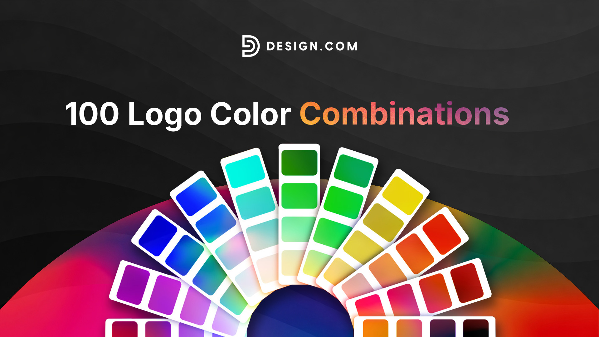
100 logo color combinations
Now comes the good part. These 100 logo color combinations span every mood, industry, and aesthetic you might need for your logo.
Each palette includes specific hex codes, the emotional vibe it creates, and which industries it serves best. Use these as starting points and adapt them to make them uniquely yours.
1. Charcoal (#36454F) + Electric Blue (#7DF9FF)
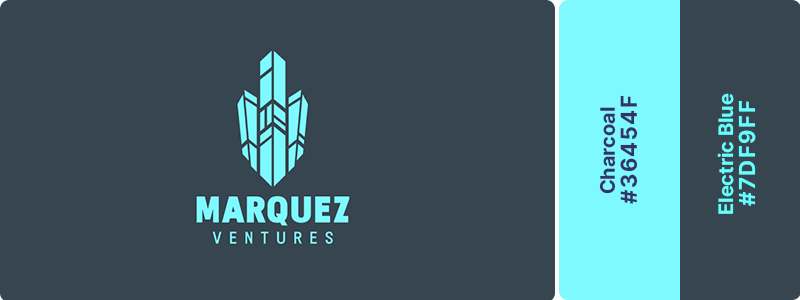
This combination radiates innovation and confidence. The deep charcoal anchors the electric blue’s vibrant energy, creating a palette that speaks to forward-thinking technology without feeling chaotic. It’s perfect for software companies, app developers, and digital agencies seeking a modern logo and a tech-forward identity.
2. Navy (#000080) + Cyan (#00FFFF) + Black (#000000)
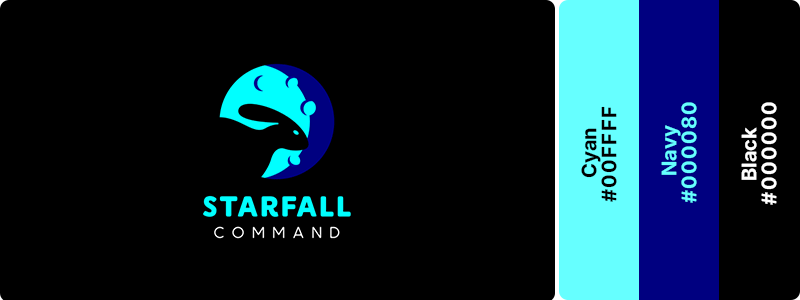
Navy and black establish tech authority while cyan accents inject bursts of digital energy throughout the design. This trio conveys both professionalism and innovation, making it ideal for enterprise software, cybersecurity firms, and B2B tech platforms that need to inspire trust while showcasing cutting-edge capabilities.
3. Electric Blue (#7DF9FF) + White (#FFFFFF)
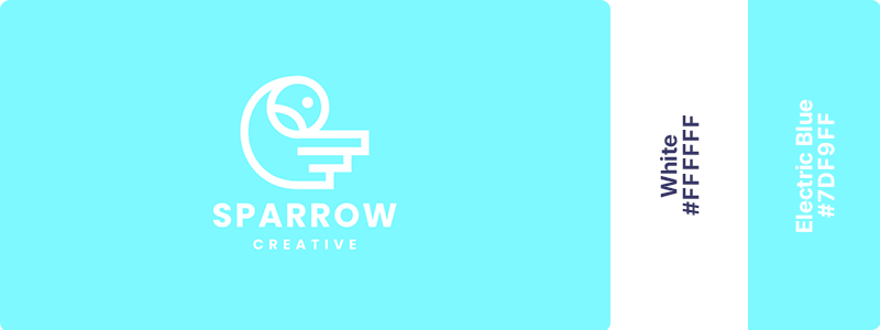
Bright and optimistic, this pairing feels like the clean future we’ve been promised. The electric blue pulses with forward-thinking energy, while white provides breathing room and clarity. It’s an excellent choice for AI companies, automation tools, and tech startup logos focused on simplifying complex problems.
4. Indigo (#4B0082) + Turquoise (#40E0D0) + White (#FFFFFF)
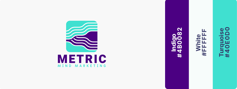
These cool digital tones create a sense of depth and mystery while maintaining clarity and approachability. The indigo provides gravitas while turquoise adds accessibility. This combination works beautifully for data visualization platforms, analytics software, and cloud computing services.
5. Graphite (#383838) + Mint Green (#98FF98)
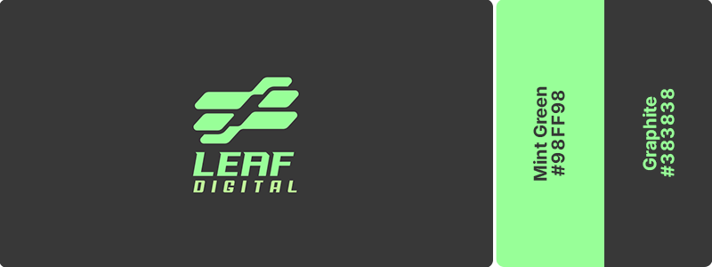
Industrial strength meets fresh innovation in this unexpected pairing. The mint accent breathes life and environmental consciousness into graphite’s serious technological foundation. Perfect for sustainable tech companies, green energy platforms, and eco-focused startups!
6. Navy (#000080) + White (#FFFFFF)
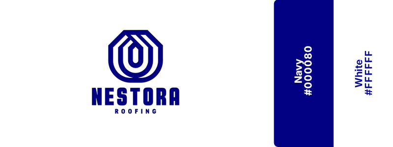
The gold standard of corporate professionalism. This timeless combination of blue and white exudes cleanliness, authority, and universal trustworthiness. Navy establishes credibility, while white provides clarity and openness. It’s the perfect choice for financial advisors, law firms, and accounting practices seeking instant recognition and respect.
7. Cobalt Blue (#0047AB) + Gray (#808080) + White (#FFFFFF)
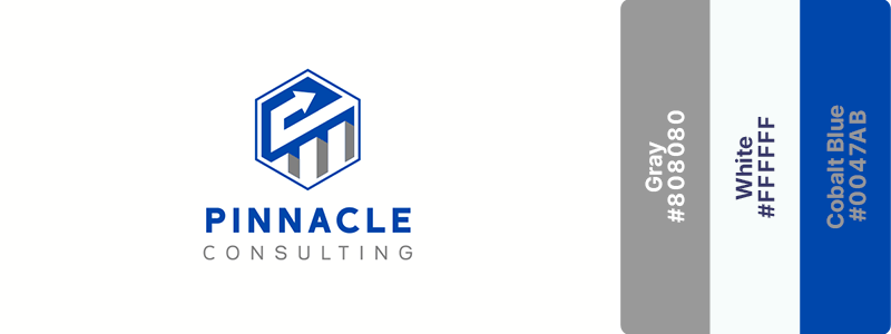
With this pairing, cobalt injects energy and a forward-thinking attitude into traditional corporate gray. This creates a balance between innovation and reliability, making it great for consulting firms, business advisors, and professional services targeting progressive clients.
8. Royal Blue (#4169E1) + Gold (#FFD700)
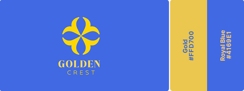
This pairing radiates established authority and achievement. Royal blue conveys trustworthiness and stability while gold accents suggest success, prestige, and winning outcomes. Ideal for universities, business coaching services, and wealth management firms that want to project excellence.
9. Midnight Blue (#191970) + Teal (#008080)
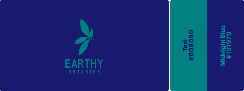
Trustworthy tradition meets modern personality. The midnight blue provides the gravitas expected in financial services while teal adds contemporary flair and approachability. This combination works beautifully for forward-thinking banks, fintech startups, and modern insurance companies.
10. Navy (#000080) + Burgundy (#800020) + White (#FFFFFF)
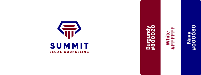
Deep, traditional prestige that commands respect. Both colors carry weight and history, suggesting establishment, seriousness, and refined taste. This take on the classic blue-and-red pairing is perfect for legal services, private equity firms, and high-end consulting practices serving discerning clientele.
11. Electric Blue (#3B82F6) + Ice White (#F8FAFC) + Charcoal (#36454F)
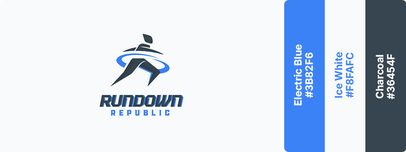
Charcoal provides strength and sophistication, while electric blue introduces energy, innovation, and visual impact. Ice white keeps the look crisp and accessible. This dynamic combination is ideal for athletic brands, fitness apps, and sports-focused businesses targeting ambitious, modern consumers.
12. Marine Blue (#003B6D) + Cream (#FFFDD0)
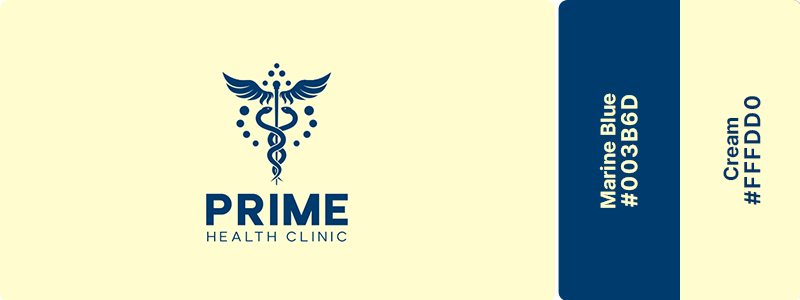
This pairing projects calm authority with a gentle touch. Marine blue conveys professionalism and stability, while cream softens the intensity with warmth and approachability. Perfect for healthcare providers, medical clinics, and educational health institutions seeking to balance expertise with patient comfort.
13. Deep lavender (#6633FF) + Cream (#FFFDD0)
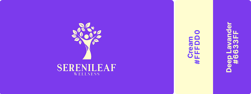
Deep lavender conveys tranquility, balance, and a sense of modern wellness, while cream adds warmth, softness, and natural elegance. This harmonious combination works beautifully for wellness brands, holistic health practices, skincare companies, and lifestyle businesses that want to communicate serenity, trust, and elevated care.
14. Deep Olive (#556B2F) + Warm cream (#F7F1E8)
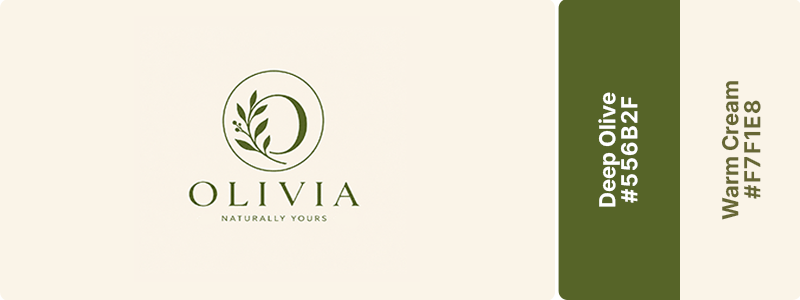
Earthy confidence paired with timeless warmth. Deep olive reflects stability, growth, and a connection to nature, while warm cream adds softness and approachability without feeling stark. This grounded, organic combination works beautifully for sustainable brands, wellness businesses, artisan products, and companies that want to convey trust, authenticity, and natural quality.
15. Teal (#008080) + Leaf Green (#90EE90) + White (#FFFFFF)
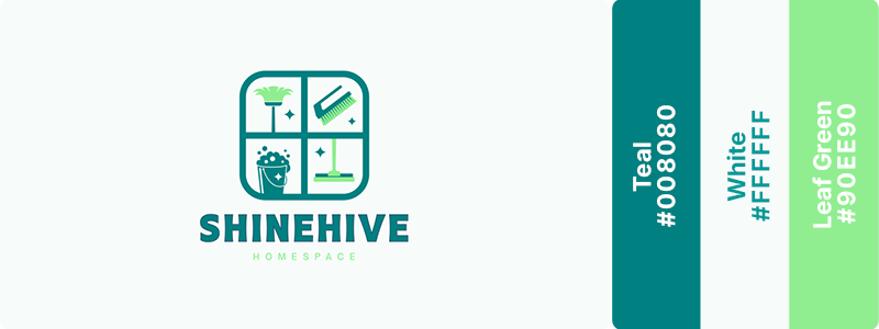
Fresh, clean, and naturally pure. This trio suggests both natural origins and clinical cleanliness – a perfect balance for modern wellness. Teal provides professionalism, leaf green adds vitality, and white ensures clarity. Great for health food brands, green cleaning products, and wellness-focused companies.
16. Red (#FF0000) + Yellow (#FFFF00)
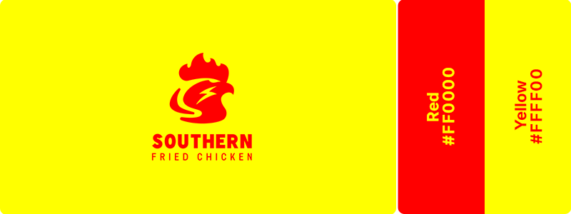
Red triggers excitement and hunger while yellow radiates warmth and happiness. This high-energy red-and-yellow pairing creates instant recognition and irresistible cravings. Perfect for fast-food restaurants, quick-service brands, and casual dining establishments that want to drive immediate action.
17. Chocolate (#7B3F00) + Vanilla (#F3E5AB)
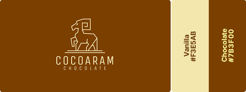
Pure dessert heaven in color form. These complementary tones of brown and white shades are irresistibly sweet and indulgent. Chocolate provides rich depth while vanilla adds creamy lightness. Ideal for bakeries, ice cream shops, and dessert-focused brands that want to make mouths water instantly.
18. Coffee (#6F4E37) + Caramel (#FFD59A)
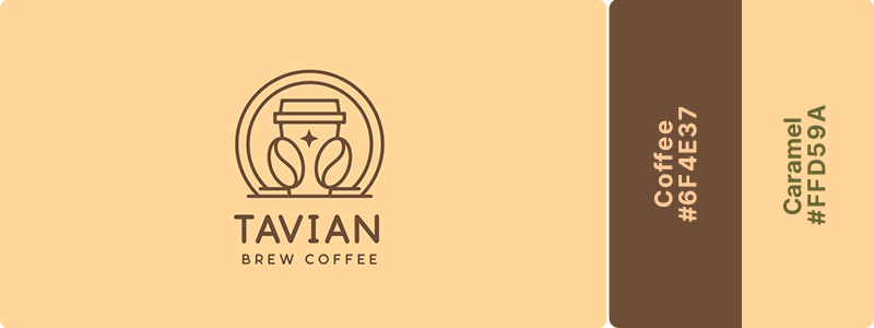
Rich, inviting, and unmistakably cozy. These warm tones evoke the comfort of your favorite café and the promise of caffeinated bliss. Coffee grounds the palette while caramel adds sweet, buttery warmth. Works beautifully for coffee shops, breakfast spots, and café-bakery hybrids.
19. Wine (#722F37) + Gold (#FFD700) + White (#FFFFFF)
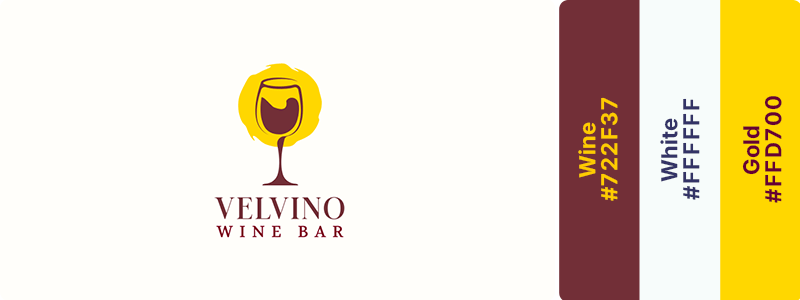
This conveys sophisticated dining excellence. This pairing suggests fine wine, upscale experiences, and premium quality. Wine provides depth and richness, while gold adds luxury and celebration. Great for wine bars, fine dining restaurants, and upscale culinary experiences.
20. Terracotta (#E2725B) + Beige (#F5F5DC)
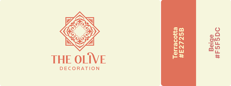
Mediterranean warmth and sun-baked deliciousness. Terracotta evokes clay ovens and rustic charm, while beige provides neutral elegance. This combination transports diners to coastal villages and authentic cuisine. This can be your go-to palette if you own an Italian restaurant, a Spanish tapas bar, and or a Mediterranean eatery.
21. Blush (#FFC0CB) + Rose Gold (#B76E79)
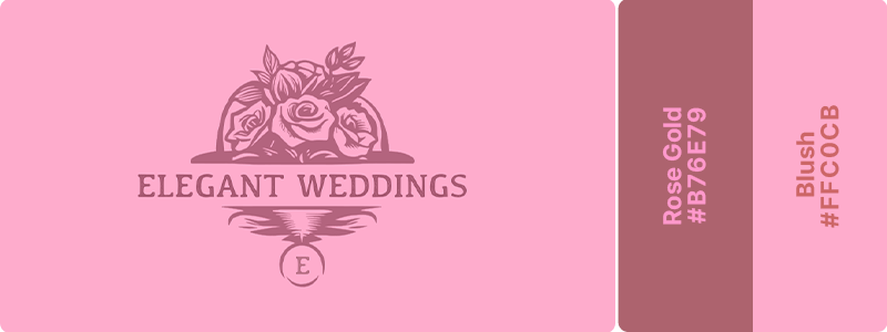
Feminine luxury with modern sophistication. Blush provides soft romance while rose gold adds contemporary metallic elegance. This pairing feels both premium and approachable. This color palette best serves beauty brands, fashion boutiques, and wedding-related businesses.
22. Black (#000000) + Gold (#FFD700)
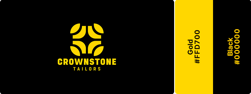
This black-and-gold pairing is timeless luxury that screams prestige and exclusivity. Black provides the ultimate backdrop for gold’s opulent shine. This classic combination conveys high-end positioning and premium quality. Ideal for high-end fashion brands, luxury accessories, and premium retail experiences.
23. Dust Pink (#DCAE96) + Taupe (#483C32)
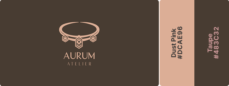
Understated chic with earthy sophistication. The dusty pink brings gentle femininity while taupe grounds it with neutral elegance. This pairing feels curated and intentional. Great for fashion boutiques, lifestyle brands, and contemporary retail spaces.
24. Navy (#000080) + Rose Gold (#B76E79)
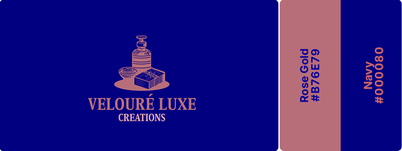
Modern elegance that balances authority with contemporary flair. Navy provides structure and professionalism, while rose gold softens with warm metallic sophistication. Perfect for beauty brands, lifestyle products, and fashion lines targeting professional women.
25. Soft Pink (#FFB6C1) + Navy (#000080)
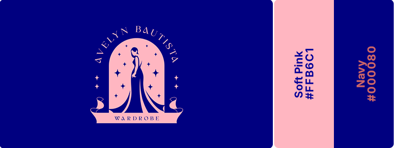
If you want a color that pops a little more than rose gold, this combination is for you. Navy anchors pink’s sweetness with authority and depth, creating a sophisticated yet approachable combination. This pairing works beautifully for professional women’s brands, contemporary fashion, and lifestyle businesses.
26. Deep Twilight (#03045E) + Sky Aqua (#48CAE4) + White (#FFFFFF)
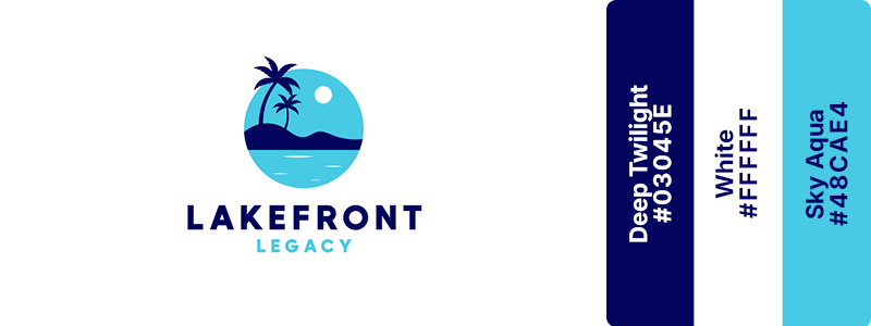
Deep twilight evokes depth, exclusivity, and the serenity of the ocean after sunset, while sky aqua brings freshness, relaxation, and tropical vibrancy. White completes the palette with a clean, airy feel that enhances the sense of space and comfort. This combination creates a sophisticated aesthetic that works beautifully for beachfront resorts, luxury hotels, vacation destinations, and hospitality brands that want to convey relaxation, elegance, and unforgettable experiences.
27. Deep Teal (#006D66) + Mint (#A7F3D0) + Peach (#FFE5B4)

Fresh sophistication with a playful, welcoming touch. Deep teal conveys trust, clarity, and professionalism, while mint adds a sense of vitality and renewal. Peach introduces warmth and friendliness, creating a balanced palette that feels both refreshing and approachable. This vibrant yet harmonious combination works beautifully for wellness brands, modern healthcare services, sustainable businesses, and lifestyle companies that want to feel credible, uplifting, and human-centered.
28. Royal Purple (#5B21B6) + Soft Gold (#F4C95D)
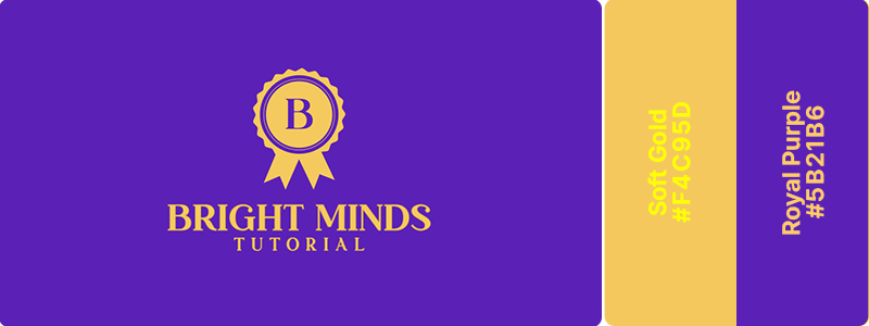
Regal confidence with a touch of luxury. Royal purple conveys creativity, ambition, and prestige, while soft gold introduces warmth, optimism, and a sense of refinement. Together, they create a rich, memorable palette that feels both sophisticated and approachable. This striking combination works beautifully for premium brands, beauty and wellness businesses, creative studios, and companies that want to communicate excellence, innovation, and elevated quality.
29. Soft Gold (#F4C95D) + Raspberry (#D63384)
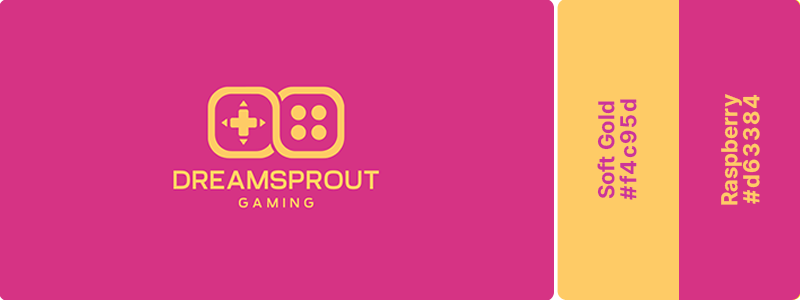
Energetic excitement with a bold, playful spirit. Soft gold brings optimism, achievement, and a sense of reward, while raspberry adds vibrancy, creativity, and emotional energy. Together, they create a dynamic, high-impact palette that feels fun, engaging, and full of personality. This lively combination works beautifully for gaming brands, esports teams, entertainment platforms, and digital products that want to capture attention and inspire enthusiasm
30. Indigo (#4338CA) + Mint (#98FF98)
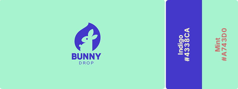
Gentle reassurance with a fresh, nurturing feel. Indigo conveys trust, stability, and dependable care, while mint brings softness, renewal, and a sense of calm well-being. Together, they create a balanced palette that feels both professional and comforting. This soothing combination works beautifully for maternity stores, baby boutiques, prenatal care services, and family-focused brands that want to communicate warmth, support, and confidence.
31. Charcoal (#36454F) + Champagne (#F7E7CE)
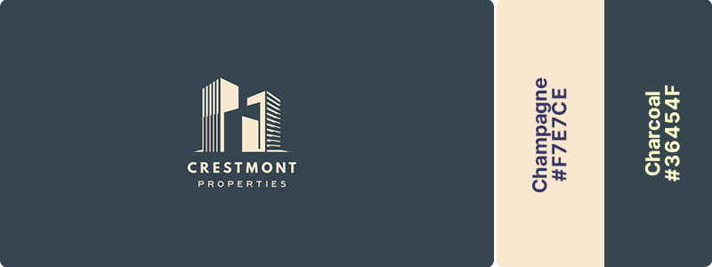
Charcoal establishes authority and modernity while champagne adds refined warmth and luxury. This pairing conveys premium positioning without ostentation. Great for boutique real estate agencies, luxury property developers, and high-end architectural firms.
32. Slate (#708090) + Sky Blue (#87CEEB)
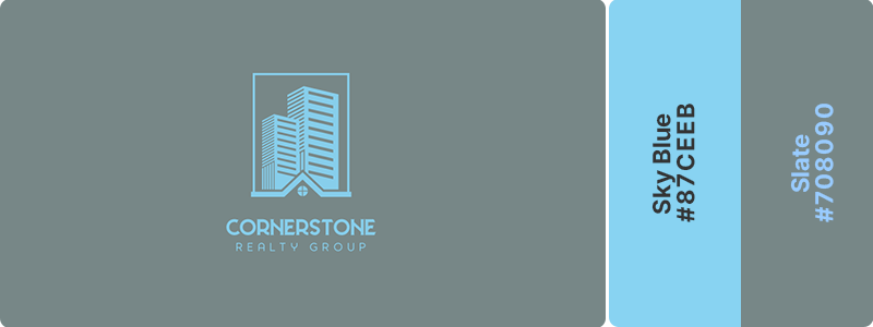
Slate provides a solid foundation and reliability, while sky blue adds spaciousness and optimism. This combination suggests trusted guidance with a human touch. Perfect for residential real estate, property management, and home services.
33. Forest Green (#228B22) + Bronze (#CD7F32) + White (#FFFFFF)
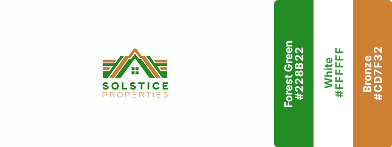
Heritage luxury with craftsmanship appeal. Forest green conveys stability and natural value while bronze suggests quality materials and artisan attention. This pairing works beautifully for heritage properties, restoration services, and luxury outdoor real estate.
34. White (#FFFFFF) + Charcoal (#36454F) + Sky Blue (#87CEEB)
Clean, modern, and approachable. White provides space and clarity, charcoal adds contemporary sophistication, and sky blue softens with welcoming warmth. Ideal for modern architecture firms, new development marketing, and contemporary real estate agencies.
35. Twilight Indigo (#3D40B5) + Eggshell (#F4F1DE)
Twilight indigo conveys intelligence, precision, and forward-thinking expertise, while eggshell introduces warmth and understated elegance. They create a balanced palette that feels both modern and timeless, reflecting the blend of creativity and technical mastery essential to great design. This refined combination works beautifully for architecture firms, design consultancies, and built-environment professionals who want to communicate innovation, trust, and enduring quality.
36. Forest Green (#228B22) + Cream (#FFFDD0)
Forest green reflects growth, sustainability, and a deep connection to the land, while cream adds warmth, simplicity, and a wholesome feel. Together, they create a timeless palette that feels fresh, trustworthy, and rooted in nature. This harmonious combination works beautifully for farms, organic produce brands, agricultural businesses, and farm-to-table restaurant logos that want to convey quality, authenticity, and environmental stewardship.
37. Olive (#808000) + Sand (#C2B280) + Moss (#8A9A5B)
Earthy, balanced, and genuinely handcrafted. These muted natural tones feel tactile and authentic. Olive provides maturity, sand adds warmth, and moss brings living freshness. Great for artisanal brands, natural skincare products, and organic farmers’ markets!
38. Pine (#01796F) + Beige (#F5F5DC) + Sky Blue (#87CEEB)
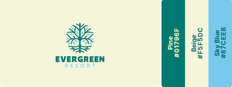
Outdoorsy and naturally approachable. Pine grounds the palette with forest depth, beige adds neutral warmth, and sky blue provides open-air freshness. Perfect for outdoor gear companies, eco-tourism, and environmental conservation organizations.
39. Emerald (#50C878) + Gold (#FFD700) + Black (#000000)
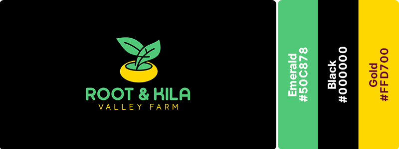
Luxurious sustainability. Emerald conveys rich natural value while gold elevates your brand positioning to a premium status. This combination works for brands merging environmental consciousness with high-end markets. Ideal for upscale organic brands and premium eco-products.
40. Seafoam (#93E9BE) + Stone Gray (#928E85)
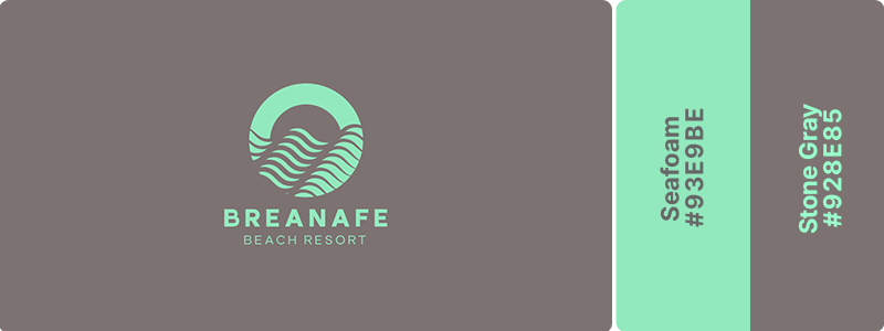
Calm, coastal, and environmentally conscious. Seafoam suggests ocean health and natural purity while stone gray provides grounded stability. This pairing evokes beach ecosystems and marine conservation. Perfect for marine conservation groups, beach lifestyle brands, and ocean-friendly products.
41. Jet Black (#0A0A0A) + Amber Yellow (#FFBF00)
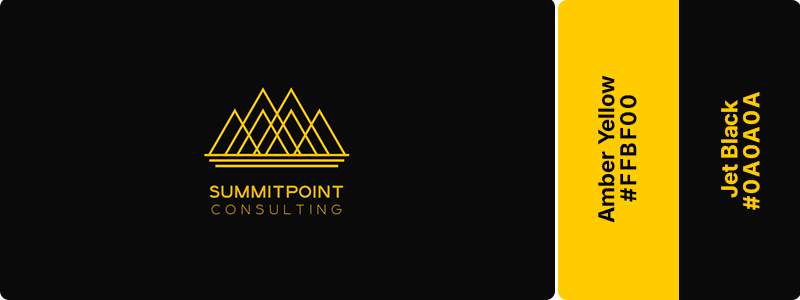
Bold contrast with warm creative energy. Jet black provides dramatic sophistication while amber yellow injects vibrant personality and creative spark. This pairing avoids severity through warmth. Works perfectly for creative agencies, modern consultancies, and innovative design studios!
42. Neon Ice (#00FFE7) + Plum (#7C3AED)
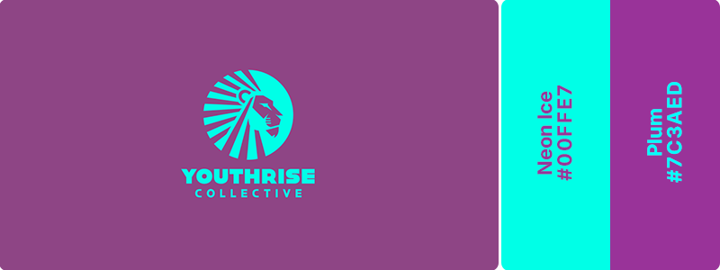
Neon ice brings freshness, innovation, and digital-era vibrancy, while plum adds sophistication, creativity, and depth. Together, they create a striking contrast that feels both contemporary and confident. This dynamic combination works beautifully for retail brands targeting young urban professionals, fashion-forward lifestyle stores, and modern consumer brands that want to project originality, ambition, and a fresh sense of style.
43. Cream (#FF7ED) + Deep teal (#0F766E)
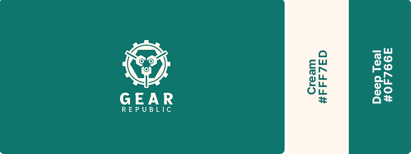
Cream provides a soft, welcoming foundation that feels comfortable and trustworthy, while deep teal conveys stability, confidence, and modern sophistication. This versatile combination works beautifully for retail stores, service-based businesses, wellness brands, and companies that want to project reliability, quality, and genuine customer care.
44. Peach (#FFE5B4) + Dark amethyst (#3C1642)
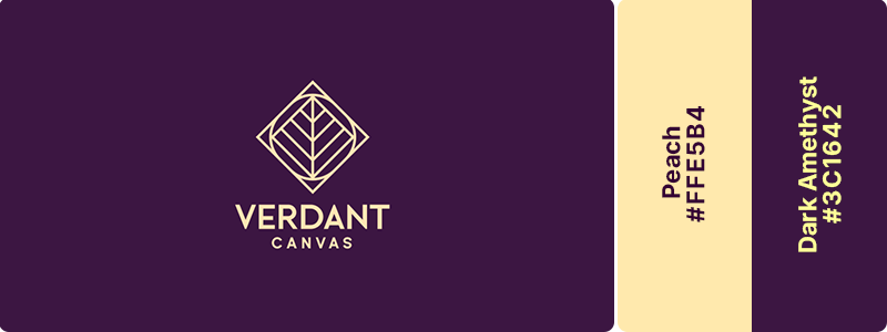
Peach brings warmth, imagination, and an inviting sense of play, while dark amethyst adds depth, artistry, and a refined creative edge. Together, they create a distinctive palette that feels both inspiring and approachable. This expressive combination works beautifully for arts supply stores, creative studios, craft brands, and artistic businesses that want to spark creativity while maintaining a polished, professional presence.
45. Navy (#1E3A84) + Crimson (#B91C1C) + Ivory (#FFFFF0)
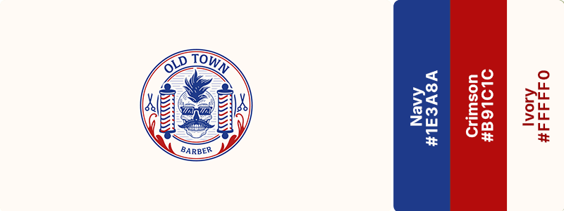
Navy conveys trust, professionalism, and timeless style, while crimson adds energy, strength, and a sense of character. Ivory softens the palette with a clean, premium finish, creating balance and sophistication. These colors create a distinguished look that works beautifully for barbershops, men’s grooming brands, and traditional service businesses that want to project craftsmanship, confidence, and enduring quality.
46. Red (#FF0000) + Black (#000000) + White (#FFFFFF)
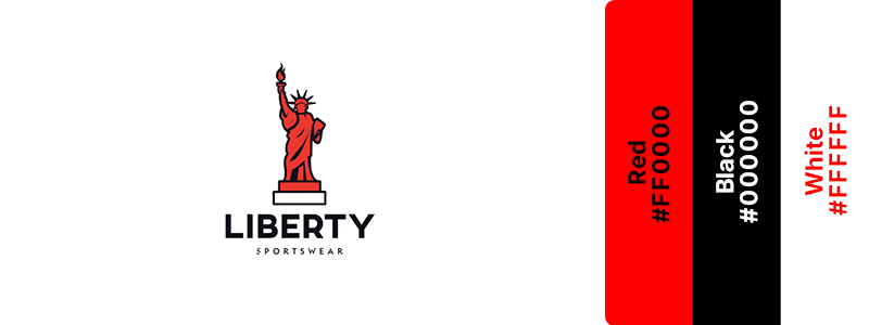
Maximum impact and undeniable power. This classic sports combination radiates intensity, strength, and competitive energy. Red drives action while black adds authority and edge. Athletic wear brands, competitive sports teams, and energy drink companies would command attention with this red-and-black color combination.
47. Orange (#FFA500) + Navy (#000080)
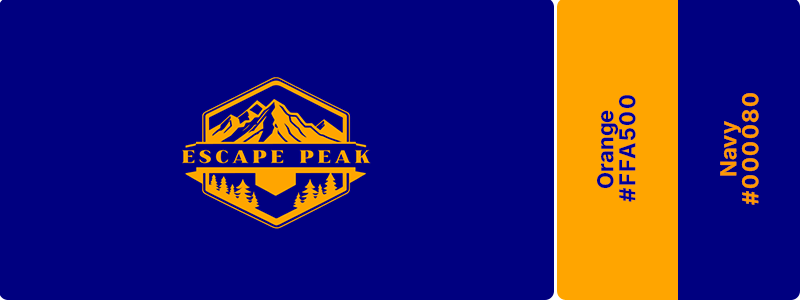
Bold confidence with grounded authority. Orange brings enthusiastic energy and visibility, while navy provides professional stability. This pairing balances excitement with trustworthiness. Great for sports teams, adventure brands, and active lifestyle companies.
48. Neon Green (#39FF14) + Charcoal (#36454F)
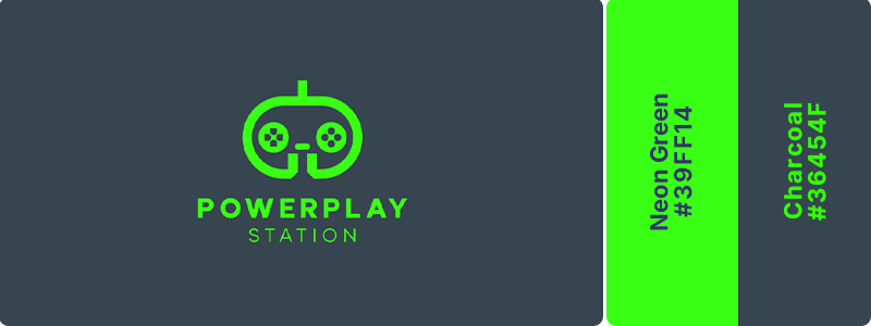
Modern intensity with edgy appeal. Neon green explodes against charcoal’s darkness, creating high-energy visual impact. This combination feels cutting-edge and powerful. This color combination would work well for fitness tech, gaming brands, and extreme sports companies.
49. Electric Blue (#7DF9FF) + Red (#FF0000)
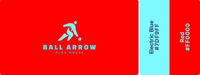
Dynamic energy and visual excitement. This vibrant blue-and-red pairing creates movement and adrenaline through pure color intensity. Both colors demand attention and action. Ideal for youth sports marketing, extreme sports brands, and high-energy fitness programs.
50. Crimson (#DC143C) + Gold (#FFD700) + White (#FFFFFF)
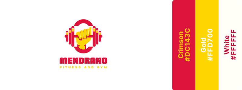
Victory and championship energy. Crimson provides passionate intensity. Gold suggests winning and achievement. This powerful logo color combination evokes competitive success and glory for sports organizations, achievement-focused fitness brands, and sports coaching services.
51. Midnight Blue (#191970) + Copper (#B87333)
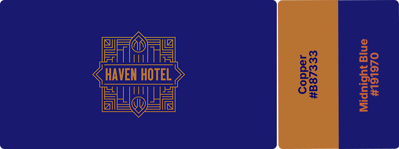
Warm luxury with inviting elegance. Midnight blue provides sophisticated depth while copper’s glow adds approachable warmth and a premium feel. This pairing feels expensive yet welcoming; perfect for upscale hospitality, boutique hotels, and high-end liquor brands.
52. Deep Plum (#660066) + Ivory (#FFFFF0)
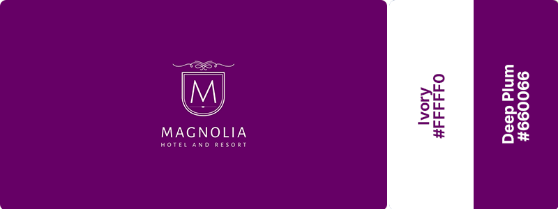
Rich refinement with elegant contrast. Deep plum brings luxurious depth and sophistication. Ivory provides clean, premium lightness. Consider this color combination if you own a cosmopolitan restaurant, luxury hotel, or high-end entertainment venue.
53. Turquoise (#40E0D0) + Tangerine (#F28500)
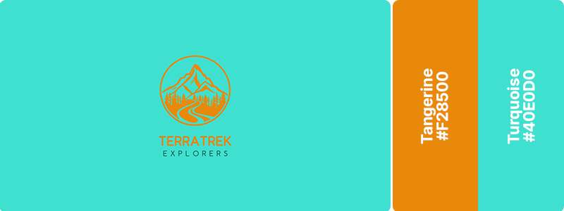
Tropical energy and summery vibrancy. This bright, warm combination evokes beach vacations and adventure travel. Turquoise suggests clear waters while tangerine adds sunset warmth. Works beautifully for beach resorts, tropical destinations, and adventure travel companies.
54. Coral (#FF7F50) + Cream (#FFFDD0)
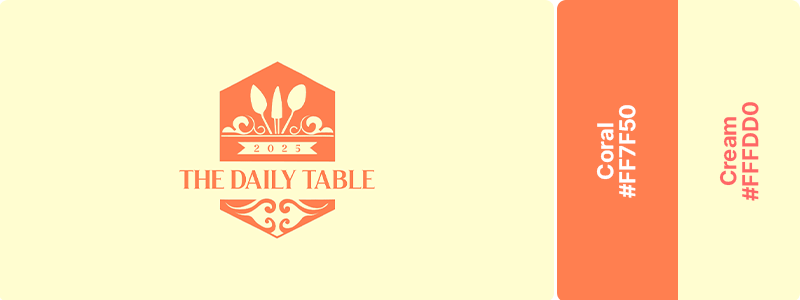
Warm, inviting, and lifestyle-focused. Coral adds energetic warmth while cream provides elegant softness and approachability. This pairing feels welcoming and stylish. Great for lifestyle hotels, boutique bed-and-breakfasts, and casual dining establishments!
55. Mauve (#9A5F83) + Champagne (#F7E7CE)
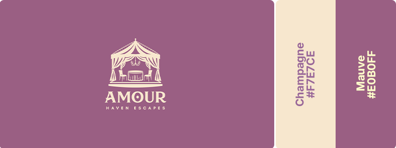
Dreamy elegance with romantic sophistication. Mauve brings soft, romantic atmosphere and champagne adds a refined celebration. This combination creates memorable, special-occasion feelings that would be perfect for wedding venues, romantic getaways, and upscale event spaces.
56. Cobalt (#0047AB) + Silver (#C0C0C0)
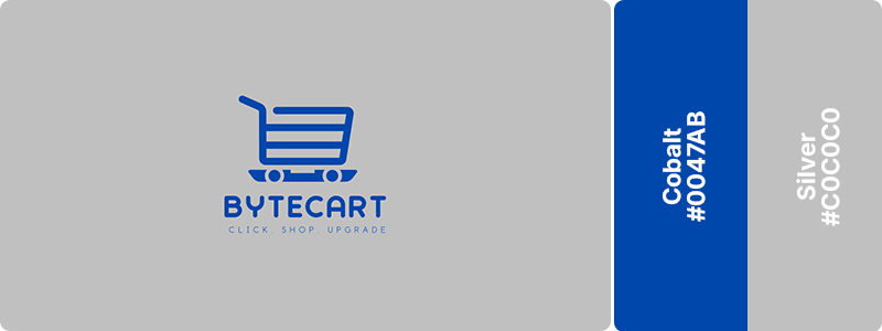
Premium tech with modern innovation. Cobalt provides digital authority. Silver suggests advanced technology and sleek design. This pairing conveys cutting-edge retail experiences. Try this color combination if you’re a hardware company or own IoT products and a tech-enabled shopping platform.
57. Sky Azure (#37B6FF) + Rose (#FF007F) + Vanilla Cream (#F3E5AB)
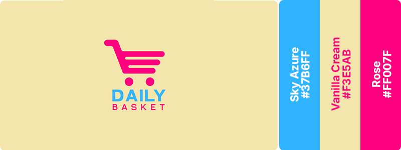
Sky azure conveys trust, convenience, and a seamless shopping experience, while rose adds excitement, creativity, and attention-grabbing vibrancy. Vanilla cream softens the palette, creating a welcoming foundation that feels approachable and inviting. These colors create a lively, memorable aesthetic that works beautifully for retail brands, e-commerce stores, delivery services, and consumer-focused businesses.
58. Mint (#98FF98) + Navy (#000080) + Charcoal (#36454F)
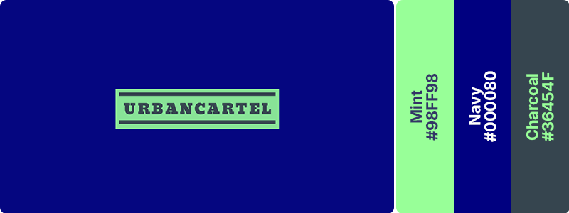
Fresh professionalism with modern appeal. Mint adds approachable freshness to the authority of navy and charcoal. This trio balances innovation with trust. Ideal for fintech shopping, health tech e-commerce, and modern subscription services.
59. Blue Gray (#6699CC) + Orange (#FFA500) + White (#FFFFFF)
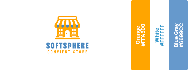
Blue gray provides tech sophistication while orange adds engaging enthusiasm and calls-to-action, creating a combination that balances innovation with energetic warmth. This pairing is perfect for B2B SaaS marketplaces, productivity tools, and business platforms.
60. Aqua (#00FFFF) + Midnight Blue (#191970)
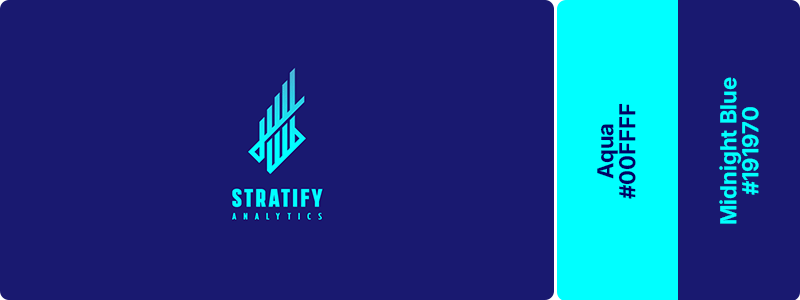
Aqua accents pop against midnight’s depth, suggesting sophisticated complexity with clear usability. This combination conveys advanced features with user-friendly design that is great for machine learning platforms, advanced analytics, and tech marketplaces!
61. Moss (#8A9A5B) + Terracotta (#E2725B) + Obsidian Green (#001906)
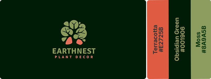
Moss green evokes growth, sustainability, and a connection to nature, while terracotta adds earthy warmth and handcrafted charm. Obsidian green provides depth and sophistication, anchoring the palette with a rich, natural foundation. These colors create a balanced, botanical aesthetic that works beautifully for plant shops, garden centers, sustainable home décor brands, and businesses that want to convey authenticity, vitality, and a love of the natural world.
62. Wood Brown (#8B4513) + Sky Blue (#87CEEB)
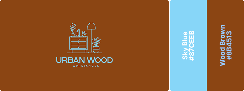
The wood brown provides organic warmth and craftsmanship while sky blue adds spaciousness and fresh air. This combination suggests quality materials and open living. Ideal for woodworking businesses, outdoor furniture, and sustainable home brands.
63. Beige (#F5F5DC) + Dust Green (#8FBC8F) + Ivory (#FFFFF0)
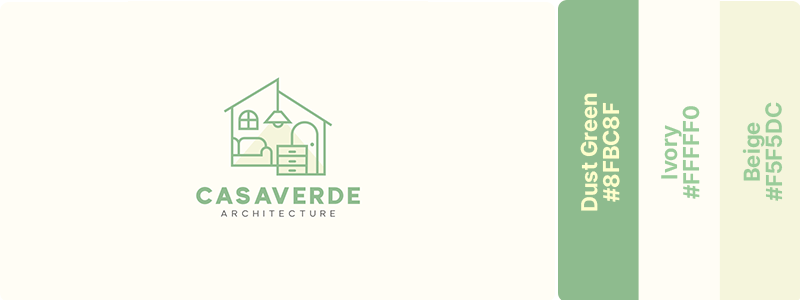
Dust green conveys balance, growth, and thoughtful design, while beige and ivory create a light, airy foundation that feels refined without being formal. This harmonious combination works beautifully for architecture firms, interior design studios, sustainable living brands, and businesses that want to communicate creativity and serenity.
64. Mahogany Brown (#6B2C1C) + Peach Beige (#FFF4E9) + Dark Terracotta (#B43807)
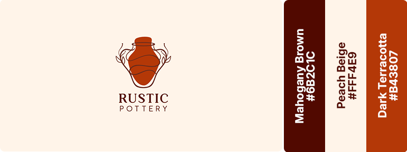
Mahogany brown conveys craftsmanship, heritage, and enduring quality, while dark terracotta reflects creativity, authenticity, and the handmade nature of the craft. Peach beige softens the palette with warmth and simplicity, creating an inviting, organic foundation. Ideal for pottery studios, ceramic artists, artisan brands, and handcrafted businesses.
65. Copper (#B87333) + Leaf Green (#90EE90)
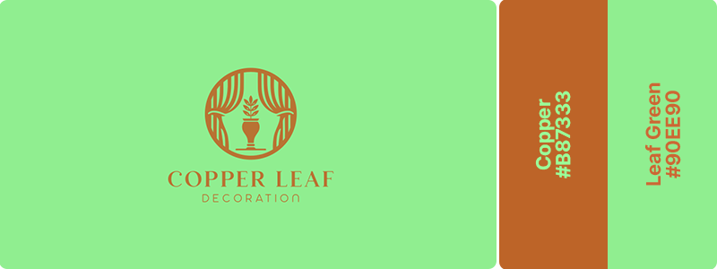
Metalwork meets living nature with this combination. Copper’s warm metallic glow contrasts beautifully with leaf green’s organic freshness, suggesting handcrafted quality with natural inspiration. Ideal for metal arts, garden decor, and artisan jewelry for the home.
66. Earth (#654321) + Light Gray (#CCCCCC)
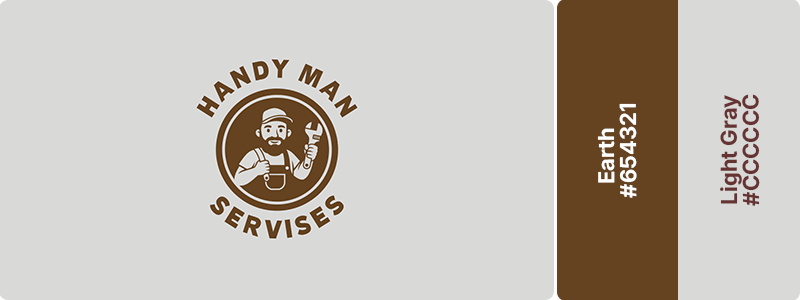
Earth brown conveys dependability, hard work, and hands-on expertise, while light gray adds simplicity, professionalism, and modern clarity. This pairing works beautifully for handyman services, contractors, home repair businesses, and skilled trades professionals.
67. Black (#000000) + Silver (#C0C0C0) + Cool Gray (#9999A4)
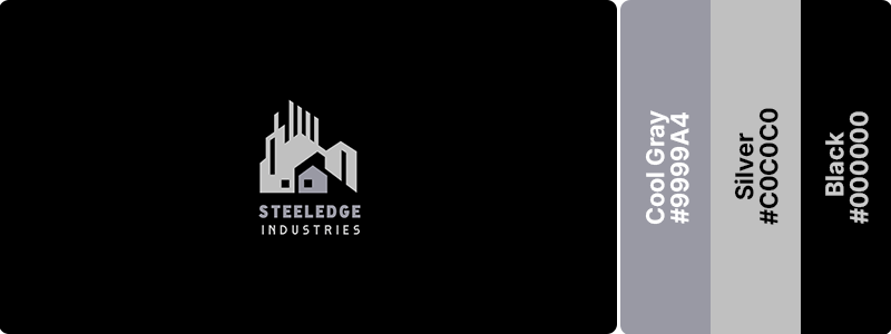
This monochromatic trio feels expensive, minimalist, and precision-engineered. Black provides strength, and silver adds premium metals. Cool gray balances both. Ideal for premium manufacturing, design studios, and high-end industrial products!
68. Onyx (#353839) + Ice Blue (#D6F5F5)
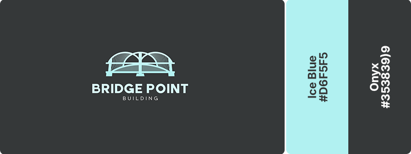
Ice blue creates high-contrast accents against deep onyx for maximum visual impact. This pairing suggests advanced technology and engineering excellence. Perfect for industrial design, tech manufacturing, and engineering portfolios.
69. Charcoal (#36454F) + Silver (#C0C0C0) + Dark Purple (#330033)
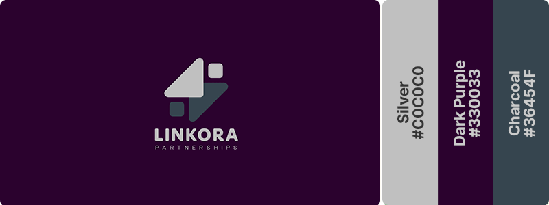
If you want sleek sophistication with metallic precision, you can’t go wrong with this combination. Dark purple conveys ambition, creativity, and exclusivity, while charcoal adds stability, professionalism, and modern confidence. Silver introduces clarity and refinement, creating contrast that feels polished and contemporary. This would work well for luxury manufacturing, industrial automation, and premium B2B services.
70. Graphite (#383838) + Teal (#008080)
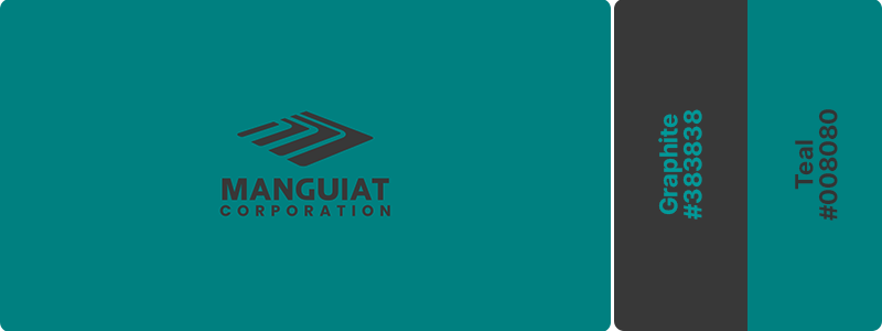
Graphite establishes industrial credibility while teal energizes with forward-thinking innovation. This pairing balances tradition with progress, making it ideal for smart manufacturing, industrial IoT, and modern engineering firms.
71. Magenta (#FF00FF) + Blue (#0000FF) + Midnight Teal (#003333)
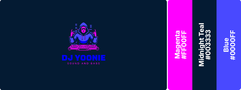
This high-energy combination demands attention and creates instant visual excitement. Magenta brings creative passion, while blue and midnight teal adds digital depth. Ideal for entertainment brands, nightlife venues, and media production companies.
72. Lime (#00FF00) + Purple (#800080) + Black (#000000)
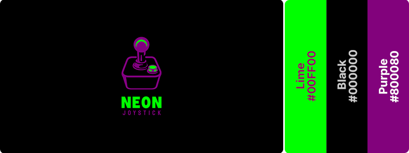
This unexpected pairing breaks conventions and creates distinctive brand recognition. Lime provides electric energy, and purple adds mysterious creativity. Great for disruptive entertainment brands, alternative gaming, and innovative content platforms.
73. Red (#FF000) + Black (#000000) + Yellow (#FFFF00)
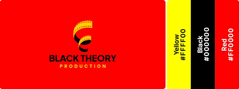
This triadic explosion screams innovation and artistic confidence. The vibrant contrast and complementary energy make it perfect for creative studios, content creation platforms, and entertainment technology.
74. Neon Green (#39FF14) + Purple (#800080)
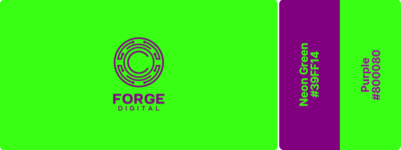
Bold innovation with gaming energy. This high-contrast pairing creates edgy, memorable visual impact. Neon green provides electric intensity while purple adds depth and mystery. Works perfectly for blockchain companies, crypto platforms, and gaming brands.
75. Scarlet (#FF2400) + Dark Gray (#555555) + Soft Pink (#FF9999)
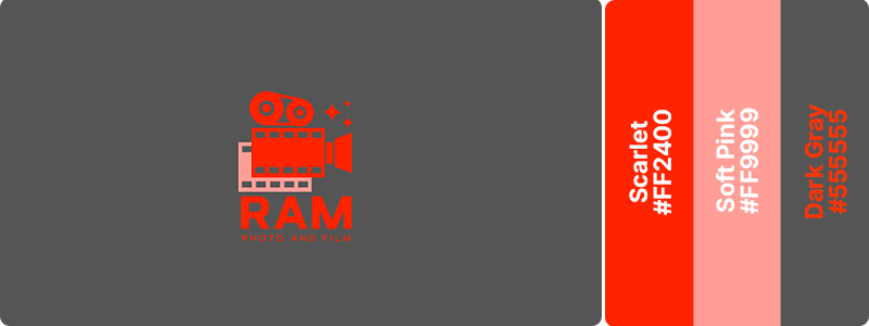
Scarlet commands attention with passion, action, and visual impact, while dark gray adds professionalism, depth, and a modern urban feel. Soft pink softens the intensity with a touch of warmth and artistic expression, creating balance without losing vibrancy. This dynamic palette works beautifully for photography studios, film production companies, creative agencies, and visual media brands.
76. Rosewood (#65000B) + Pearl (#F0EAD6)
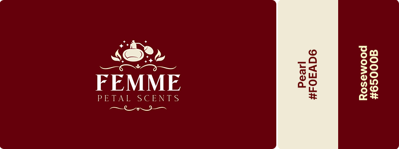
Dark rosewood creates dramatic depth while pearl adds luminous elegance. This color combination evokes evening glamour and premium beauty. Ideal for perfume brands, luxury cosmetics, and high-end evening wear.
77. Baby Pink (#F4C2C2) + Gray (#808080) + White (#FFFFFF)
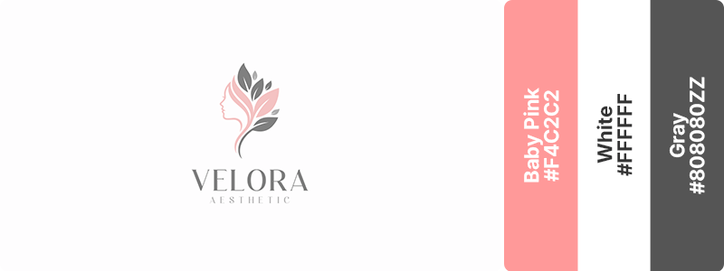
Modern femininity with structural balance. Gray adds contemporary structure to baby pink’s soft sweetness. This pairing feels current and sophisticated. Works beautifully for contemporary fashion, beauty tech, and modern accessories!
78. Lilac (#C8A2C8) + Brown (#663333)
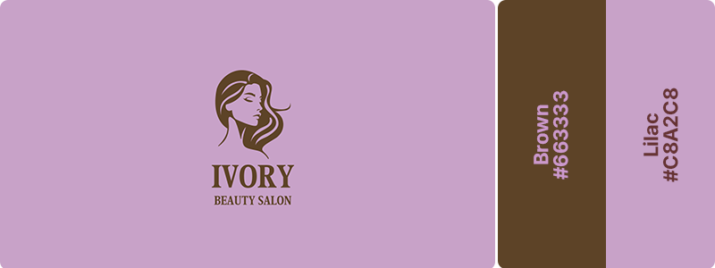
Soft elegance with a sense of luxury and care. Lilac conveys beauty, relaxation, and gentle sophistication, while brown adds warmth, stability, and a touch of timeless refinement. This graceful combination works beautifully for beauty salons, spas, skincare brands, and wellness businesses that want to communicate comfort, sophistication, and personalized care.
79. Peach (#FFE5B4) + Tangerine Orange (#FF9900)
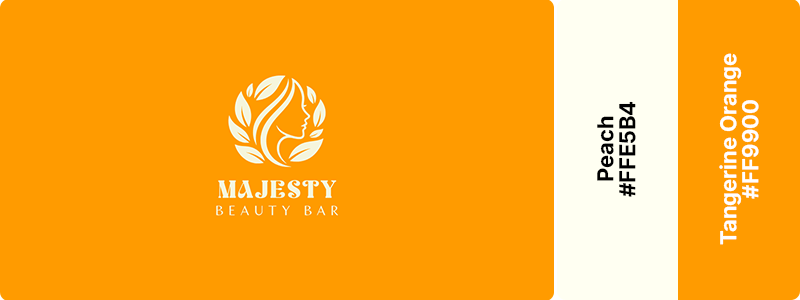
Radiant confidence with a warm, uplifting charm. Tangerine orange conveys energy, creativity, and optimism, while peach softens the palette with elegance, warmth, and a welcoming touch. This cheerful combination works beautifully for beauty bars, salons, skincare brands, and self-care businesses.
80. Blush Pink (#DE5D83) + White (#FFFFFF)
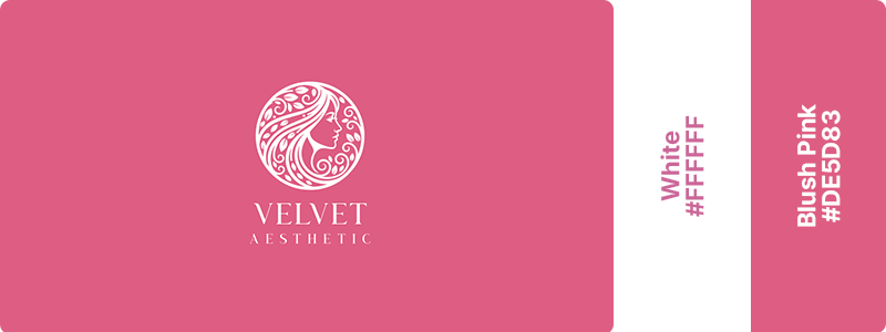
Blush pink conveys beauty, confidence, and compassionate care, while white adds purity, simplicity, and a sense of luxury. This graceful combination works beautifully for aesthetic clinics, beauty brands, skincare businesses, and wellness practices that want to communicate trust, refinement, and personalized care.
81. Burgundy (#800020) + Beige (#F5F5DC)
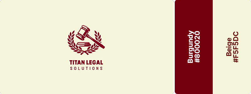
This wine-inspired combination conveys establishment, gravitas, and refined professionalism. Burgundy provides authority while beige adds approachable warmth. Great for legal services, established law practices, and professional advisory firms.
82. Gray (#808080) + Denim Blue (#1560BD) + Light Gray (#EFEFF1)
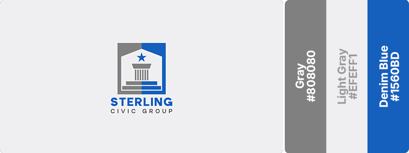
Steady and dependably reliable, gray establishes neutral authority while denim blue adds accessible professionalism. This pairing feels trustworthy without being intimidating. Ideal for government services, compliance firms, and public institutions.
83. Charcoal (#36454F) + Silver (#C0C0C0)
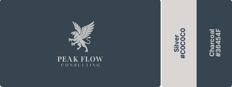
Charcoal conveys strength, stability, and strategic expertise, while silver adds sophistication, clarity, and a premium touch. This classic combination works beautifully for consulting firms, financial advisors, executive coaching businesses, and professional service brands.
84. Navy (#000080) + Eucalyptus Green (#5F8575) + Soft Gray (#E5E5E5)
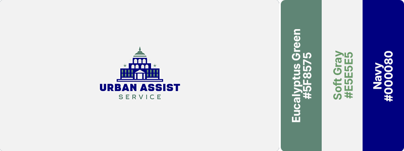
Navy anchors the palette with professionalism and trust, eucalyptus green introduces calm progressiveness, and soft gray keeps everything clean and contemporary. This combination is ideal for progressive law firms, government agencies, and regulatory services that want to signal expertise while embracing modern values and transparency.
85. Charcoal (#36454F) + Lime (#00FF00) + White (#FFFFFF)
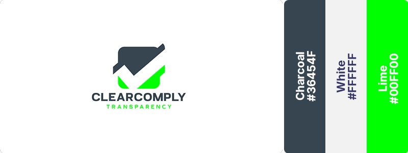
Lime accent injects distinctive character into corporate charcoal. This combination feels innovative yet serious. Works for B2B legal services, compliance technology, and modern regulatory consultancies.
86. Onyx (#353839) + Emerald (#50C878) + Mint Cream (#EDFCFA)
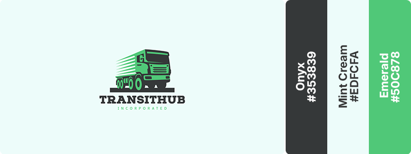
Onyx conveys strength, professionalism, and operational reliability, while emerald represents growth, movement, and forward-thinking innovation. Mint cream softens the palette with clarity and openness, creating a clean, approachable foundation. This works beautifully for transportation companies, logistics providers, supply chain businesses, and service brands.
87. Charcoal (#36454F) + Platinum (#E5E4E2) + Deep Blue Gray (#4F6D7A)
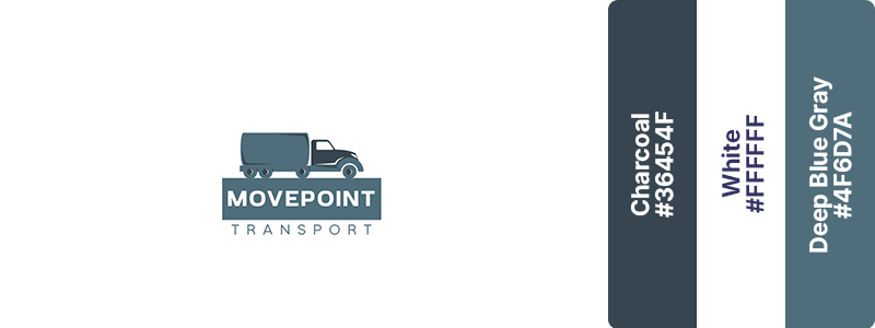
Charcoal provides strength and stability, platinum elevates the palette with polished refinement, and deep blue gray introduces a cool, technical intelligence. This combination conveys innovation, reliability, and premium craftsmanship. Ideal for luxury automotive brands, advanced transportation services, and high-end engineering or mobility companies.
88. Crimson Red (#B11226) + Carbon Black (#1C1C1C) + Gunmetal Gray (#6E6E6E)
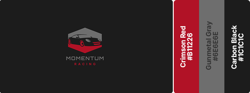
Crimson red delivers controlled intensity and passion, carbon black adds power and authority, while gunmetal gray brings refined, technical sophistication. This trio is perfect for performance automotive brands, racing teams, premium vehicle services, and high-end mobility platforms.
89. Midnight Blue (#191970) + Copper (#B87333)
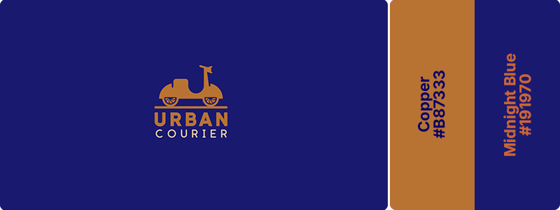
Midnight blue provides premium depth while copper adds distinguished warmth. This pairing suggests executive quality and refined taste. Great for executive car services, premium transportation, and luxury logistics.
90. Black (#000000) + Pearl White (#F0EAD6) + White (#FFFFFF)
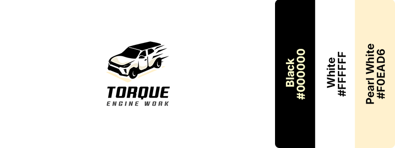
High-contrast elegance with luxury positioning. Pearl white provides luminous contrast to deep black with subtle warmth. This black-and-white combination evokes premium automotive design. Works for minimalist luxury vehicles, premium detailing, and high-end transportation.
91. Olive (#808000) + Rust (#B7410E) + Floral White (#FFFAF0)
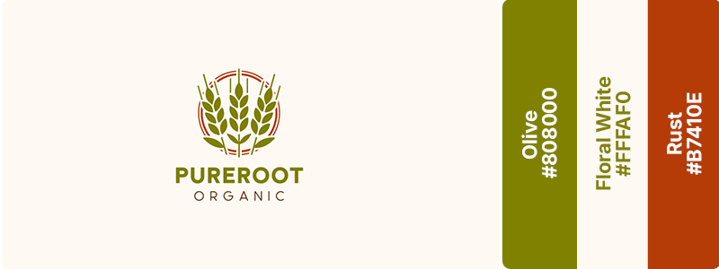
Olive green reflects growth, sustainability, and a connection to the earth, while rust adds warmth, heritage, and a sense of handcrafted quality. Floral white provides a clean, inviting backdrop that enhances the palette’s organic appeal. Perfect for organic food brands, agricultural businesses, and natural products.
92. Tan (#D2B48C) + Forest Green (#228B22) + White (#FFFFFF)
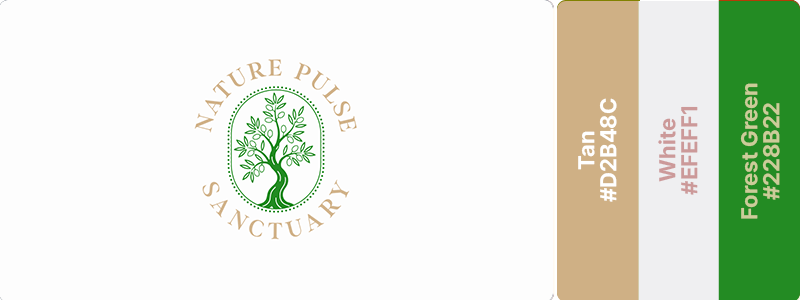
Tan suggests natural materials and earth while forest green adds living growth. This combination conveys reliable farming and outdoor expertise, making it great for agricultural equipment, farming supplies, and rural services.
93. Lime (#00FF00) + Fern (#4F7942)
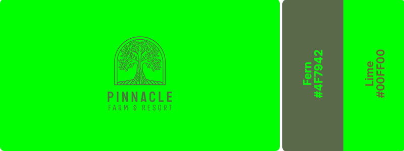
If you’re looking for something vibrant that conveys natural growth energy, this pairing is for you. Lime provides modern vitality while fern keeps it grounded in nature. Perfect for modern agricultural brands, organic farming targeting younger audiences, and sustainable agriculture!
94. Green Gray (#8A9A7B) + Khaki (#C3B091) + Black (#000000)
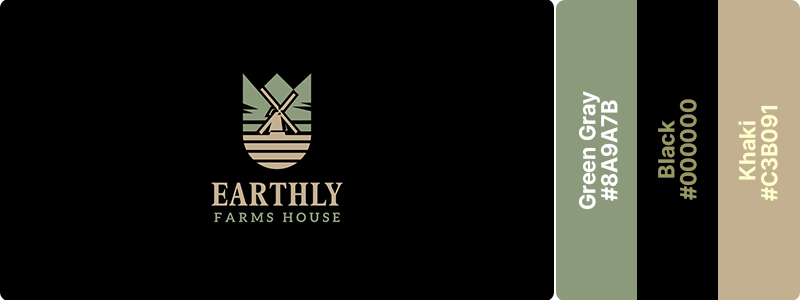
This subtle palette feels both upscale and environmentally conscious. Green gray provides natural authority, khaki adds earthiness, and black ensures a clean, luxurious presentation. Great for upscale organic farming, premium agricultural products, and heritage farms.
95. Moss (#8A9A5B) + Burnt Clay (#C65D3A) + Cream (#FFFDD0)
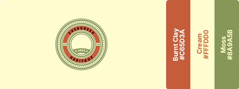
Moss reflects living growth and agricultural tradition, burnt clay adds sun-baked authenticity and strength, while cream softens the palette with clarity and approachability. This is a strong choice for agricultural brands, farm tourism, heritage producers, and sustainable food operations.
96. Clay (#B66A50) + Cream (#FFFDD0) + Sand (#C2B280)
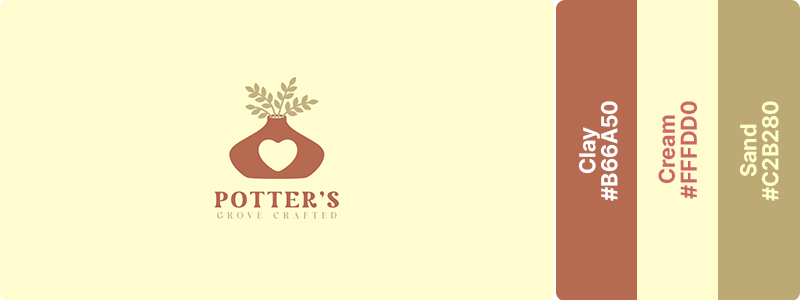
This trio evokes the tactile quality of handmade goods. Clay provides artisan richness. Cream adds softness, and sand grounds with earth. Perfect for ceramics, pottery studios, and handmade goods.
97. Beige (#F5F5DC) + Olive (#808000)
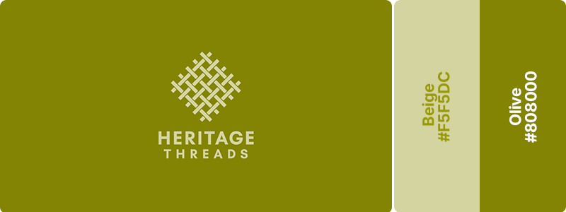
Olive green conveys tradition, craftsmanship, and a connection to enduring quality, while beige adds warmth, simplicity, and a sense of comfort. This classic combination works beautifully for textile brands, artisan businesses, and sustainable fashion labels.
98. Rust (#B7410E) + Taupe (#483C32) + White (#FFFFFF)
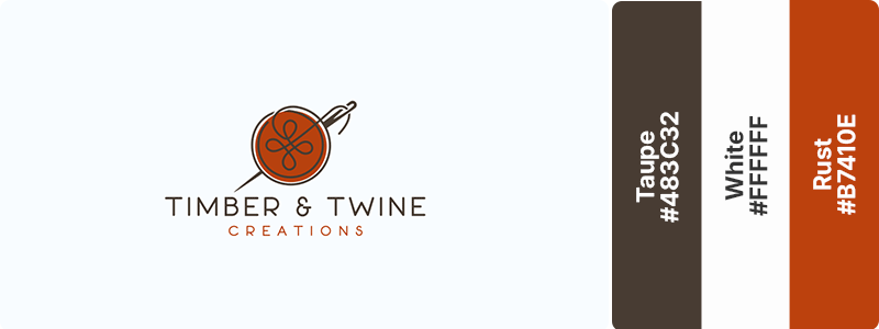
These tones suggest heritage craftsmanship and time-honored techniques. Rust provides warmth while taupe adds earthy sophistication. This combination is perfect for leather goods, vintage shops, and heritage craft businesses.
99. Sand (#C2B280) + Sea Blue (#006994)
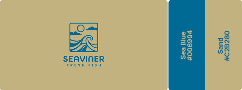
These are beach-inspired tones that evoke handmade quality and seaside living. Sand provides natural warmth while sea blue adds coastal freshness. Coastal artisans, beach boutiques, and seaside craft shops would benefit the most from this combination.
100. Forest Green (#14532D) + Warm Bronze (#B7791F)
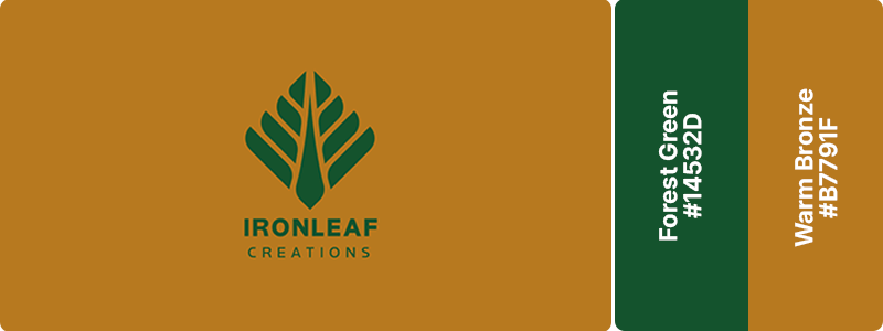
Forest green conveys growth, resilience, and a commitment to quality, while warm bronze adds richness, durability, and an artisanal touch. This timeless combination works beautifully for woodworking businesses, handcrafted brands, design studios, and makers who want to communicate authenticity, expertise, and enduring value.
Bring Your Brand Colors to Life
You’ve just explored 100 carefully curated color combinations spanning every industry and aesthetic. But remember, these palettes are starting points, not strict rules.
The best logo colors are the ones that authentically represent your brand’s unique personality and resonate with your specific audience.
Testing these palettes is easier than ever with Design.com. Simply select any color and watch your logo transform in real-time.
Beyond logos, you can apply your chosen colors across website designs, digital business cards, YouTube channels, and more to build a cohesive brand identity. The platform handles the heavy lifting, allowing you to focus on running your business.