40 Wordmark Logos to Make Your Brand Name Unforgettable
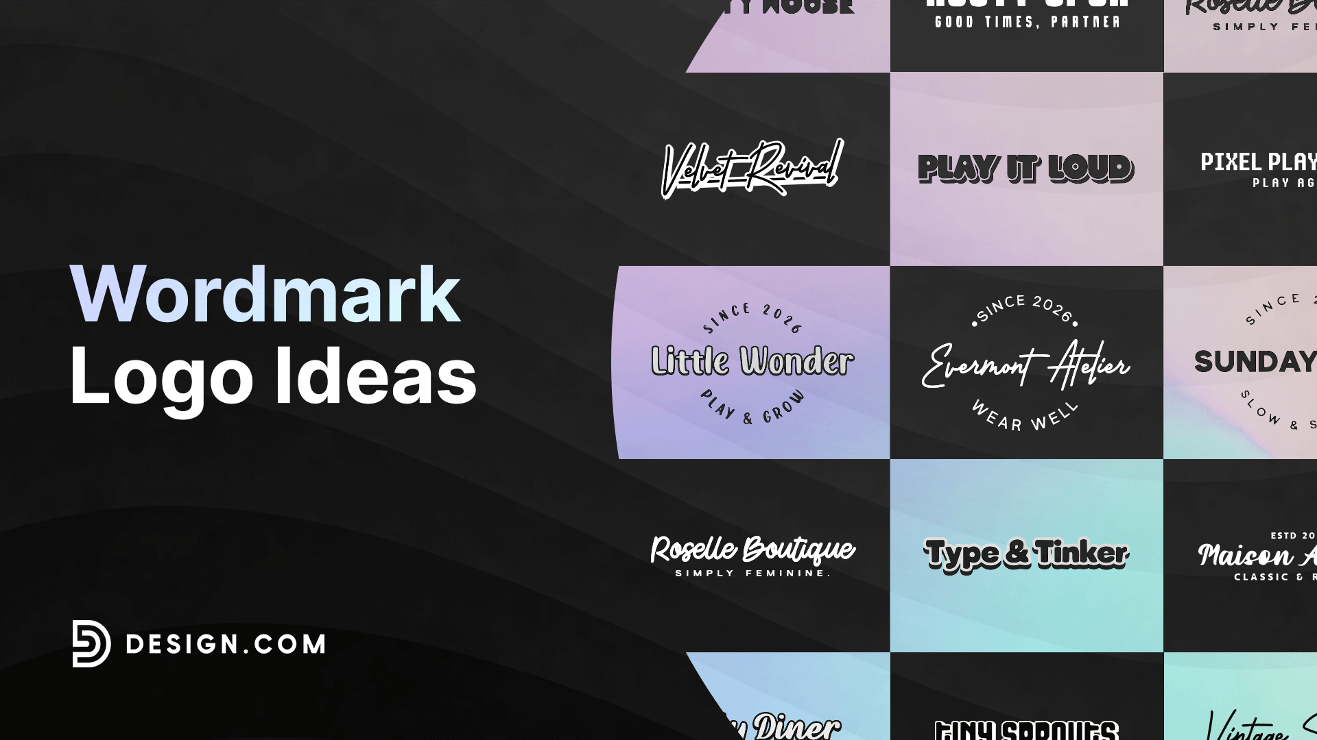
A wordmark logo is a text-only logo that turns a brand’s name into its visual identity. There is no icon to lean on and no symbol to hide behind. Every ounce of personality has to come from the letters themselves.
That makes wordmarks one of the boldest logo choices a brand can make. When done right, the name becomes instantly recognizable on its own, whether on a billboard or a phone screen.
This roundup breaks down what makes wordmark logos work, showcases ten of the most famous examples in the world, and offers design directions you can recreate with a logo maker of your own.
Key elements of wordmark logos
Great wordmark logos share a few traits that make them memorable and effective.
- Distinctive typography. Most brands do not use an off-the-shelf font as is. They customize the letterforms so the type feels owned rather than borrowed.
- Simplicity and legibility. A wordmark has to read clearly, whether it is on a mobile app icon or a poster. If it is too complex, it loses impact at small sizes.
- Hidden details. Some of the most celebrated wordmarks use negative space or subtle shapes within the letters. FedEx’s arrow and Amazon’s smile are two of the best-known examples.
- Color psychology. The color behind a wordmark carries as much weight as the typography. Red often signals energy, blue signals trust, and black signals authority.
- Scalability. A strong wordmark has to hold up across packaging, apparel, signage, and digital screens. If a logo only works at one size, it is not doing its job.
10 famous wordmark logos
These brands prove that a name alone, styled with intention, can become one of the most valuable assets a company owns.

Google’s wordmark uses a clean, friendly sans serif with each letter in a different primary color. The playful color pattern softens a brand that is, at its core, a massive technology company. It signals approachability without sacrificing credibility.
Coca‑Cola
The Coca‑Cola script is arguably the most recognized wordmark on the planet. Its flowing Spencerian style has barely changed since the 1880s. That consistency has turned the logo itself into a symbol of nostalgia and comfort.
FedEx

FedEx’s wordmark hides a right-pointing arrow in the negative space between the E and the x. It is a small detail, but it quietly reinforces the brand’s promise of speed and precision. Once you see it, you can never unsee it.
Visa

Visa keeps its wordmark simple with bold blue letters. The restraint reflects the brand’s role as a trusted, global financial network. Nothing about the design competes with the message of reliability.
eBay

eBay’s wordmark uses multicolored letters that feel casual and human. The playful type choice reflects the brand’s original identity as a marketplace built by everyday people. It stands apart from the more corporate feel of other tech logos.
Netflix
Netflix relies on bold, high-contrast red block letters set against black or white. The design was built to grab attention in a small thumbnail, which matters when the logo competes with dozens of other titles on a screen. Simplicity here is a functional choice as much as a stylistic one.
Disney

The Disney wordmark uses a whimsical script that feels handwritten and personal. It ties directly to storytelling and imagination, which is the entire foundation of the brand.
IBM

IBM’s wordmark uses bold, striped lettering that has remained largely unchanged since the 1970s. The horizontal stripes give the letters a sense of motion and structure simultaneously. It is a classic example of a corporate wordmark built for longevity.
Amazon

Amazon’s wordmark pairs a lowercase sans serif with a curved arrow running from the A to the Z. The arrow doubles as a smile, suggesting customer satisfaction, while also implying the company sells everything from A to Z. It is one of the smartest hidden details in modern branding.
Uber

Uber uses a clean, geometric typeface that feels modern and efficient. The tight letter spacing and minimal styling reflect the brand’s focus on speed and simplicity. It is designed to look sharp on a phone screen, where most people interact with it.
Wordmark logo design ideas
Once you understand what makes a wordmark work, the next step is choosing a style direction that fits your brand.
Here are three design ideas that you can use for your wordmark logo:
- Script logos
- Retro logos
- Playful logos
Script logos
Script logos bring a flowing, handwritten feel to a brand name. They work especially well for brands built on heritage, warmth, or craftsmanship, similar to Coca‑Cola and Disney.
Here are some script logos in action:
Retro logos
Retro logos borrow from vintage typography, often using serif fonts, bold outlines, or muted color palettes. This style suits brands that want to feel established, nostalgic, or rooted in tradition.
Browse through our retro logos below to find inspiration:
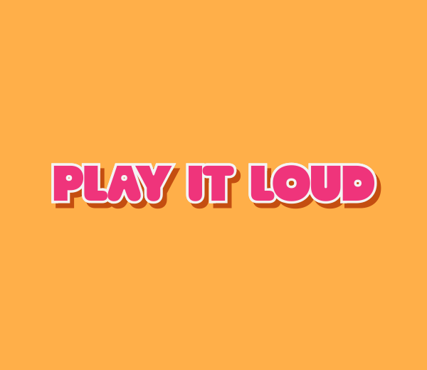
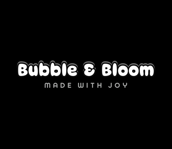
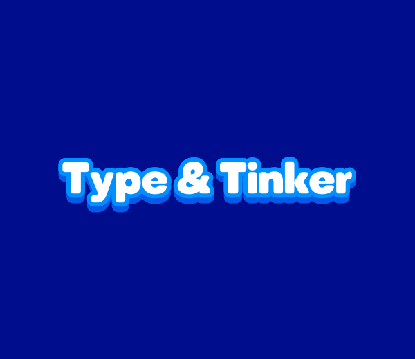
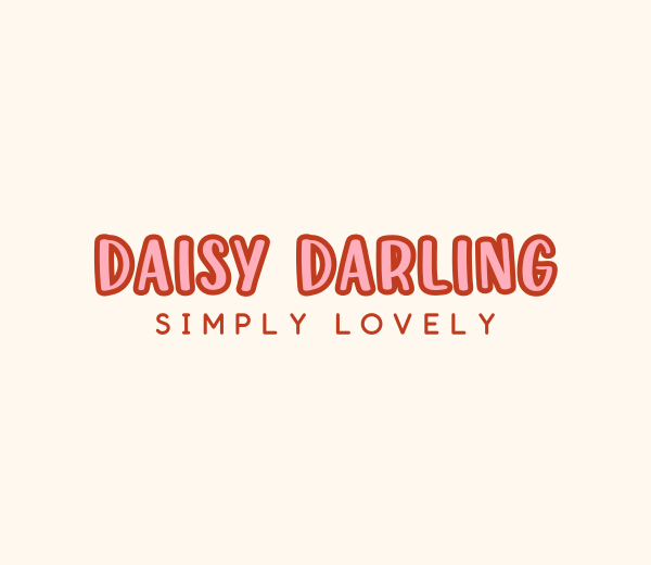
Playful logos
Playful logos use bright colors, rounded letterforms, or unexpected type combinations, as seen with eBay and Amazon. This direction works well for brands that want to feel approachable, fun, or community-driven.
See some playful logos below to get started:
Create your own wordmark logo now
A strong wordmark can turn your brand name itself into your most memorable asset. It does not need an icon, a mascot, or a symbol to make an impression. It just needs typography, color, and intention working together.
The right wordmark can set your brand apart from the very first impression. Head over to Design.com to explore thousands of customizable wordmark logos built for every industry and brand style. You can tweak fonts, colors, and layouts until every detail feels exactly right.
If you want to move even faster, the AI logo generator can bring your vision to life in seconds, generating options based on your brand name and style preferences. Once your wordmark is ready, Design.com gives you access to matching business cards, social media templates, and a website builder, so your new brand identity looks consistent wherever it appears.
Start building a wordmark that is clear, confident, and built to last.
Read more on logo designs here
- 60 Yellow Logos To Brighten Up Your Brand
- 50 3D Logos for Modern Brands
- 50 Circle Logos for Corporate Excellence
Hannah Suroy suroy brings clarity to complex topics across entertainment, business, and creative industries. She specializes in translating industry trends and innovations into engaging content that helps readers understand the creative process behind the work they love.