60 Yellow Logos To Brighten Up Your Brand
Just one look at the color yellow and you’ll instantly feel happy, bright, and warm. It’s no wonder that brands across various industries love to use yellow logos to harness the magnetic and charming appeal of the color and capture their audience’s hearts.
If you’re looking to use the power of yellow logos on your own, then you are in the right place. We’ll break down why exactly the color yellow is so effective, plus share tips on how you can utilize it on your logo design. We also compiled a list of yellow logo ideas in various styles for inspiration, which you can then easily put to use in our handy AI logo generator tool.
Let’s get started!
What makes a yellow logo effective?
Yellow logos are effective since they naturally draw attention, and are associated with positive traits like optimism, warmth, friendliness, and excitement.
Let’s take a closer look at the reason why:
- High visibility – Yellow is the most visible color on the rainbow, which is why it’s the color used for warning signs, emergency vehicles, and traffic lights. This applies to logos as well — since it’s very attention-grabbing, your audience can easily spot your logo across shelves or crowded social media feeds.
- Clear emotional message – Yellow in color psychology is associated with warmth, positivity, and excitement. Brands then use the color in their logos to instantly link their brand with these traits.
- Color harmony – Yellow pairs well with a lot of colors, like red, blue, black, orange, and white. It opens up your brand to experiment with creative color combinations and gradient looks.
- Great for distinct looks – Since yellow is eye-catching, it makes it easy to achieve memorable designs, especially when paired with typography or illustration. It also makes you stand out amongst competitors, especially if you use the color while in a more understated or corporate industry.
Famous yellow logo design examples
If you think yellow is reserved for certain industries only, then you got it wrong. It’s a versatile color that works well for a wide range of brands, and these yellow logos from famous brands show exactly how they made them work.
McDonald’s

McDonald’s Golden Arches is easy to spot even when you are driving from a distance because of its eye-catching color and simplistic design. Yellow also complements the brand’s friendly and welcoming image, which is why the logo is such a perfect fit.
Shell

Shell’s bold yellow and red combination helps the logo stay highly visible on busy streets and highways. The design is also a clever nod to their name, which is why the logo is so easy to remember.
Best Buy

This version of the Best Buy logo is so loved for how it cleverly combined a price tag symbol (meant to instantly evoke a sense of shopping and discount) with the bright yellow color and bold wordmark. It’s a great way to make the logo eye-catching while reinforcing what your product is all about.
Ferrari

Ferrari is all about prestige, heritage, and power, and their logo shows that yellow can be suitable in that brand identity as well. They paired a darker yellow color with their prancing horse symbol to form an insignia, thus creating a bold and dynamic logo design.
Western Union

Yellow is also proven to be effective in the world of finance, as seen in the Western Union logo. They used the bright color to make their lettermark stand out, while keeping the rest of the typography simple, clean, and polished to maintain the professionalism expected in the industry.
Chupa Chups

Chupa Chups embraces bright yellow and a flower-shaped badge to create a cheerful and playful identity.
Lay’s

The circle logo is meant to mimic the sun, which represents the brand’s light and playful image. The red ribbon wrapped around it is also meant to evoke a seal — sort of like a stamp of quality of the chips.
Lipton

Lipton also uses a glowing yellow sun in their logo, but this time it’s to symbolize freshness and vitality, which is a great fit for the tea brand.
Pokemon

Pokemon’s bright yellow and blue colors combined with the bold and playful lettering perfectly encapsulates the franchise’s sense of adventure.
Mailchimp

Mailchimp pairs the yellow with their mascot Freddie, thus giving the brand a more friendly and approachable look. It fits with their goal of making email marketing more accessible and less intimidating for beginners.
Snapchat

Snapchat intentionally chose bright yellow because very few social media platforms used the color at launch. Combined with the ghost icon, the logo stands out immediately among rows of app icons while reinforcing the platform’s playful personality.
DHL
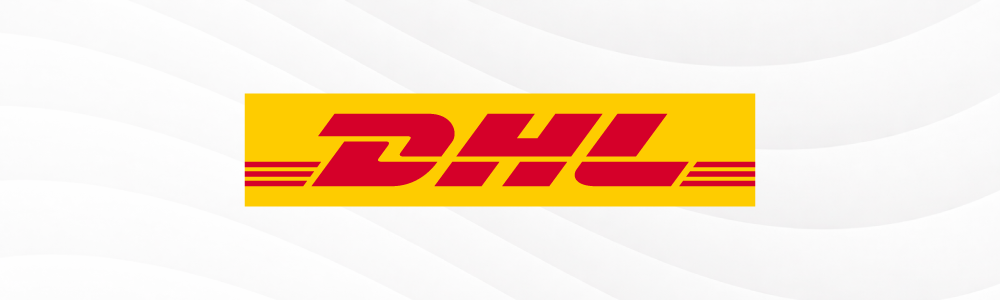
The bright yellow color combined with the italicized text and the vertical lines all give a sense of speed and direction in the logo, which is exactly what the logistics company is going for. The logo is so perfect for them which is why it’s no surprise that it hasn’t changed much in over fifty years.
Borussia Dortmund

Borussia Dortmund’s bright yellow logo perfectly captures the energy, passion, and excitement of the football club. The crest-like design also makes it highly suitable to be displayed across the club’s jerseys, merch, and stadium.
Post-It

The brand uses their product as the main symbol in their logo to strengthen brand recognition. They then paired it with a bold yellow color palette to make it visible among competing sticky notes brands.
Schweppes

Schweppes used a more muted tone of canary yellow and paired it with an elegant serif font to create a chic yet still vibrant look.
Norton Antivirus

Norton shows that yellow can be suitable for the tech industry too. The brand uses a checkmark to symbolize security and protection, while the yellow color makes it visible when it pops up from a busy screen. It also makes them look more approachable compared to the more “serious” branding of antivirus software companies.
Nikon

The bright yellow square and white lines give the logo a bright, fresh, and happy vibe, which fits perfectly with the company’s brand identity.
Carhatt

Carhatt’s symbol is a stylized wave, which conveys movement and innovation. It’s paired with a unique lowercase typeface which still comes across as bold, giving the logo a dynamic and contemporary vibe that appeals to their target audience.
National Geographic

National Geographic’s logo might seem simple but the meaning behind it is deep. The rectangle is supposed to reflect the brand’s main identity: as a magazine on science and culture, as a source of spectacular photographs, and as a “window” to the wonders of the world. Hence, the rectangular shape. The yellow color is also a nod to the sun, a source of light, life, and energy, which again fits their theme.
IMDb

The high contrast between the dark yellow and black plus the bold blocky typography creates a strong and confident look, which fits the platform’s legacy as the most visited movie database site.
What are the most popular yellow logo styles?
Yellow can support many different design directions and styles: from bold logos that are great for energetic sports teams to modern geometric logos fit for a tech company.
Here’s how the top yellow logo styles look in action:
Bold yellow logos
You’ll typically see detailed illustrations, high-contrast typography, and bright color combinations like yellow-red or yellow-orange. These are great for sports teams, gyms, gaming apps, bars, restaurants, or entertainment companies.
Yellow Dancing Star by Design.com
Yellow Volleyball Crown by Design.com
Yellow Fitness Gym Barbell by Design.com

Yellow Thunder Kettlebell by Design.com
Yellow Workout Barbell by Design.com
Yellow Lemon Sunrise by Design.com
Entertainment Celebrity Star by Design.com
Yellow Fish Star by Design.com
Golden Eagle Fitness Gym by Design.com
Modern yellow logos
Modern logos often favor geometric shapes, sharp line work, clean sans-serif font, and more abstract icons. This style is suitable for tech companies, creative agencies, logistics companies, architecture firms, or even banks.

Yellow Triangle Enterprise by Design.com
Yellow Abstract Startup by Design.com
Yellow Professional Agency by Design.com
Circuit AI Tech Cyberspace by Design.com
Fancy Yellow Swirls by Design.com
Creative Light Bulb Pencil by Design.com
Yellow Star Company by Design.com

Tech Company Symbol by Design.com
Yellow Wing Tech by Design.com
Community Support Foundation by Design.com
Minimalist yellow logos
Expect thin line illustrations, spacious layouts, and elegant fonts in this minimalist logo style. Sometimes, brands even stick to just wordmark logos splashed with the color yellow. You can usually find this style in spas, hair salons, skincare brands, apparel stores, or mobile apps.
Yellow Hand Torch by Design.com

Yellow Media Professional by Design.com
Yellow Ticket Agent by Design.com
Yellow Lemon Flower by Design.com
Yellow Construction Hook by Design.com
Gold Yellow Crown by Design.com

Yellow Cloud Human by Design.com
Yellow Modern Logistics by Design.com
Cute yellow logos
Because yellow is vibrant and cheerful, it’s a great fit for brands aimed for kids. You’ll often see this color paired with bubblier fonts, cute mascots, or animal icons. As such, it’s a good fit for nurseries, playgrounds, kids clothing brands, zoos, and more.
Cute Yellow Puppy by Design.com
Yellow Star Smile by Design.com
Cute Smiling Hen by Design.com
Cute Bee Cartoon by Design.com
Kiddie Raincoat Clothing by Design.com
Angry Chick Bird by Design.com
Capybara Animal Zoo by Design.com
Conclusion
Yellow is one of the most versatile colors in the world. As our logo collection above shows, it can slot perfectly into any industry, whether it be food, entertainment, tech, finance, clothing, or sports. It can also communicate different brand identities and values, provided you pair it with the right icon, typography, and layout.
If you’re ready to create your yellow logo, hop on to our logo maker tool now. You can also browse our other branding tools like AI website builder or digital business card maker to give your brand a consistent look from day one.