55 Famous Logos with Hidden Meanings
Every logo tells a story.
Sometimes it’s obvious, like a heart symbolizing love. Other times, the story is hidden in plain sight, waiting to be discovered through negative space, clever typography, or symbolic shapes.
These subtle details are what separate good logos from truly memorable ones. In this article, we’ll look at 55 famous logos with hidden meanings, explain the design techniques behind them, and share branding lessons that you can apply when creating your own logo.
Common design techniques behind logos with hidden meanings
Not all hidden meanings are created the same way. Some designers cleverly use negative space, while others rely on typography or tell a story through shapes.
Understanding these techniques not only makes you appreciate famous logos more, but also helps you create designs that communicate more with less.
Negative space
Negative space is the empty area around or between design elements. Skilled designers use this space to hide symbols, arrows, animals, or other images without making the logo feel busy. When done well, it creates an “aha!” moment that makes the logo more memorable.
FedEx
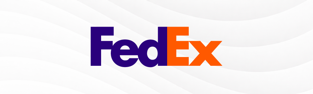
If you look closely at the space between the letter E and X, you’ll see that it forms a white arrow. This arrow is meant to symbolize speed, motion, and progress, which are the logistics company’s core values. It’s a subtle but meaningful visual trick – it manages to keep the logo simple while adding clever symbolism. No wonder the logo has won over 40 design awards!
Formula 1
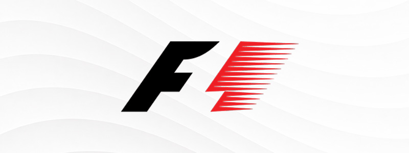
The old logo of Formula 1 is another great example. If you look at the space between the letter “F” and the red stripes, you can see that it forms “1”. The logo also manages to pack other symbolism: the red stripes represent speed marks, the bold F conveys power, while 1 shows the champion of the race.
Guild of Food Writers

How do you convey both food and writing in one symbol? Look no further than this logo, as the spoon’s negative space doubles as a fountain pen nib. It manages to cleverly convey the guild’s main purpose while still keeping the logo elegant and tasteful (which is their brand identity.)
Toblerone
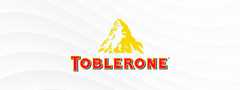
The mountain in the Toblerone logo represents both the triangular shape of the chocolate and the Matterhorn mountain in Switzerland, where Toblerone originated. But did you know they added one more fun detail to connect the logo to their heritage? Look further in the spaces in the mountain, and you can see an outline of a standing bear, which is another nod to Switzerland.
Spartan Golf Club

At first glance, you may just see a golfer mid-swing. But if you look closely at the arc and the negative space, you can see a Spartan warrior’s helmet. This logo is so celebrated because it manages to tell multiple stories in just one image: the sport itself, the athletic precision required in golf, golf’s heritage, and warrior mentality.
Hershey’s Kisses
Hershey’s offers a fun Easter Egg in their logo, as the space between the letter K and I form the iconic teardrop shape of the chocolate. It’s a great way to capitalize on their brand’s distinct symbol while also embodying the essence of the product – that it’s a sweet surprise waiting to be unwrapped.
WWF

This logo is a great demonstration of Gestalt’s principle, where your brain groups elements together and instinctively fill in the gaps to form an image. As you can see, WWF’s logo is made up of black patches while cleverly using the negative space to form the other details of the panda. It keeps the logo clean and simple yet still distinct. It’s also apparently a huge money saver, as founder Sir Peter Scott wanted a logo that would still have an impact even if it’s rendered in black and white to save printing costs.
Bronx Zoo

This logo may seem simple at first. Giraffes and birds to represent a zoo, that’s pretty straightforward. But if you look closely at the giraffe’s legs, you can see that it forms the iconic New York skyline, which is a witty nod to the zoo’s location.
Yoga Australia

This logo uses a stylized yoga pose to depict the brand’s main offering, while also keeping the design continuous, balanced, and poised to show yoga’s essence. The space between the woman’s leg and arm also creates the outline of Australia, tying the brand’s location into the logo.
Continental
Look at the arrangement and space between the letter C and letter O, and you’ll see a tire. It’s a great way to showcase what the brand’s main product is without making it too obvious.
Letter manipulation
Another way to convey hidden meaning is to reshape letters into symbols or to hide meaningful details within typography. This makes the brand name itself become part of the visual identity rather than just simply being a text logo.
Beats by Dre

The lowercase letter B not only represents the first letter of their name but also resembles someone wearing headphones, reinforcing the company’s focus on audio. It’s such a successful encapsulation of their company that the logo remains unchanged until now.
Sony VAIO
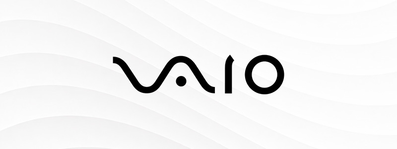
The “VA” resembles an analog wave, while the “IO” represents the binary digits 1 and 0, symbolizing both analog and digital technology. It shows the company’s long history while also showing Sony’s progression to the future with their products.

The letter P doubles as a pushpin, cleverly referencing the brand’s idea of pinning inspiration into a board.
Goodwill

Rather than using a mascot, Goodwill opted to let their typography do the talking. The lowercase letter G is stylized to be seen as a smiling face, communicating positivity, friendliness, and goodwill, which is the organization’s mission.
Unilever
You may know Unilever’s iconic wordmark logo, but have you looked deeper at the symbols that make up the letters? You’ll see that each of the 24 symbols represent part of the company’s products, values, or sustainability efforts. For example, the bee symbolizes community spirit, the water droplet for purity, the lips represent their Vaseline products, and so on. Very clever, if you ask us!
Chick-fil-A
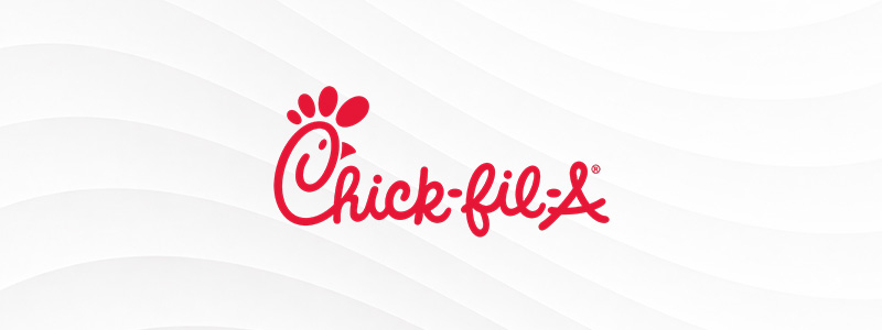
The capital letter C is cleverly stylized to form a chicken head, reinforcing the restaurant’s specialty without needing another icon. The playful typography and bold colors also add to the brand’s approachable and friendly feel.
Gillette
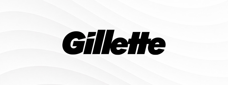
Gillette’s logo is simple yet striking thanks to its bold typography. They also managed to incorporate their product’s main selling point – its sharp precision – with that sharp cut on the letters G and I.
LG
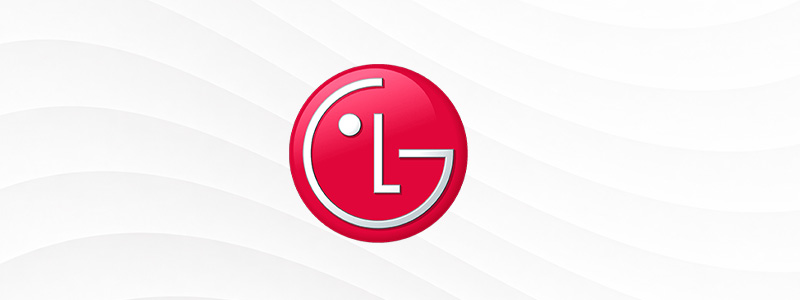
The logo uses the letters L and letter G to form a stylized winking face, which represents their motto of “Life’s Good” as well as their identity of being warm, approachable, and a more human-centric technology brand.
Eight
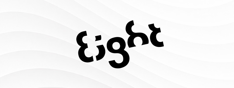
A really popular logo in the designer’s sphere is the design company’s Eight logo. As you can see, the wordmark uses the number 8 to form every letter, making the brand name and visual identity inseparable.
IBM
The horizontal stripes convey IBM’s core values of speed and progress. It also adds a subtle visual interest to the logo, making it look more dynamic while still keeping the professional look.
Northwest Airlines
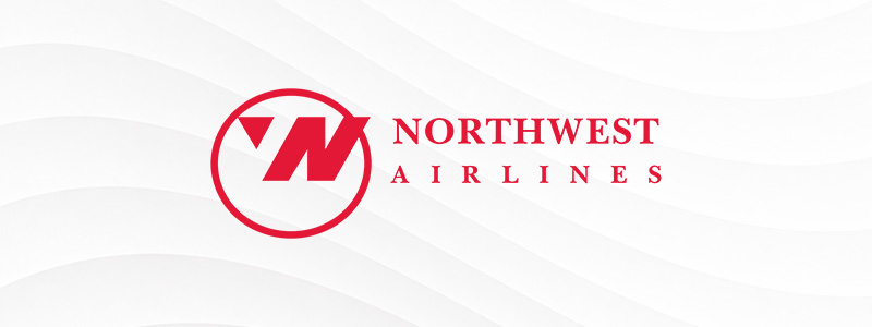
Northwest Airline’s logo is a masterclass on how to cleverly reinforce your brand name. If you look at the letters on the icon, it can show both “N” and “W”. And if you look at only the triangle, it resembles a direction on the compass, which coincidentally points northwest.
Shapes and patterns
Circles, triangles, and other basic shapes often represent ideas like growth, stability, unity, or ambition. Because these symbols are nearly universal, they help brands communicate instantly.
At the same time, brands looking for more creative logos can experiment with the arrangement of the shape or use more niche ones to communicate complex ideas.
Slack
Slack’s colorful logo is a stylized combination of the hashtag sign and chat bubbles. It represents communication and collaboration, perfectly reflecting Slack’s role as a workplace communication platform. The hashtag is also a reference to the app itself, which is the same character you see on the channels inside the app.
Adidas
Adidas’ famous three stripes form the shape of a mountain, symbolizing the challenges and obstacles that athletes strive to overcome. It’s a simple visual metaphor that aligns with the brand’s focus on performance and perseverance.
Dropbox
The open cardboard box in Dropbox’s logo is not just a reference to the “box” in their name but is also a succinct symbolism of storage and sharing, which aligns with their core mission of providing reliable cloud storage solutions.
Target

The red bullseye is a literal reference to the brand name. However, it is also a metaphor for precision and hitting the mark, which suggests that Target can deliver exactly what shoppers need.
Olympics
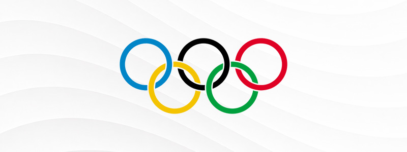
Did you know that this seemingly simple circle logo packs a lot of symbolism? First, the five rings are meant to symbolize the five continents that are in the Olympics. The colors used are also the colors found in the flags of the countries that joined. And lastly, the circles are meant to represent the athlete’s unity, togetherness, and solidarity.
Renault
Renault’s diamond was chosen because it represents quality, precision, and innovation, values that Renault has long associated with its vehicles. Its clean geometric design also helps the logo feel modern despite its long history.
Mercedes-Benz

The three-pointed star is meant to represent dominance on land, sea, and air, as Mercedes’ early days also include production of aircraft and maritime engines. Three is also considered a sacred number as it denotes perfection, which is why they used a three-pointed star. Most consumers, though, think that the logo is meant to be a stylized version of a steering wheel, which (though not completely accurate) is still pretty relevant to the brand!
Animal symbolism
Animals are a popular choice in logos as they instantly communicate personality traits like speed, strength, elegance, or reliability. They’re also easy to recognize, making logos more memorable across different languages and cultures.
Red Bull
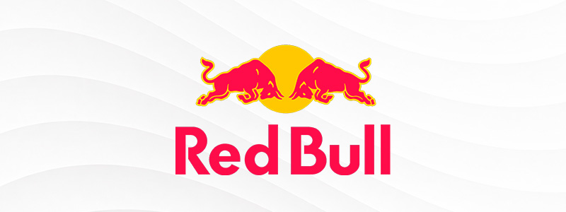
Red Bull’s logo features two charging bulls facing each other beneath a bright yellow sun. The bulls symbolize strength, power, and determination, while the sun reinforces the brand’s energy and vitality. Together, they reflect Red Bull’s promise of boosting performance and helping people push their limits.
Dove
Dove’s elegant bird logo represents peace, purity, and gentleness. These qualities align closely with the brand’s focus on skincare, self-care, and everyday beauty.
Firefox

Firefox’s logo shows a fox wrapped around a globe, representing speed, agility, and worldwide connectivity. It’s a great example of using an animal’s natural characteristics to reinforce a product’s core benefits.
Lacoste
Lacoste’s famous crocodile is inspired by the nickname of founder René Lacoste, who earned the title “The Crocodile” during his tennis career for his relentless determination on the court. It’s proof that an authentic brand story can become a powerful visual identity.
Puma
Puma’s leaping big cat represents speed, strength, agility, and athletic performance. The leaping motion also makes the logo feel like it’s moving, even when it’s a still image.

Twitter’s old bird logo was a perfect match for the platform’s original idea: quick, short messages flying from one person to another. They even used the onomatopoeia of a bird’s “tweet” to name the app’s main feature. It’s a smart way to tie in a single element in your whole brand, which is why Twitter was so recognizable back then.
Cultural and historical references
Some logos also draw from culture, geography, the company’s heritage, or even mythology. These references give logos a deeper meaning while reinforcing the stories that make brands unique.
Starbucks

Starbucks’ iconic siren isn’t just a unique mascot. The twin-tailed mermaid, from Greek mythology, was chosen to reflect the romance of the sea and the company’s roots in Seattle, a historic port city.
Mitsubishi

The Mitsubishi logo is a combination of the founder’s parents’ family crest: the three oak leaves of the Yamauchi clan (which gives that propeller shape) + the three-tiered water chestnut crest of the Iwasaki family (which gives that angular diamond shape). Additionally, the propeller-like shape is also a reference to their origins in air transport manufacturing, while the diamonds show durability and strength (which is their mission).
Alfa Romeo

Alfa Romeo combines the red cross of Milan with the Biscione, a serpent taken from the historic Visconti family crest. The logo embraces their heritage, giving the brand a sense of authenticity and tradition that has endured for over a century.
Versace
The Versace logo features Medusa, one of the most recognizable figures in Greek mythology. Gianni Versace chose her because she symbolized beauty, power, and irresistible attraction, hoping his fashion designs would have the same captivating effect.
Baskin-Robbins

Baskin-Robbins’ logo hides the number 31 within the pink portions of the “BR,” celebrating the company’s original promise of offering 31 ice cream flavors, one for every day of the month. It’s a great way to honor their heritage while keeping the logo playful and fun.
Cisco
Cisco’s vertical bars are inspired by the Golden Gate Bridge, paying tribute to the company’s home city of San Francisco. At the same time, the bars resemble digital signal waves, connecting the logo with its main product.
BMW

The blue and white colors are a reference to the Bavarian flag, which is where the brand started. Meanwhile, the symbol is seen as a reference to both a wheel and a propeller, with the latter said to be a nod to their aviation history.
Audi
Audi’s four interlocking rings represent the four automakers Audi, DKW, Horch, and Wanderer that merged to form Auto Union in 1932. Audi uses their logo to celebrate the company’s origins and honor the partnership that shaped its future.
Domino’s
The dominoes are meant to represent their brand name, yes. But did you know that the dots represent the chain’s first three stores when it opened? The founder even thought of adding more dots per expansion, but the idea was scrapped when they became too popular to keep up. Still, we appreciate their way of honoring their brand’s beginnings.
Color psychology
Colors can also portray a brand’s meaning and identity, as the right palette can reinforce emotions such as trust, excitement, optimism, or reliability. At the same time, colors can also be used as a way to recognize a brand.
IKEA
Blue conveys trust while yellow creates warmth and optimism, which reflects the company’s brand identity. It is also a reference to the Swedish flag, which is where IKEA was founded.
Google follows color psychology for its logo: blue represents trust, red with energy, yellow with positivity, and green for growth. All values the company aligns themselves in. The primary color pattern is also deliberately disrupted with the green, which was meant to show that Google is going to be a rule-breaker or trendsetter among its technological cohorts at the time.
Microsoft
The four colored squares in the Microsoft logo aren’t just an aesthetic choice. It represents their four major products: red for Microsoft Office, blue for Windows operating system, green for Xbox, and yellow for Bing.
NBC

NBC’s colorful peacock logo was introduced in the 1950s to promote the network’s pioneering of color television broadcasts. Today, it also represents the network’s diverse range of programming.
Mastercard
The overlapping circles of this logo symbolize unity and connectivity. However, the colors also denote a deeper meaning. The red shows passion and vitality (the company side), while the dark yellow shows prosperity and happiness (the customers’ side). The middle, where the sections meet, entails that Mastercard makes this mutual cooperation happen seamlessly.
Visual storytelling
Hidden meanings aren’t limited to just hiding a symbol or text. Some also tell a full brand story through thoughtful visual details. These designs communicate the company’s personality, brand messaging, or promise in a way that’s easy to understand.
Amazon
Amazon’s arrow stretches from the letter A to the Z, showing that the company sells everything from A to Z. It also forms a smile, representing customer satisfaction and a positive shopping experience. The logo is simple yet leaves a big impression.
London Symphony Orchestra
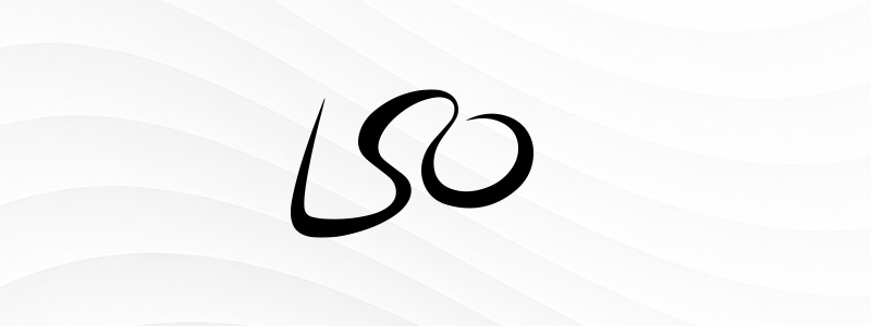
At first glance, it looks like a simple “LSO” wordmark. Look closer, however, and you’ll notice the flowing letters also resemble a conductor passionately leading an orchestra. The logo captures the energy and emotion of live music while remaining elegant and minimalist.
Quiksilver

Quiksilver’s logo is inspired by Hokusai’s famous Japanese artwork “The Great Wave off Kanagawa”. By combining a crashing wave with a mountain, the brand instantly communicates surfing, adventure, and a deep connection with the ocean.
Airbnb
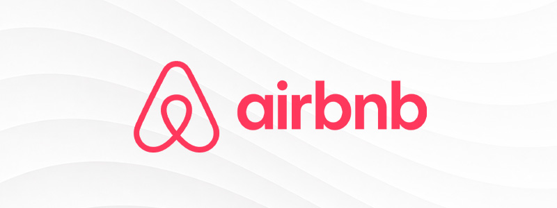
Airbnb’s Bélo symbol combines four ideas into one simple icon: a location pin, a heart, the letter A, and a person with raised arms. Together, they represent the company’s mission of helping people belong anywhere in the world.
Toyota
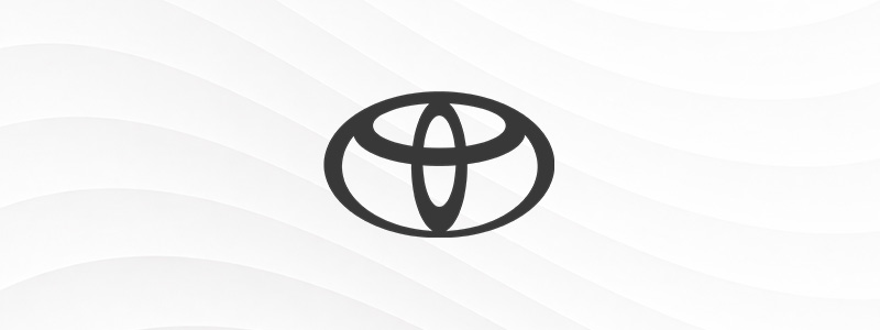
Toyota’s logo may just look like three overlapping ovals. But it’s actually packed with meaning: the two inner ovals represent the relationship between the customer and the company, while the outer oval symbolizes the world embracing both. As a bonus, the logo can also be rearranged to spell every letter in “Toyota,” making it one of the most cleverly constructed logos of all time!
Hartford Whalers

This logo is another masterclass in combining visual elements. It shows a blue whale tail to showcase the whaling heritage of their region, while the negative space shows hidden hockey sticks. As a bonus, it also forms the letter H and letter W. Very creative, right?
Tour de France

Look closely at the lettering, and you’ll spot a cyclist in the letter R, with the yellow circle acting as the bicycle’s wheel. We love how the logo incorporates a fun hidden detail while also showing the act of the race itself through typography.
Conclusion
This list of famous logos with hidden meaning proves that the best logos don’t just have hidden puzzles for fun. Instead, they use thoughtful design choices to reinforce a brand’s story, personality, or values in a way that feels natural and creative rather than just simply shoehorned in.
Inspired to add a secret message in your logo? Feel free to experiment with our AI logo maker or company logo maker to get started. Here you can explore thousands of professionally designed logo concepts in various styles, whether vintage, minimalist, modern, or bold. You can also customize colors, icons, fonts, and layouts to make the logo feel more uniquely yours.
So what are you waiting for? Check out our logo maker tool today!