The History of Logo Design
Logos are everywhere.
You see them when opening your phone apps. On the side of your coffee cup. When you pass by a giant billboard on your way to work. Even your favorite sneakers probably have the brand logo emblazoned on them.
With how these logos are woven into our modern life, it’s easy to see why they feel like a product of modern society. But did you know that it actually started way, way back, as far as the ancient civilizations in Egypt? Indeed, what started as simple marks of ownership has now evolved into a powerful branding asset.
If you’ve ever wondered when logo design started, who invented logos, or how logo styles have changed over the decades, you’re in the right place. Join us as we take a trip down memory lane to learn more about the history of logo design!
When did logo design start?
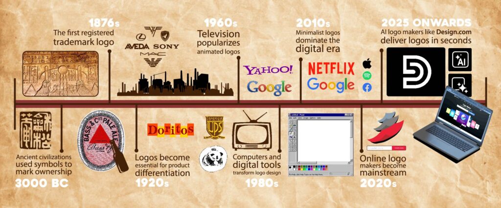
Contrary to what you may think, logos didn’t start with an ad agency or with a brand. It started in ancient civilizations.
Symbols have long been used to identify cultural, sociopolitical, or religious information. For example, the Egyptians have hieroglyphs, which, while mainly used as their “alphabet”, were also used as an identifier that a particular item came from Egypt. Meanwhile, in medieval Europe, crests were made to symbolize which noble family one came from.
Ancient merchants also used symbols on pottery, livestock, or trade goods to indicate ownership. Think of it as them stamping cattle with their mark to signify ownership.
While symbols were used as simple identifiers back then, it wasn’t until the Industrial Revolution that they fully turned into a branding necessity.
You see, this is when we started mass-producing items. Unlike back then, where you only made a dozen items and sold them face-to-face with your customers, items are now made by the thousands and shipped all over the world. How will your customer then know that this awesome product was made by you? That’s right, by a logo!
And thus started the logos that we know of today, which are visual marks that served marketing, branding, and commerce needs.
Who invented logos?
There is no one individual who is credited as the inventor of logos.
As mentioned above, logos organically evolved through time. What used to be symbols to identify a specific culture, place, religion, noble family, or even a simple mark that an item is yours, has turned into the branding assets we know today.
Another example is the Middle Ages. As the population started to grow, society moved away from the self-sustaining life of farming and fishing and started more specialized trades. This means more and more businesses popped up.
But as most of the population was still illiterate, people relied on hanging symbols on their storefronts to serve as identifiers of what business they offered. Think the red cross for clinics or striped poles for barbershops. It also became a way for customers to remember which store was their favorite. This became the groundwork for brand logos.
Maybe one business here had the idea of using the symbol as we use modern logos. But again, we cannot know for sure. It’s still more appropriate to call logos a societal evolution rather than a specific invention.
What is the oldest logo?
Ancient symbols and marks became the official, modern logos that we know today when trademark laws were passed. These laws were made to formally establish logos as legal brand identifiers during the 1800s, driven by the rampant imitation that was happening.
So if we were to define the oldest logo (meaning the first registered trademark), then it is the logo of Bass Brewery. The iconic red triangle was recorded in 1876 under the UK’s new trademark system.

What is vintage logo design?
Nostalgia is a powerful emotional trigger. It evokes a sense of warmth, familiarity, and trust, which is why brands love to harness it in their branding.
At the same time, the long reign of minimalist designs made people yearn for more unique and playful looks that can stand out from the crowd.
This is why we now see a resurgence of vintage logo designs. These are logos that take inspiration from earlier eras of branding, particularly the late 19th and early 20th centuries. You’ll often see it feature:
- Badge or emblem-style compositions
- Retro typography
- Script or serif fonts
- Hand-drawn illustrations
- Textured, distressed, or weathered finishes
Check out these samples from our collection:
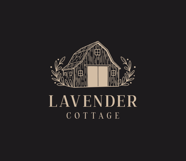
Barn Farming Ranch by Design.com
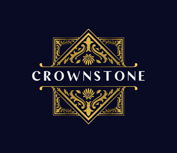
Premium Ornament Filigree by Design.com
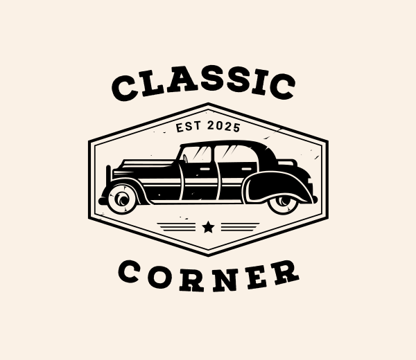
Classic Car Transportation by Design.com
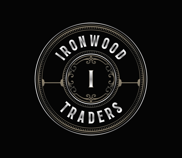
Premium Ornamental Crest by Design.com
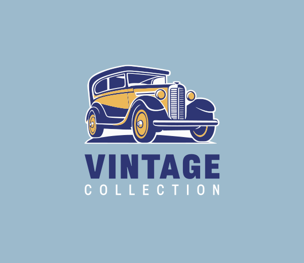
Retro Car Transport by Design.com
In many ways, vintage logo design shows how trends come full circle. What once was standard becomes outdated… and eventually desirable again.
How logos looked in the 1920s

If you compare early logos to today’s designs, the difference is striking.
Back then, logos were filled with:
- Highly detailed illustrations
- Tons of decorative flourishes
- Ornate typography
- Calligraphy-style scripts
- Emblems, crests, or badge logos
- Victorian and Art Deco aesthetics
Elaborate logos like these were in style because logos were mainly used as authority signifiers. The more detailed and refined the logo, the more established the company appeared.
How logos looked in the 1940s

The 1940s saw a shift in logo design. After the war, most brands wanted a more colorful and vibrant approach to their design to reflect the hope and optimism of the people during that time.
This is why we see more bold color palettes, fun illustrations, and more playful typography, and fewer of the “luxurious” styled ones.
How logos looked in the 1960s

Television became more dominant in the 1960s, so logos adapted as well.
This marks the start of animated logos, plus the use of sound and jingles to make your logo even more memorable. Logos also became bolder and brighter in order to stand out among the visual noise in this era.
How logos looked in the 1980s

The rise of computer-generated imagery (CGI) and computer-aided drawing (CAD) technologies allowed brands to be more creative with their logos. This gave rise to 3D logos, skeuomorphism, and more dynamic animations.
The concept of adaptive logos also started in this era. MTV created a basic logo sketch that they will then constantly change depending on the context.
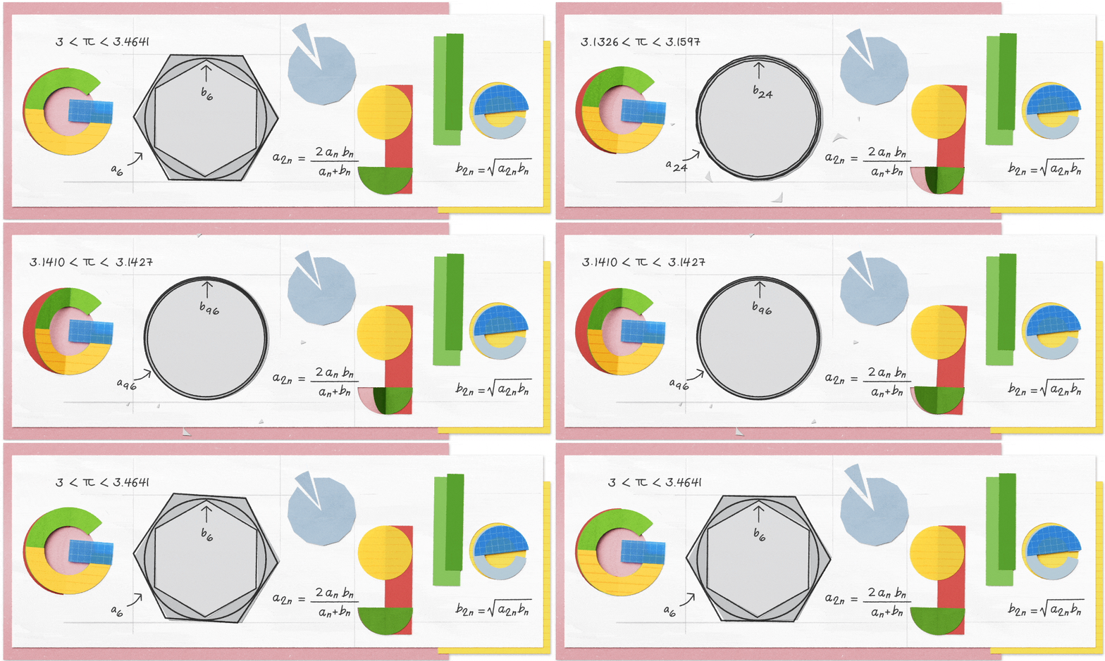
This practice still lives on today. Brands like Google often make seasonal logos or event logos, depending on the occasion. Called Google Doodles, these designs are even created for fun, unusual “holidays”, like this one for World Pi Day.
How modern and minimalist logo design became popular

You’ll probably notice that most logos from the 2000s to today have the same clean, minimalist, flat look.
But when exactly did the minimalist logo trend start?
It started during the late 2010s, when technology became even more advanced and we shifted into a mobile-first mindset.
Unlike logos of the past that only needed to appear on a few things (like the packaging and newspaper ads), today’s logos need to appear on multiple platforms: email signatures, social media profile pictures, vertical videos, LED billboards, mobile apps, and many more.
This means that your logo needs to be simple and flexible enough to easily adapt across various screens.
The minimalist trend isn’t really about aesthetics. It’s about functionality – making sure the logo will remain clear, legible, and understandable even on a small screen.
Why do brands redesign logos over time?
Even the most iconic logos evolve. In fact, the iconic script of Johnson & Johnson that was used for 137 years was just recently rebranded.
But why would brands do it? Some reasons are:
To modernize outdated visual styles
Design trends change. What once looked stylish can now look outdated and just make your brand look like it is stuck in the past. An example is Pepsi.
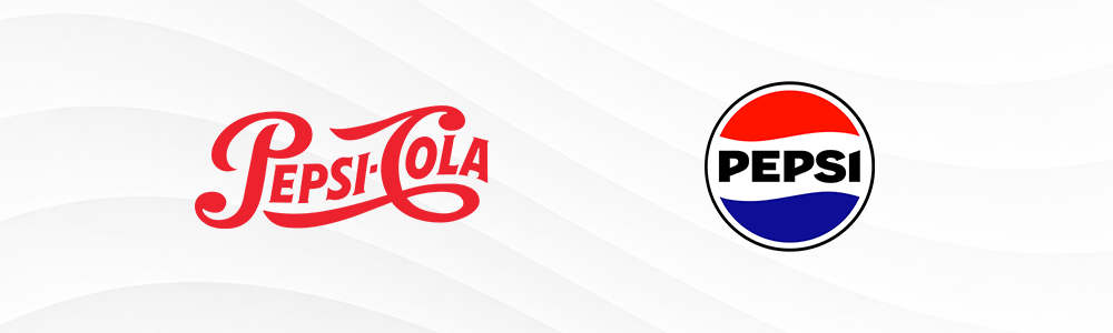
Over the decades, Pepsi’s logo has undergone multiple redesigns from the ornate script that was popular in the early 1900s to the clean and simplified red-white-and-blue emblem we recognize today. It’s a necessary shift to keep up with the times.
To adapt to new technology
As technology evolves, logos must function across more platforms than ever before. Look at Instagram.
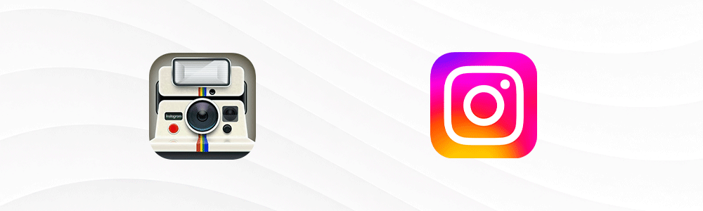
Their original logo is a detailed camera icon filled with shadows and texture. It looked great and distinct. However, the intricate details of the logo can get washed out when it is shrunk to fit favicons and app icons. So they decided to simplify their logo to ensure it can scale properly.
To reposition brand identity or audience
Sometimes a logo redesign signals more than aesthetic change. It can mean a shift in mission, market positioning, or audience. An example of this is Jaguar.
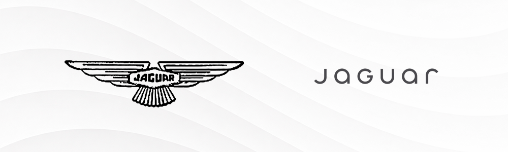
They have changed their emblem logo into an ultramodern wordmark to symbolize their shift into an all-electric car lineup and their new focus on their Gen-Z audience.
To simplify complex legacy designs
Many heritage brands originally had detailed logos designed for print-heavy eras. As branding moved into digital spaces, complexity became harder to maintain. Take Starbucks.
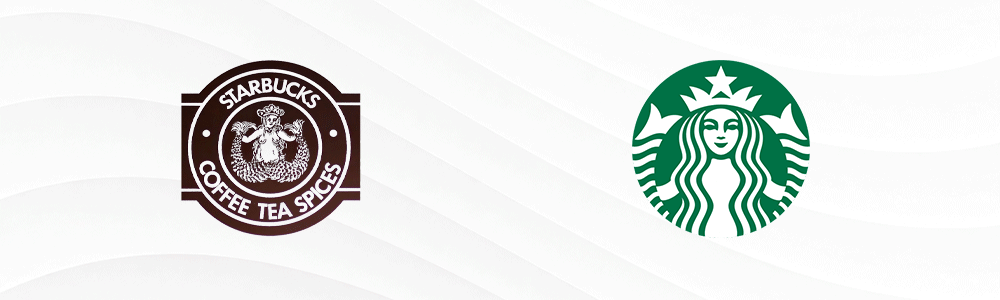
Its early logo featured a detailed mermaid illustration surrounded by text. Over time, Starbucks gradually removed text and simplified the siren illustration to make the logo more recognizable and less cluttered.
Redesigning logos also doesn’t mean a complete overhaul. Subtle logo changes, like tweaking the stems of a font or making the color a bit brighter, can make a huge difference.
Conclusion
There you have it! Did you enjoy our trip down the past of logo design?
Knowing the history of logos isn’t just for fun either. Understanding how a logo has evolved throughout the years can also help you make more strategic decisions with your design.
If you’re building or refreshing your brand, take inspiration from history:
- Keep it simple.
- Go with a strong shape or typography.
- Design for the long term and not for trends.
- Rebrand carefully (only if needed).
Ready to start creating your logo? We got you. Hop on to our AI logo generator tool now or take a look at our customizable templates for company logos, brand logos, and more.
We wish you the best of luck with your design journey!