How to Choose the Right Logo Font
Fonts might look like a small detail in branding, but they quietly shape how people feel about your business. Before anyone reads your message, they already “read” your brand through your typography.
The right font can make your brand feel professional, friendly, luxurious, or playful. The wrong one can make it feel inconsistent or hard to trust. That’s why choosing brand fonts and logo fonts is not just a design decision; it is a branding decision. If you’re building a brand from scratch, using a logo maker can also help you experiment with different font combinations to find a style that best reflects your business.
In this guide, we’ll break everything down so you can confidently choose fonts that actually fit your brand.
Let’s get started!
How to choose the right fonts for logos and branding
Choosing the right fonts for your brand starts with understanding the role of typography and recognizing that not all fonts serve the same purpose. Some fonts are meant to represent your identity in a logo, while others are meant to support everyday communication across your brand.
Before you start picking styles, weights, or aesthetics, it’s important to understand the difference between these two roles. This foundation will make every decision that follows much clearer and more intentional.
Understand the difference between logo fonts and brand fonts
What are brand fonts?
Brand fonts are the set of fonts a business uses consistently across all its communication. Think of them as your brand’s visual voice. Every time someone sees your website, social media feed like Instagram posts, or ads, your brand fonts are speaking for you.
They are used across:
- Websites and landing pages
- Social media posts
- Advertisements
- Packaging and product labels
- Presentations and documents
A good brand font is not just attractive. It needs to be readable, flexible, and consistent across different platforms. It should look good on a phone screen, on a billboard, and in printed materials without losing clarity or personality.
Here’s an example:
Spotify uses a consistent sans-serif typography system across its:
App

Ads

Website
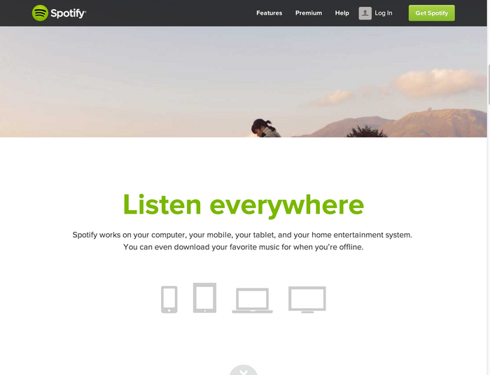
This ensures readability and maintains a unified visual experience across all user touchpoints.
What are logo fonts?
Logo fonts are the fonts used specifically in your logo design. Unlike brand fonts, they are often more distinctive and designed to make a strong first impression.
They are used in:
- Logo designs
- Brand marks and wordmarks
- Visual identity systems
A good logo font should feel unique enough to stand out but still simple enough to remain readable at a glance. Many brands use modified or custom fonts for their logo to create a stronger identity.
The goal is recognition. People should be able to recognize your brand just by looking at the lettering style.

Coca-Cola uses a highly distinctive script-style logo font that exists purely for brand identity. It is not used for body text or general communication, but it is instantly recognizable worldwide.
You’ll typically see this lettering and red logo consistently applied to packaging, bottles, cans, signage, and advertising materials, where it serves as the primary visual marker of the brand.
See samples below:

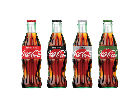
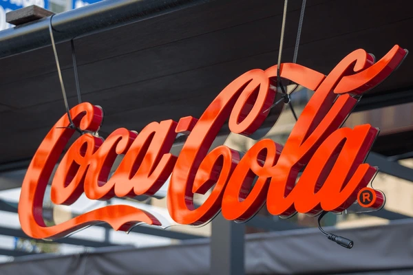
What makes this a logo font rather than a brand font is that it is locked to a single purpose: visually representing the brand name.
It does not extend into everyday communication, such as website text, app interfaces, captions, or documents, or even business cards. Instead, it remains fixed as part of the logo design itself, meaning it is used for identification rather than general readability or content structure.
Choose fonts that remain readable at all sizes
A strong brand font must remain readable across all sizes and formats. This includes mobile screens, desktop websites, social media posts, and printed materials. If a font becomes unclear or loses structure when scaled down, it will create usability issues later.
This step is often overlooked, but it is one of the most important practical checks in typography selection. Fonts should always be tested in real-world environments before being finalized.
Readability is not optional. It is the foundation of functional branding.
Brand font:
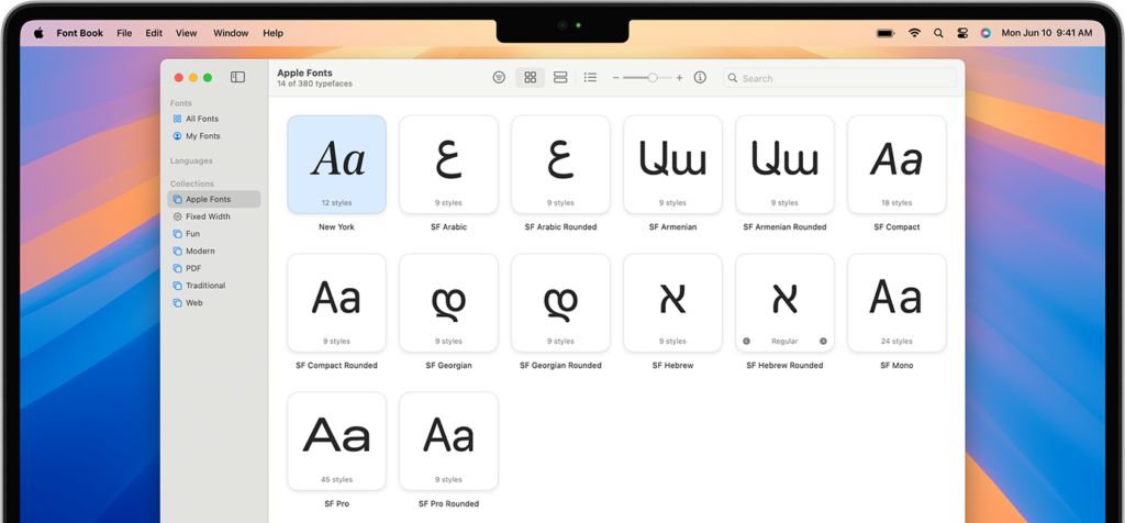
For example, Apple uses the San Francisco system font across iOS and macOS. It is specifically designed for clarity at small sizes, ensuring text remains sharp and legible across all devices and interfaces.
Logo font:

Google’s logo uses a simplified geometric wordmark that remains readable even at favicon size.

Its structure is designed to maintain clarity even when scaled down significantly.
Design logo fonts that stand out without losing clarity
Logo fonts should be distinctive enough to be memorable but not so complex as to be hard to read. The goal is controlled uniqueness. A logo should be recognizable at a glance, even without close inspection.
Many effective logo fonts are either custom-designed or based on existing typefaces that have been modified for uniqueness. This helps balance originality with readability.
Over-stylization is a common mistake. If the logo becomes difficult to read, recognition suffers.
Examples:
Airbnb

Airbnb uses a clean, modern logo with soft, rounded letterforms. The design’s simplicity makes it highly readable across digital platforms while still feeling friendly and distinctive.
Netflix

Netflix uses a bold, custom wordmark with strong weight and minimal styling. The heavy lettering ensures instant recognition and strong visibility across screens, apps, and promotional materials.
FedEx

FedEx uses a clean sans-serif wordmark with simple, tightly controlled spacing. A key detail is the hidden arrow between the “E” and “x,” which reinforces speed and precision while keeping the overall design extremely readable.
Adobe

Adobe uses a bold, geometric wordmark with strong letterforms and high clarity. The design is simple and structured, which helps it remain legible across software interfaces, branding materials, and digital platforms.
Pair display fonts with functional body fonts
Strong typography systems rely on hierarchy. This means using different fonts for different purposes instead of forcing one font to do everything. Display fonts are used for headlines and expressive moments, while body fonts are used for readability and long-form content.
This separation ensures that communication remains both engaging and easy to read. It also reduces visual fatigue among users who frequently interact with the brand.
A balanced system improves both personality and usability.
Check out how you can experiment with logo font pairings using Design.com:

Luxury High Rise Building by Design.com
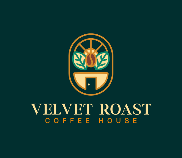
Organic Coffee Bean by Design.com
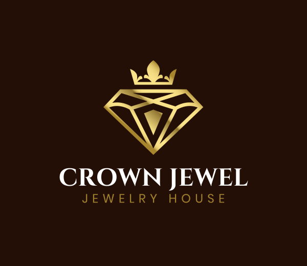
Crown Diamond Jewelry by Design.com

Rose Flower Shop by Design.com

Education Torch Book by Design.com
Choose fonts that reinforce your brand personality
Fonts should not only reflect brand personality in theory, but also in real-world use cases. This includes advertisements, landing pages, packaging, and presentations. A font must consistently reinforce the brand message across all environments. One of the most important decisions is choosing between serif and sans-serif fonts.
Testing typography in context helps ensure that it performs well beyond mockups or isolated design previews.
For example:
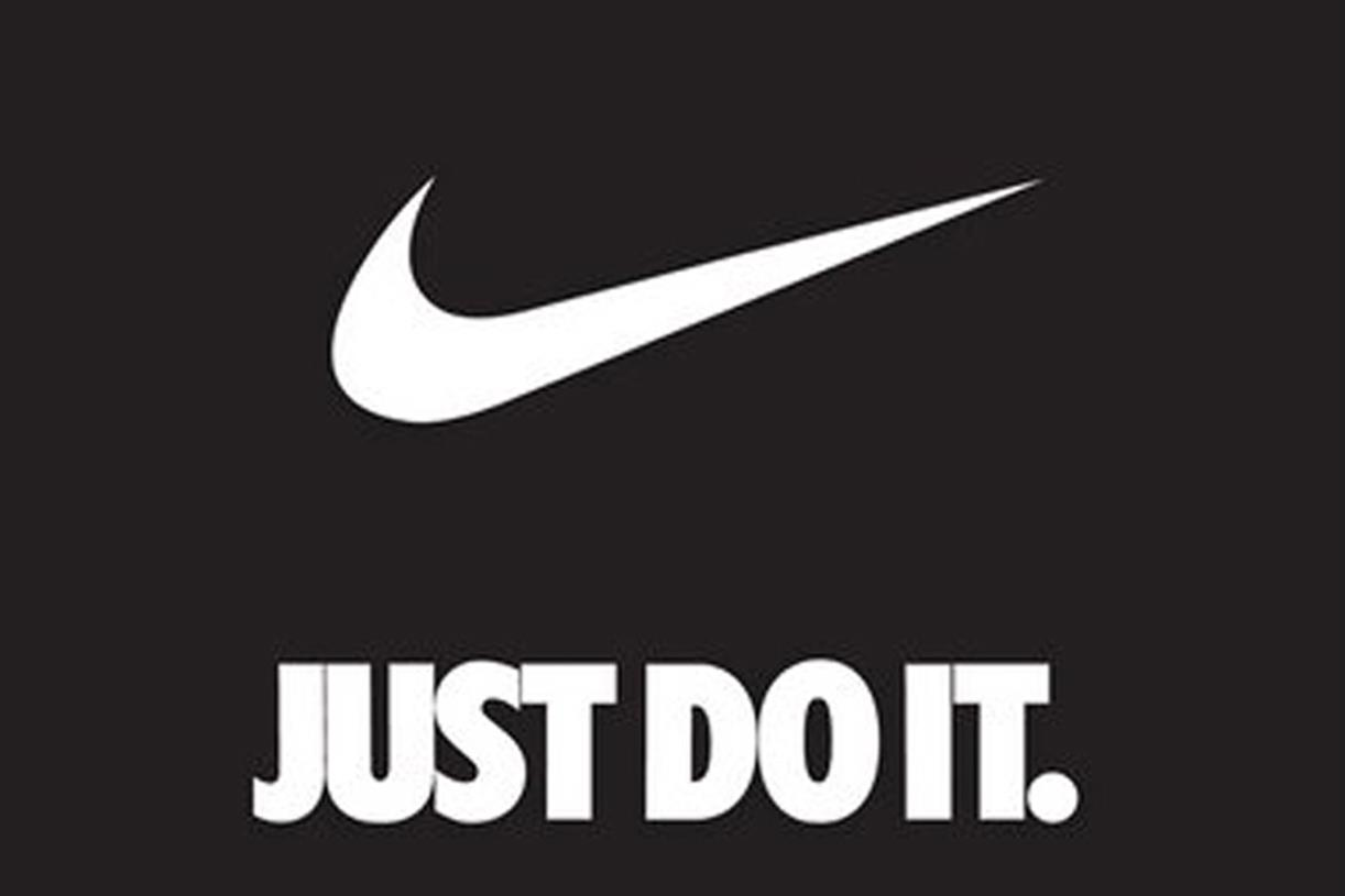
Nike uses bold, high-impact sans-serif typography across campaigns and product pages. This reinforces its identity as a performance-driven and energetic brand.

Chanel also uses a refined serif-style interlinked logo that reflects its luxury positioning. It is consistently applied across packaging, branding, and marketing materials.
Quick tips for choosing the right font
Choosing the right font is about more than aesthetics. The fonts you select influence how people perceive your brand, how easily they consume your content, and how consistently your brand is presented across different platforms.
Keep these practical tips in mind when building your typography system:
- Prioritize readability over style: A font may look impressive in a logo mockup, but it should also remain clear and legible across websites, social media, and printed materials. If people struggle to read it, it is not the right choice.
- Match the font to your brand personality: Different font styles communicate different emotions. A clean sans-serif may feel modern and approachable, while a serif logo font can convey tradition, trust, or sophistication.
- Test fonts at different sizes: Always check how your fonts perform in large headlines, small captions, mobile screens, and printed materials. A good font should remain effective regardless of scale.
- Limit the number of fonts you use: Using too many fonts can make a brand feel inconsistent and unprofessional. Most brands can achieve a strong visual identity with one logo font and one or two supporting brand fonts.
- Create a clear typography hierarchy: Define which fonts, sizes, and weights will be used for headings, subheadings, and body text. This improves readability and creates a more organized visual experience.
- Verify font licensing before commercial use: Fonts are licensed software and may have restrictions for websites, apps, logos, or client projects. Always confirm that your chosen fonts are properly licensed for your intended use before launching your brand.
Final thoughts
Fonts are one of the most powerful tools in branding, yet they are often overlooked. The right typography helps shape first impressions, reinforces brand personality, and creates a consistent experience across every customer touchpoint.
When choosing fonts, remember that logo fonts and brand fonts serve different purposes. A logo font is designed for recognition and identity, while brand fonts are responsible for everyday communication across websites, social media, advertisements, packaging, and more. Both play an important role in building a strong and memorable brand.
With tools like Design.com, you can quickly explore font styles, generate logo ideas, and build a complete visual identity without needing advanced design skills. Our tool allows you to test different typography directions and create a logo that fits your brand before committing to a final design.