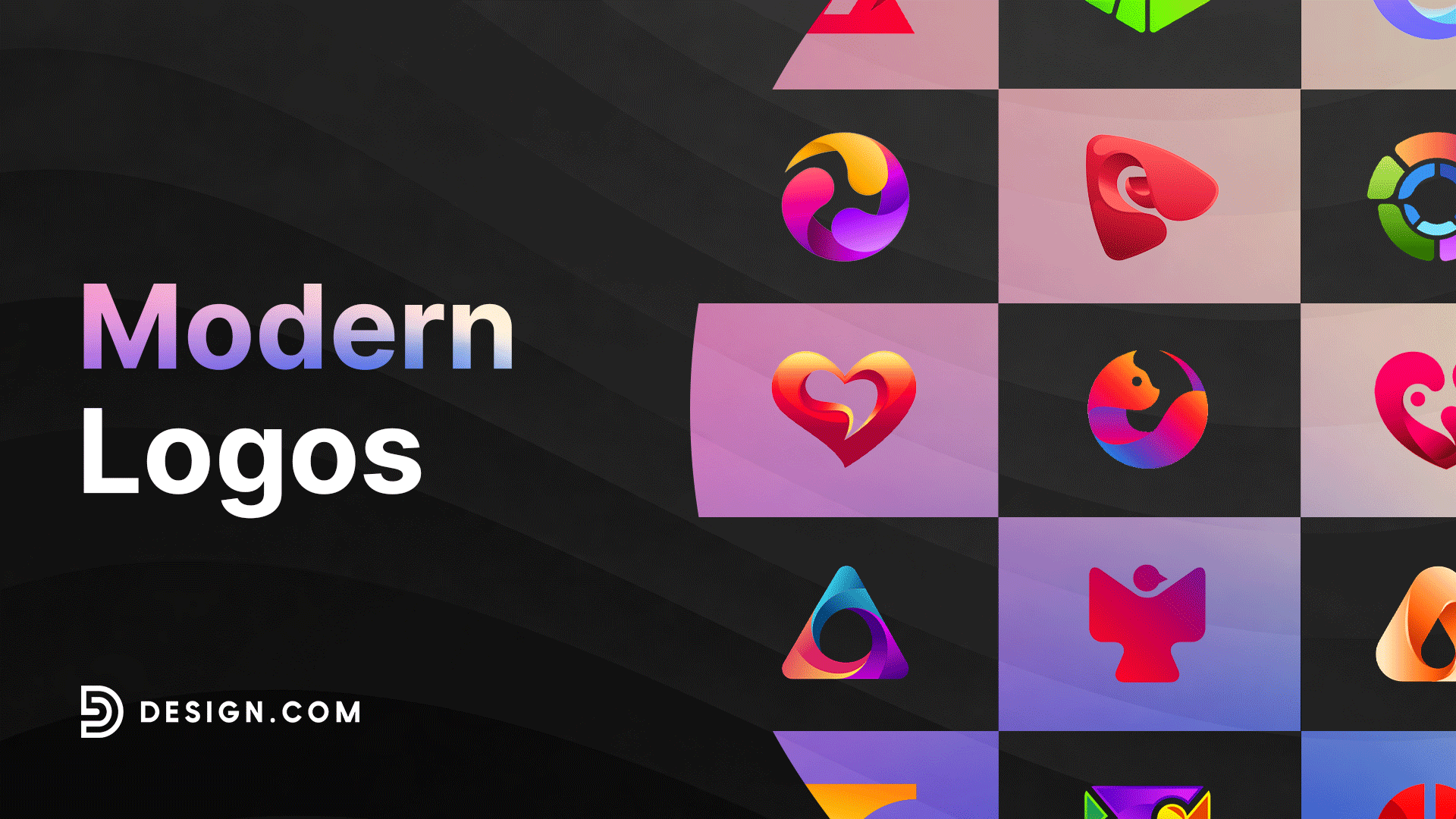
50 Inspiring Modern Logos
Your logo is everywhere your business is. Every social post, email signature, product label, and business card you hand out adds up to thousands of impressions, each shaping how people perceive your brand. The question is whether those impressions are working for you or against you.
Outdated logos send signals you don’t intend to send. They suggest you’re behind the times, not paying attention to details, or simply not investing in your brand. The best modern logos fix this by prioritizing clarity, flexibility, and visual impact.
We’ve curated examples of modern logos getting it right in today’s market. You’ll see what makes them effective, why certain design choices resonate with audiences, and how to apply these insights to your next move. Whether you’re using a logo maker for the first time or an established business ready for a refresh, this roundup will show you exactly what good looks like.
What makes a logo “modern”?
Modern logos share certain qualities that set them apart in today’s crowded marketplace. These designs prioritize clarity and function while still maintaining visual interest.
Here’s what sets modern logos apart from their traditional counterparts:
- Clean, simplified design elements that communicate your brand message without unnecessary clutter or complexity
- Strategic use of negative space to create hidden meanings and make your logo more memorable
- Contemporary color palettes that feel fresh and current while remaining timeless enough to last for years
- Versatility across digital and print, so your logo looks great whether it’s on a phone screen or a billboard
- Timeless yet fresh appeal that won’t look dated in a few years but still feels relevant right now
What are some modern logo design trends?
Modern logo design is constantly evolving, but the best approaches share one thing in common. They prioritize how a logo performs across real-world contexts rather than chasing what looks good in the moment.
Some styles lean into simplicity and typography. Others explore geometry, color, and dimension. Understanding which direction fits your brand is the first step toward a modern logo that actually works.
Let’s explore three popular approaches that are shaping modern logo design today.
Flat logos
Flat logos strip away the decorative effects to emphasize clean shapes and purposeful typography. They are among the most versatile and recognizable marks in the world, relying entirely on strong visuals to convey a brand identity. Think of how Google, FedEx, or Coca-Cola communicates everything about who they are without any added dimension or effects.
Choosing the right typeface is everything here. Modern fonts for logos like Futura, Montserrat, and Inter are popular for a reason. They carry authority and readability at any size. A custom-lettered approach takes it even further, giving your brand a mark that nobody else can replicate.
Browse through our modern flat logo examples below:
Diamond Jewelry Gem by Design.com
Violet Star Circle by Design.com
Simple Brown Company by Design.com
Minimalist Professional Consulting by Design.com
Minimalist Sun Boho by Design.com
Simple Apple Minimalist by Design.com
Minimalist Publishing Business by Design.com
Professional Minimalist Studio by Design.com
Minimalist Holy Candle by Design.com
Modern Minimalist Brand by Design.com
Minimalist Perched Magpie by Design.com
Minimalist Modern Business by Design.com
Minimalist House Roof by Design.com

Minimalist Bumblebee App by Design.com
Red Service Company by Design.com
Geometric logos
Geometric logos use shapes like circles, triangles, squares, and hexagons to create visual structure and meaning. These shapes carry psychological associations that can reinforce your brand message. Circles suggest community and wholeness. Triangles convey stability or movement depending on their orientation.
The tech industry has particularly embraced geometric design because it feels modern and precise. But these logos work well across many sectors. Financial services companies use geometric patterns to convey security and structure. Creative agencies use them to show they understand both form and function.
Check out our modern geometric logo samples below:
Geometric Hexagon Fintech by Design.com
Geometric Triangle Hourglass by Design.com
Creative Geometric Tech by Design.com
Circle Geometric Tech by Design.com
Modern Geometric Business by Design.com
Modern Geometric Business II by Design.com
Circular Round Ring by Design.com
Digital Motion Circle by Design.com
Corporate Circle Agency by Design.com
Modern Geometric Triangle by Design.com
Tech Triangle Company by Design.com
Sphere Wave Tech by Design.com
Geometric Angry Lion by Design.com
Violet Geometric Pattern by Design.com
Geometric Tech Hexagon by Design.com
Gradient logos
Gradients add depth and dimension to logos by blending two or more colors. This technique has seen a significant resurgence in recent years as screen technology has improved.
What once looked muddy on old monitors now displays beautifully on modern high-resolution displays. Gradients can make flat designs feel more dynamic and eye-catching.
Modern gradient logos often use bold color transitions that create energy and movement. Instagram’s shift to a gradient logo in 2016 helped spark this trend.
Since then, countless brands have adopted gradients to signal innovation and creativity. The technique works particularly well for digital-first companies that want to showcase their modern approach.
Get started with our modern gradient logos below:
Gradient Kangaroo Animal by Design.com
Gradient Yellow Gradient by Design.com
Gradient Crocodile Animal by Design.com
Business Sphere Fluid by Design.com
Gradient Apple App by Design.com
Gradient Rose Flower by Design.com
Gradient Flying Hummingbird by Design.com
Gradient Water Drop by Design.com
Pink Gradient Human Star by Design.com
Viola Gradient Violin by Design.com
Generic Flower Pattern by Design.com
Business Tech Professional Letter J by Design.com`
Beauty Pillar Lotus by Design.com
Toy Puzzle Pieces by Design.com
Gemstone Diamond Crystal by Design.com
Tech Location Pin by Design.com
Colorful Professional Circle by Design.com
Red Triangle Creative by Design.com
Tech Laboratory Flask by Design.com
How to future-proof your modern logo
A modern logo must work today and stay relevant for years. The challenge is designing a logo that feels current without being so trendy that it looks dated in a few seasons.
Here’s how to create a logo that stands the test of time.
Design for tomorrow’s technology
Your logo should work on any screens, devices, or platforms that emerge over the next five to ten years. This means building in flexibility from the start. Choose design elements not tied to current tech limitations or fleeting visual trends.
The best modern logos adapt to new contexts without losing their brand identity. Consider how your logo will appear on devices and platforms that have yet to be invented. Building in this kind of flexibility ensures your brand stays strong no matter how technology evolves.
Balance trends with timeless design
Certain aspects of modern design will always work because they’re rooted in human psychology and visual perception. Clean lines, thoughtful use of space, and strategic simplicity never go out of style. These are the timeless principles you should build your logo around.
However, specific color treatments, effects, or stylistic flourishes that feel cutting-edge today might look dated tomorrow. Know the difference and design accordingly. Use trendy elements sparingly and only when they genuinely serve your brand message.
Test for long-term versatility
A logo that will last has adaptability and simplicity at its core. If your logo relies heavily on gradients, ensure you have a solid single-color version. If it uses negative space cleverly, ensure that cleverness doesn’t disappear at small sizes.
Test it everywhere you can imagine it appearing, and in places you haven’t thought of yet. Try it on light, dark, and busy backgrounds, as well as in unusual contexts. The more versatile your logo is, the longer it will serve your brand effectively.
Build a system, not just an image
A truly future-proof logo doesn’t try to predict what’s next. It builds a strong enough foundation to evolve without losing its identity. Think of it as creating a visual system rather than a single mark.
When you design flexibly, your logo can adapt to new contexts without needing a complete overhaul every few years. This approach saves money, maintains brand consistency, and strengthens your visual identity even as your business grows and changes.
Conclusion
A modern logo can transform how customers perceive your business and set you apart in a competitive market. Whether you choose minimalist simplicity, geometric precision, or gradient vibrancy, finding a design approach that authentically represents your brand values and connects with your audience is key.Design.com offers tools and resources to help you create a modern brand identity that works across all platforms. From websites and digital business cards to complete branding packages, you’ll find everything you need to succeed in your branding.