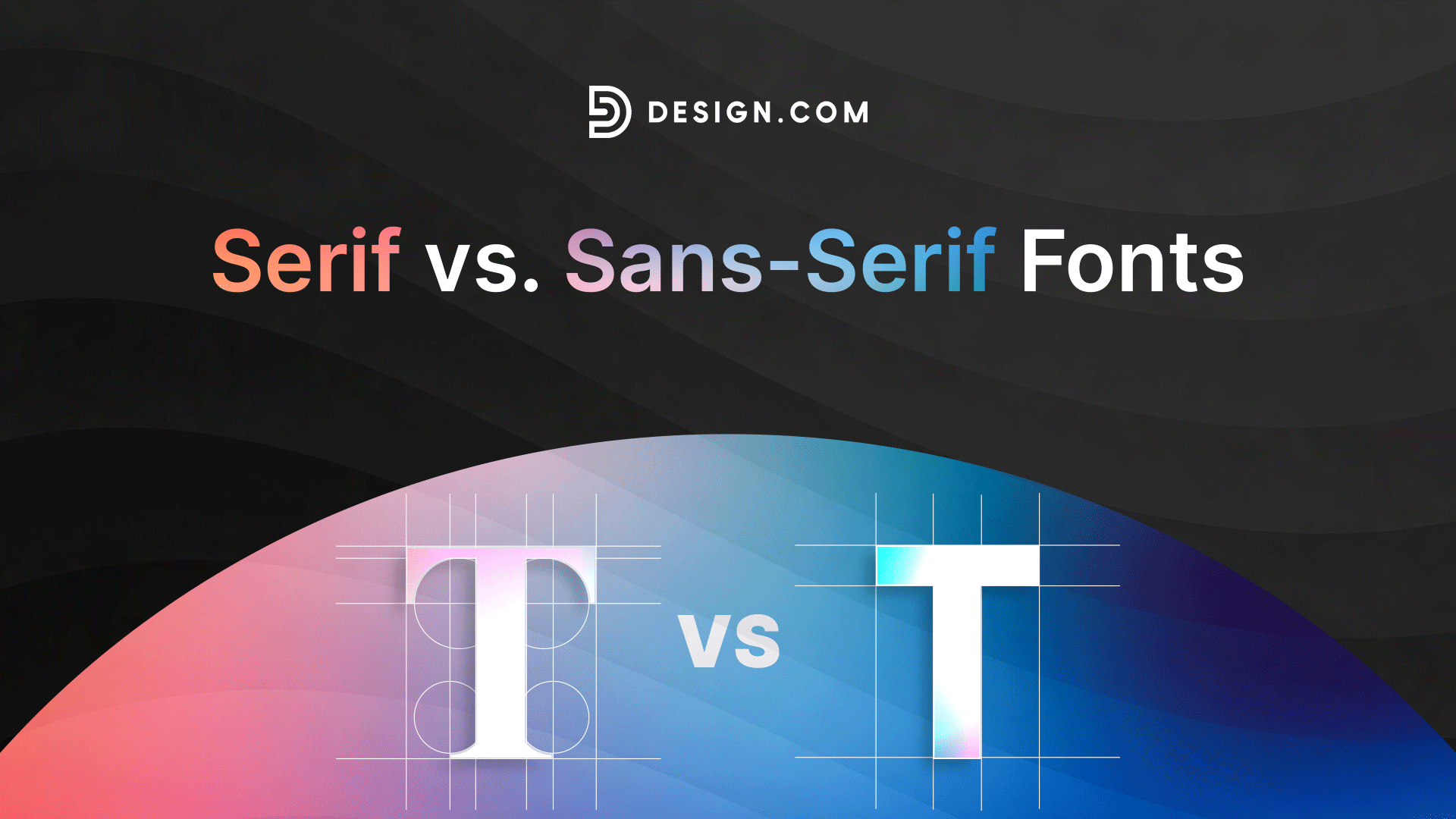
Serif vs. Sans-Serif: How to Choose the Right Font Style
Choosing a font is one of the first decisions in any branding project, and it’s more consequential than it might seem.
The typeface you select, particularly during the logo design process, directly influences how your audience perceives your brand before they read a single word. Different fonts carry different associations, and picking the wrong one can undermine an otherwise strong visual identity.
Most of this comes down to one foundational question: should you use a serif or a sans-serif font?
This guide breaks down the key differences between the two, with real-world examples, so you can make an informed choice for your brand or design project.
Serif vs sans serif: What’s the difference?
Here’s a quick table comparison to easily understand how these two compare:
| Aspect | Serif Fonts | Sans Serif Fonts |
|---|---|---|
| Overall feel | Classic and traditional | Modern and clean |
| Brand personality | Formal, elegant, trustworthy | Friendly, simple, approachable |
| Readability | Better in print and long text | Better on screens and digital use |
| Emotional impact | Serious and established | Light and easygoing |
| Best use cases | Luxury, publishing, law, finance | Tech, startups, digital brands |
| Visual style | Decorative and detailed | Minimal and clean |
| Brand perception | Feels experienced and premium | Feels fresh and modern |
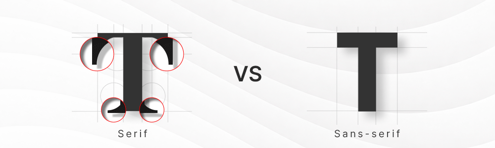
A serif font has small lines or strokes at the ends of letters. You’ll notice these little extensions on characters like T, N, and S. These details are called serifs.
See this simple difference here:
What is a serif font?
Serif fonts have been around for a long time. You’ll usually see them in books, newspapers, and printed materials. Because of that, they often feel more traditional and familiar.
When people see serif fonts, they don’t just notice the letters. They also get a certain feeling from them. Serif fonts tend to feel more serious and established. They give a sense that the brand has history or experience behind it.
This is why serif fonts are often used in vintage-style logos, especially for brands that want to look classic or timeless, like old coffee shops, heritage fashion labels, traditional bakeries, and retro-inspired businesses.
Serif fonts also work well when you want your brand to feel premium or refined. Think of brands that want to look timeless instead of trendy. Serif fonts help create that kind of impression.
Serif font examples
1. Times New Roman

What it is: A classic serif font designed for readability in print media.
Design traits:
- Strong contrast between thick and thin strokes
- Sharp, structured serifs
- Highly compact and efficient for long text
Why it works: It is extremely readable in printed documents and has been a standard for newspapers and academic writing for decades.
Where it is used:

The Times has long used classic serif newspaper typography in its print editions, which helped establish the broader “Times” serif aesthetic used in publishing and documentation worldwide.
It has also become a standard in many academic formatting guides, especially in fields that require formal documentation. The font’s familiarity also reduces distractions, allowing readers and examiners to focus on the content rather than the style.
2. Georgia

What it is: A serif font specifically designed for digital readability on screens.
Design traits:
- Larger x-height for better clarity
- Softer contrast than traditional print serifs
- Clear, open letterforms that stay legible at small sizes
Why it works: It was designed to remain readable even on low-resolution screens, making it a bridge between traditional serif style and modern digital needs.
Where it is used:
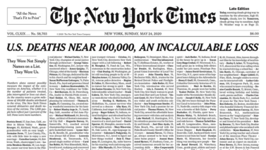
One of the most well-known examples is The New York Times newspaper, which used Georgia as part of its body text typography in its earlier design system. This news giant wants to keep the feeling of paper on screen.
3. Garamond

What it is: A refined, elegant serif typeface rooted in Renaissance-era design principles.
Design traits:
- Soft curves and balanced proportions
- Light contrast between strokes
- Classic, book-like aesthetic
Why it works: It creates a premium, timeless feel, which is why it is still widely used in publishing and high-end editorial design.
Where it is used:
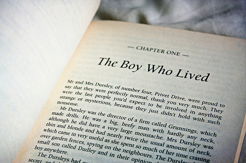
Garamond is one of the most popular serif fonts in print publishing, especially in books and literature editions. One well-known example of its use is in printed editions of the Harry Potter series by J.K. Rowling.
What is a sans-serif font?
A sans serif font removes those small strokes at the ends of letters. So instead of decorative edges, you get clean and smooth letterforms.
Because of that simplicity, sans serif fonts often feel more modern and direct. They don’t have extra details, so the focus is on clarity and readability.
Sans-serif fonts are very common in digital design. You’ll see them everywhere on websites, apps, and social media. That’s because they are easier to read on screens, especially at small sizes.
When people see sans-serif fonts, they often think of something fresh and easy to understand. There’s less “formality” and more simplicity.
Sans-serif fonts are widely used in industries that want to feel current and accessible. They help brands look less formal and more open.
Sans-serif font examples
1. Helvetica

What it is: A classic and highly influential sans serif typeface used in global branding and design.
Design traits:
- Neutral appearance
- Balanced spacing
- Consistent letterforms that feel clean and professional
Why it works: It is extremely versatile and works across almost any design context, from logos to signage to editorial layouts.
Where it is used:

BMW, the car brand, uses a heavily modified version of Helvetica in its branding, helping create a clean, premium, and precise visual identity often associated with automotive engineering and performance.

Meanwhile, Harley-Davidson has used a modified version of Helvetica Extra Compressed in parts of its branding, contributing to its bold and compact visual style often seen in motorcycle culture and merchandise design.
2. Arial

What it is: A widely used sans serif font that comes pre-installed on many systems and is commonly used in digital documents.
Design traits:
- Simple structure
- Clear letter shapes
- Functional design focused on readability
Why it works: It remains highly readable across devices and screen sizes, making it a practical choice for everyday use in documents and web content.
Where it is used:
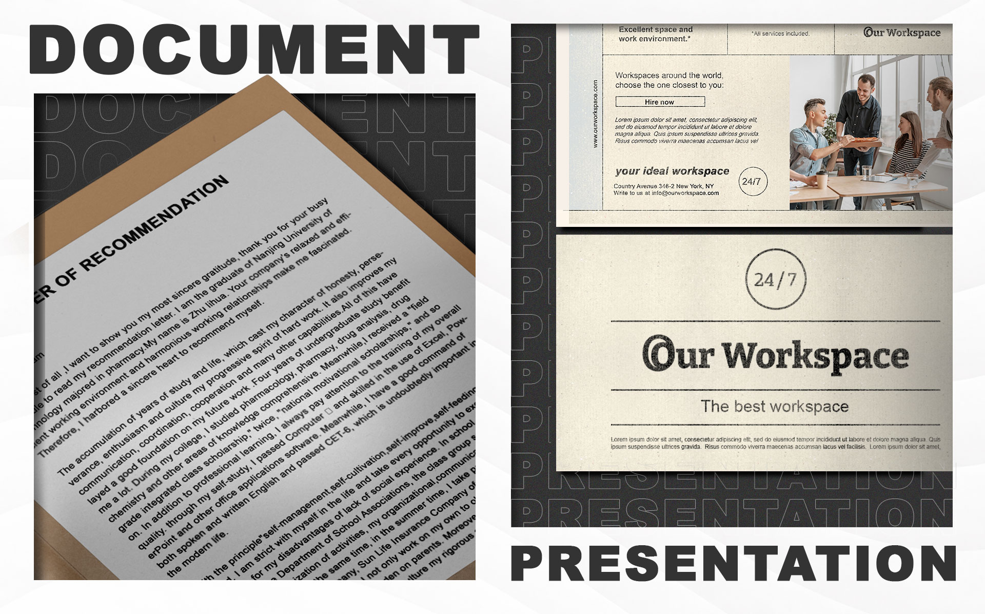
Arial is one of the most widely used fonts in everyday digital work. If you’ve ever typed a document, used a presentation maker, or opened a web browser, you’ve probably used Arial – whether you meant to or not.
3. Futura

What it is: A geometric sans-serif typeface known for its precise and modern design style.
Design traits:
- Built on circular shapes
- Clean lines
- Strong geometric proportions
Why it works: It feels modern and forward-thinking, which is why it is often used in branding, posters, and design-focused identities.
Where it is used:
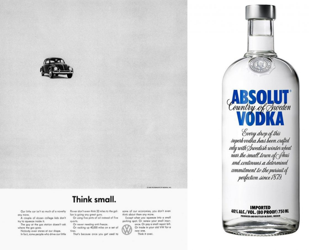
The Volkswagen text advertising work is a good example of clean, structured sans-serif typography being used to communicate reliability and modern engineering. Around the same era, the liquor company, Absolut Vodka, became famous for its bold, minimal layouts where typography and simplicity played a huge role in brand recognition and visual impact.

Today, sans-serif fonts continue to dominate in modern sports and digital branding. A strong example is the top Spanish football league, La Liga, which uses clean, geometric sans serif styling in its identity to feel modern, global, and digitally friendly across broadcasts, apps, and merchandise.
Why font choice matters in branding
Typography in logo design matters in branding because it is one of the first things people notice before they even read your message. It quietly shapes how people feel about your brand, whether they see you as professional, trustworthy, or even confusing.
Here are some of the reasons why your font choice is important:
- First impressions happen instantly: People form an opinion about your brand in just a few seconds. Your font plays a big role in that first visual reaction before any words are actually read.
- It shapes brand personality: Fonts carry emotion. A serif font can feel serious and traditional, while a sans serif font can feel modern and simple. This helps people “feel” your brand before they understand it.
- It affects readability: If your font is hard to read, people will lose interest quickly. Good typography makes your message easier to understand, especially on websites and mobile screens.
- It builds brand recognition: Consistent font use helps people remember your brand. When your font style stays the same across logos, posts, and websites, it becomes part of your identity.
- It influences trust and credibility: A clean and well-chosen font makes your brand look more reliable. On the other hand, a poor font choice can make your business feel less professional, even if your product is good.
Can you combine serif and sans-serif fonts?
Yes, you can combine serif and sans-serif fonts, and many strong brands actually do this. It might feel like you have to choose only one at first, but in real design work, mixing both is very common.
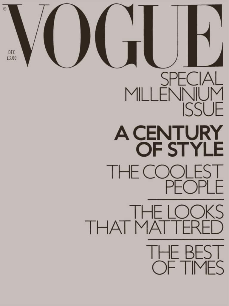
Vogue’s fashion magazine also uses serif typography in its editorial headlines combined with clean sans-serif for web navigation and captions
Serif for headings and sans-serif for body text
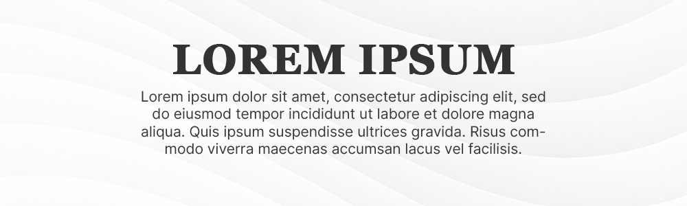
This is one of the most common combinations. Serif fonts in headings can make your brand feel more expressive and stylish, while sans serif fonts in body text keep everything readable and clean. This works well for blogs, websites, and editorial layouts.
Sans-serif for logos and serif for supporting text

Some brands prefer a clean sans-serif logo because it feels modern and simple. Then they use serif fonts in other parts of their branding to add a bit of elegance or contrast. This creates a balanced identity that feels both current and established.
Serif for emphasis and sans serif for structure

In some designs, serif fonts are used only to highlight certain words or sections, while sans serif handles most of the content. This creates visual variety without making the design feel messy or inconsistent.
Why this combination works: Using both fonts helps avoid monotony. If everything uses only serif or only sans serif, designs can sometimes feel flat or repetitive. Mixing them adds contrast, which makes your content easier to scan and more visually interesting.
Conclusion
Choosing the right font doesn’t have to be complicated. Once you understand how serif and sans serif fonts shape perception, you can build a brand identity that feels more intentional, consistent, and professional.
With Design.com, you can:
- Test different font styles instantly
- Preview logos with serif and sans serif options
- Customize typography to match your brand
Try switching between serif and sans serif fonts in a logo template on Design.com and see how it changes your brand’s personality. Get started today!