Types of Logos: A Complete Guide for Beginners
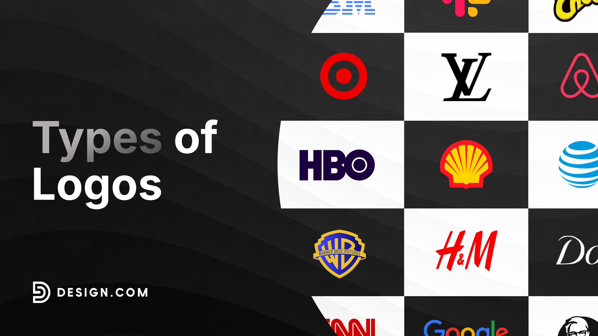
If you’ve ever searched for logo inspiration, you’ve probably noticed that logos have different types and styles.
Some brands use text, like the iconic Google logo. Others use memorable symbols, like the apple icon for Apple. While some use character illustrations as brand ambassadors, like Pringles or Wendy’s.
That’s because different types of logos are built for different branding goals and different industries. Understanding these logo types can make it easier to create the right logo design, whether you need it for an e-wallet app, a barbecue restaurant, or a skincare line.
That’s exactly why we are here today. This guide will teach you the main types of logos, when to use each one, and how to build a logo system that works across every platform. Read on to find out more!
What is a logo?
Before we explore the different types of logos, let’s first have a clear understanding of what a logo is.
A logo is a design that represents your business. It can include your business name, a symbol, an illustration, or a combination thereof. All of these, plus the color, typography, arrangement, and other visual elements, then have to work together to create a unique identity that feels like “you”.
Think of your logo as your brand’s signature. Just as people recognize a familiar signature on a document, customers can recognize you through your logo. Over time, that design comes to represent you as a whole: your products, the quality of your services, your reputation, and the overall customer experience.
A great logo also doesn’t mean the most detailed or the most colorful one. A mascot logo isn’t inherently better compared to a simple text logo, just because it has more elements. The best logo is one that is memorable, easy to recognize, and the best representation of your brand identity.
Why do logos matter?
Logos aren’t just a simple graphic. It’s also not just there to look aesthetically appealing or cool. Your logo plays a huge role in how customers perceive your brand, how you communicate your values and identity, plus how your reputation will be shaped.
Here are some reasons why your logo matters:
It’s your customer’s first impression of you
You only get one chance to make a first impression, and your logo is a big part of it.
Whether someone lands on your website, scrolls past your social media page, or spots your product on a shelf, your logo immediately tells them something about your business. A professional logo helps your brand look credible, memorable, and well put together, giving potential customers more confidence to learn about what you have to offer.
It makes you look more credible and trustworthy
Most customers expect a logo from any decent, legitimate business. If you have a logo (and it is well-designed), you automatically look more credible and trustworthy. But if you don’t have one? Or if it looks unappealing and not visually polished? Your customers will think of you as disorganized, or worse, a scam.
It’s the foundation of your brand identity
Your logo is the starting point for your entire visual identity.
The colors you choose, the fonts you use, and the style of your graphics will directly influence how your marketing materials (business cards, flyers, presentations, Facebook ads, etc.) will look. Even the tone and writing style of your blogs, social media captions, or TV commercials will be influenced.
So, making sure you have a great logo right from the start ensures you have a clearer visual direction and path for your future marketing work.
It improves brand recognition
The more often people see your logo, the easier it becomes to recognize your brand.
Imagine seeing the Nike swoosh or the Starbucks siren. You don’t need to read the company name because you’ve seen those symbols consistently and know it’s them from just one glance.
The same principle applies to businesses of every size.
By using your logo consistently across your website, social media, advertisements, packaging, invoices, and promotional materials, you gradually build familiarity. That familiarity eventually turns into recognition, making customers more likely to remember your business when they’re ready to make a purchase.
Types of logo: Quick comparison
Don’t have time to read the whole article? Here’s a quick TL;DR of the different types of logos and their strengths.
| Logo Type | Advantage | Best For |
| Wordmark logo | Builds name recognition and recall | Companies with unique and distinct name |
| Lettermark logo | Clean, space-efficient, and scalable | Modern brands, fashion houses |
| Pictorial logo | Instantly recognizable, even across languages and cultures | Digital brands, global companies |
| Combination logo | Most versatile logo | E-commerce, retail businesses |
| Emblem logo | Establishes prestige and authority | School, government organization, heritage brands |
| Mascot logo | Great at showing your brand personality | Food brands, family-oriented brands |
| Abstract logo | Unique and distinct | Tech companies, creative businesses |
What are the different types of logos?
You may think that there are thousands of different logo types (considering how many unique logos you see), but the truth is all of them can be sorted into seven major types.
And each type of logo has their own characteristics and strengths, which makes them suitable for specific industries or brand identity.
Let’s take a look at these different types so you’ll know which logo is best for you.
Wordmark logo
A wordmark logo (also called logotype) is made entirely from your business name. There is no icon or illustration. Instead, your name and its typography are the hero of the design.
Wordmarks are especially effective for brands that have a snappy or unique name. Think of brands like Visa, Coca-Cola, and Google. Since their names are unique, they can be used as their main identification point instead of relying on an icon.

Wordmarks can also be used by new businesses that want to be known for their name. Since you see the logo everywhere, wordmark logos can boost name recognition.
Wordmark logos are also great for showcasing your brand identity, as typography can be used to shape it. You can do this by adjusting the spacing, letter shapes, or color to turn a simple text into something corporate, playful, or luxurious.
Best for
- Businesses with short, memorable names
- Startups
- Personal brands
- Fashion companies
- Technology businesses
Advantages
- Builds strong name recognition
- Great for brand recall
- Names are more timeless compared to illustrations or icons
- Works well for both digital and print use
Lettermark logo
A lettermark logo also uses your name, but instead of spelling it all out, it uses initials.
This is particularly useful when a business has a long or complex name that’s difficult to display everywhere. An example is IBM. Those initials are easier to use compared to “International Business Machines Corporation”, right?

Aside from being easier to remember, lettermarks are also more scalable since it takes up less space. This is why you see a lot of brands make a lettermark version of their logos for their app icons or social media accounts.
Lettermarks are also a favorite among fashion brands, since they can give off that monogrammed feel that is a typical fashion element. You can see this in the Louis Vuitton logo or even in more affordable brands like H&M.


Best for
- Companies with long names
- Corporate businesses
- Digital-first brands
- Fashion brands
Advantages
- Easy to remember
- Simplifies lengthy company names
- Looks great even on small spaces
- Creates a clean, professional appearance
Pictorial logo
A pictorial logo uses only a recognizable symbol or icon in the design, no company names present.
Because of this, most brands use an image that can directly represent their name or their brand values. Think of the famous logos of Apple, Shell, or Target.



One of the biggest advantages of a brandmark is its scalability and adaptability. A simple icon works beautifully as a social media profile picture, mobile app icon, website favicon, or product label without feeling crowded. Icons also don’t require translation like words, making them more versatile for global use.
Icons and images are also scientifically proven to be easier to remember and process compared to words. So if you are in a very crowded industry, using an icon logo might help you stand out amongst your competition.
Best for
- Mobile apps
- Technology companies
- Consumer brands
- International businesses
Advantages
- Instantly recognizable
- Easy to remember
- Works across different languages and cultures
- Perfect for small digital applications
Combination mark
A combination mark uses both a symbol and a wordmark in one logo.
It’s one of the most popular logo styles because it gives businesses the best of both worlds. Customers can learn the company name while also having a recognizable symbol to refer to. Win-win!

As your business grows, those two elements can even be separated. You might use the full logo on your website but only the icon for social media or mobile apps. It’s truly versatile.

This flexibility makes combination marks an excellent long-term investment for businesses that expect to grow across multiple platforms. It’s also why this type of logo can be used by nearly any industry or niche in the world.
Best for
- Ecommerce brands
- Small businesses
- Retail companies
- Startups
- Service-based businesses
Advantages
- Extremely versatile
- Builds both visual and name recognition
- Easy to adapt across different marketing materials
- Supports future brand growth
Emblem logo
Emblem logos are those that are meant to emulate the look of a badge, crest, or seal. Since it evokes the feeling of authority, tradition, and prestige, it’s typically used by schools, government organizations, and heritage brands.

You can see this in the logos of Harvard, Stella Artois, and Porsche.

Of course, emblem logos can also be adjusted to fit a brand’s specific identity. For example, here is Harley-Davidson’s more rugged take on the emblem logo:

While here is how Warner Bros made it look more dynamic and modern:

Emblem logos visually stand out due to the high detail of craftsmanship involved, plus instantly give a premium and established feel to your brand. However, keep in mind that it can also be difficult to adapt to smaller digital spaces, which makes it not as versatile as other logo types.
Best for
- Universities
- Government organizations
- Traditional companies
- Breweries
- Automotive brands
Advantages
- Creates a sense of heritage and authority
- Classic and timeless
- Looks impressive on signage and merchandise
- Strong visual presence
Mascot logo
A mascot logo uses an illustrated character to represent the business.

Mascots are especially effective for businesses that interact directly with families, children, or communities. This is because a “face” makes the business feel more human, welcoming, and approachable.
They also work well in marketing because the character can appear in commercials, social media content, and promotional campaigns. Having a character also lets you easily showcase your brand’s personality, making it easier for customers to build an emotional connection with you.

Best for
- Food and beverage brands
- Entertainment brands
- Children’s businesses
- Community organizations
- Sports teams
Advantages
- Adds personality to the brand
- Creates emotional connections
- Highly memorable
- Great for storytelling and marketing campaigns
Abstract logo
An abstract logo also uses symbols like the pictorial logos. However, it uses custom shapes, patterns, or designs instead of literal images.
To put it simply:
Pictorial = recognizable icons to straightforwardly represent your name or values (apple icon for Apple, lotus to represent the purity of Pond’s, etc.)
Abstract = custom shapes to communicate ideas and emotions (the stylized symbol on AirBnb which is meant to represent a location pin, heart, and A all in one icon)
Abstract logos are particularly popular among modern brands and tech companies because they’re distinctive and unique. Brands can have a fresh logo that doesn’t resort to typical symbols that have been used a million times before.
Abstract shapes are also less limiting because they represent ideas rather than one specific product or service. As companies grow and expand into new markets, the logo can continue representing the brand without becoming outdated or mismatched.
Best for
- Technology companies
- Creative agencies
- Global businesses
- Innovative startups
Advantages
- Unique and distinct
- Flexible across industries
- Can represent your brand more accurately, since it is custom-made for you
- Easier to trademark
Tips on choosing the right logo type
When creating a logo, you’re probably thinking, “Which type of logo is best?” Because who doesn’t want the best logo for their business, right?
However, there is no single, universal “best” logo type. But there is the “right” logo for you. And the right logo will depend on what you want your brand to communicate, where it will be used, and the industry you are in.
So, how will you choose the right type of logo to use? Here are some of our tips:
Know your brand identity
Before you start sketching or using our logo maker tool, it’s best to fully understand and establish what your brand is all about.
This is because your brand identity will serve as the foundation of your design. Should it look sporty? Luxurious? Friendly and approachable? Or corporate and straight-laced?
Once you know all of these, it should guide you toward the right aesthetic and style for your logo, as well as the right logo type that incorporates all of them.
Think about your industry
Every industry has its own design trends and standards.
Corporate companies, banks, and law offices often prefer clean and understated logos. That’s why they typically use simple wordmarks or combination marks with simple icons. You won’t really see any mascot logos since they will come off as childish and unprofessional.
The reverse is also true. Kid brands and entertainment companies usually go for expressive designs (either with their mascots or icons), to communicate that playful and dynamic feel.
Meanwhile, tech and SaaS companies often opt for abstract logos because they align better with their modern, innovative values.
Consider your audience
Your customers matter just as much as your products.
A children’s toy company and a consulting firm shouldn’t use logos that look alike, because they’re trying to attract completely different audiences.
Choose a logo type that reflects the expectations and preferences of the people you want to reach.
Scout the competition
It’s also smart to take a look at what your competitors are doing. Not to copy them but to gain a sense of what works and what doesn’t in your industry.
You can also use this to be strategic about your brand positioning. Do you want to follow the convention? Or do you want to make a completely different logo style to stand out? Do you want to look like the premium choice, or the more affordable one? And so on.
Plan for long-term growth
A logo isn’t something you want to redesign every year.
Don’t just go for a design that is trendy now or something that you just personally like. Choose a style that is timeless and can scale with your business and continue working across websites, mobile apps, packaging, signage, and future marketing materials.
How many logos should a company have?
One logo isn’t always enough.
Today’s businesses appear in dozens of different places, from wide website headers to circular Instagram profile pictures, down to printed packaging and embroidered uniforms. A single logo can’t exactly fit all those situations.
That’s why many brands create logo variations.
Logo variations are rearranged versions of your logo to fit a specific size, space, arrangement, color, season, or platform.
And no, these aren’t different logo designs. You’ll just rearrange the logo but still maintain the core color, typography, icon, and style.
Here are the different logo variations that your brand should ideally have:
Primary logo
Your primary logo is the main version of your branding.
This is the version customers will see most often on your website, advertisements, presentations, and printed materials.
Secondary logo
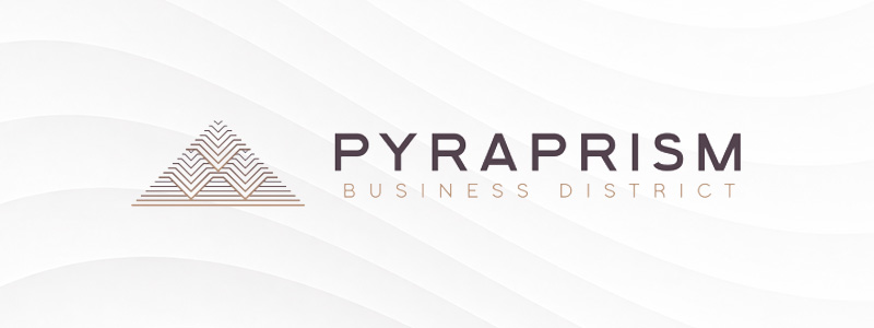
A secondary logo rearranges or simplifies the primary design while keeping the same visual identity.
For example, if your primary logo is horizontal, then the secondary logo is vertical. And vice versa.
It’s particularly useful when the full logo doesn’t fit comfortably into narrow or vertical spaces.
Icon only
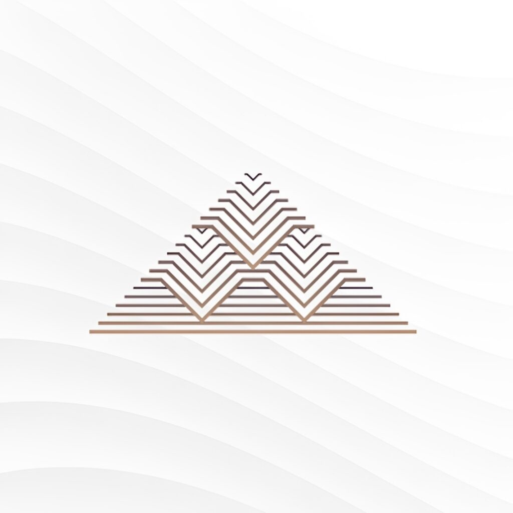
Icon only is, as the name suggests, your primary logo stripped down to just the icon or symbol.
If you use a wordmark logo, it’s usually just one letter of your name (like the N logo for Netflix or the letter M for McDonald’s).
It’s designed for places where space is really limited, like app icons or website favicons.
Wordmark only
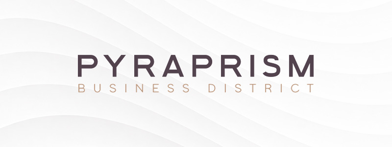
This is similar to the variation above, except the focus is on the wordmark rather than the icon.
It’s great for labels, product packaging, uniforms, and outdoor signs, since text is more legible and easier to replicate than icons.
Color variations
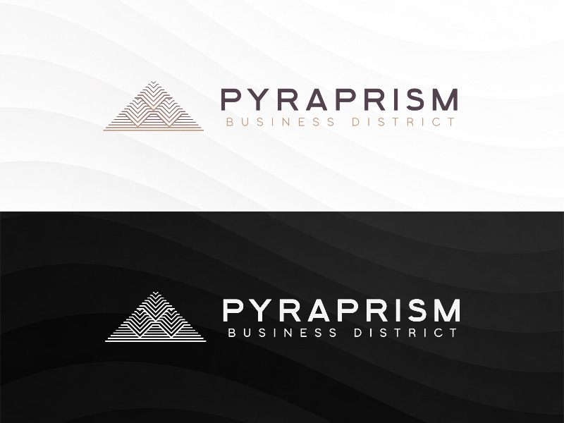
Finally, create a one-color version of your logo. These are usually in black, white, or your primary brand color.
This makes your logo more versatile for applications like invoices, stamps, merchandise, embroidery, and grayscale printing, where full color isn’t practical. It also ensures your branding remains clear and consistent across different backgrounds and design layouts.
Conclusion
Every successful brand starts with a logo that accurately communicates who they are. Whether you choose a clean wordmark, a versatile combination mark, or a distinctive pictorial, the right logo will help customers recognize your business and build trust over time. Pair it with a complete set of logo variations, and you’ll have a branding system that’s ready for everything from digital marketing to product packaging.
If you’re ready to start designing, Design.com makes it easy for you. Feel free to explore our tools like brand logo maker, AI website builder, and AI design tools to help you easily build a consistent brand identity from day one.