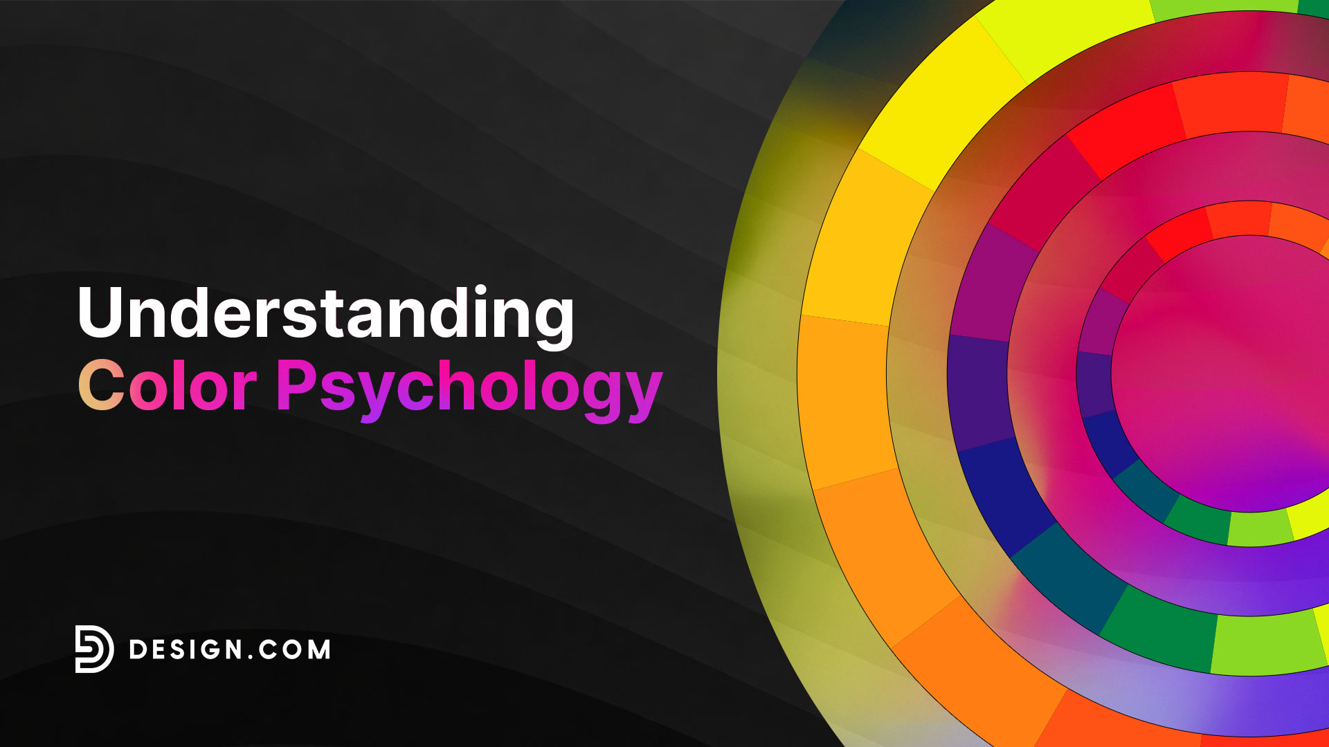
Understanding Color Psychology
Ever wondered why McDonald’s uses a red-and-yellow color palette? Or why Spotify uses that particular shade of green? Or why are blue logos so predominant in tech companies?
No, it’s not just an aesthetic choice. There’s a science behind it, known as color psychology.
Color psychology suggests that color influences a person’s emotions, behavior, or perception of a brand in distinct ways. This means that your brand can come across as friendly, luxurious, bold, or knowledgeable, depending on the logo colors you choose.
Want to know more about the power of logo colors? This article explores color psychology and how you can use it to choose the right palette for your logo design and branding materials, so keep on reading!
Why color psychology matters for logo design
Studies have found that up to 90% of people’s initial impression of a product is based on color alone.
This just shows that choosing the right color is crucial, particularly for your logo design, which is the first thing your customers see from you.
But how do you know which color to choose for your logo or brandmark? This is where color psychology comes in. You see, each color is often associated with a specific emotion or personality. For instance, blue is seen as calm and secure, while red is seen as fiery and bold.
Using the right logo color can help you instantly communicate to your customers what your brand is all about and evoke the emotion you want them to feel when seeing your products.
Color can also impact revenue and sales. Eighty-five percent of customers cite color as their primary reason for purchasing a product. If your brand uses the colors your customers find appealing, they’ll likely gravitate towards your products.
Research also shows that color can increase brand awareness and recognition by 80%. Considering that customers prefer buying from brands they recognize, building familiarity with your color palette is crucial if you want to grow your business.
Color meanings and their role in logo design
Let’s now take a look at what each color stands for in color psychology and how brands use them for their logo designs.
Red
Red is often associated with energy, excitement, boldness, and passion, which is why it is frequently used in the retail and entertainment industry.
Brands like YouTube, Netflix, Nintendo, LEGO, and Target primarily use red logos to evoke a similar feeling of excitement.
Red logos also stimulate hunger. Yes, this is why fast food brands like McDonald’s, Wendy’s, and Arby’s have red logos!
Blue

Blue is a color of security, stability, and serenity. Brands use blue logos to convey reliability and trustworthiness. This makes it a popular choice for those in the finance, tech, and healthcare industries.
Blue is also a widely popular color. Fifty-seven percent of men and 33% of women chose blue as their favorite color. Over 40% of Fortune 500 brands also use blue. Blue is the safest choice if you are unsure what color to use for your logo.
Yellow
Yellow is the color of sunflowers, ducks, smiley faces, dandelions, and anything fun and vibrant. This is why we associate the color with happiness and positivity.
Yellow is also associated with youthfulness, which is why brands targeting a young audience tend to use this color.
Yellow is also a very attention-grabbing color. That’s the reason it’s the color of things like police tape, street signs, or traffic lights, as you can immediately spot the color even from afar. So if you want to stand out, a yellow logo is a great choice.
Orange

Orange represents confidence, courage, energy, and warmth, which is why most sports teams use it for their logos. Like red and yellow, orange commands attention but is more soothing to the eyes.
Just like yellow, orange is a fun and youthful color that works best for noncorporate brands or creative studios. Go for this color if you want a more dynamic or unconventional business identity.
Green
Green is the color of grass, leaves, and trees, so it’s no wonder we link the color to nature and eco-friendliness.
Green logos are also perceived as a symbol of freshness, health, and vitality due to this association.
Additionally, green is associated with prosperity and growth, which is why some finance and software companies use green logos.
Purple
The color purple is often associated with royalty, luxury, and sophistication. This is because only ancient royals had access to this color, so it remains a symbol of luxury to this day.
Dark purples are also linked to magic and spirituality, so it’s the go-to color for mystical branding.
On the other hand, lighter purple shades like lavender and lilac are seen as gentle, calming, and relaxing. They are often used in logos for businesses like spas, yoga studios, wellness centers, and meditation apps.
Pink
Pink is the color of femininity. For that reason, brands with a predominantly female target audience, such as Barbie, Cosmopolitan, and Avon, use pink logos.
Pink is also seen as creative, innovative, and forward-thinking. Some tech brands like T-Mobile, LG, and Lyft use pink logos to stand out from their competitors.
Brown

The color brown is seen as authentic, down-to-earth, and reliable. Since brown is present in nature, it’s typically used to convey that a product is eco-friendly, all-natural, or great for outdoor equipment such as hiking gear.
Brown is also the color of food like chocolate and coffee beans, so it’s no surprise that most food brands use the color.
Black

Black can make your brand look sophisticated, classy, and powerful. Most fashion or luxury brands use black logos with an elegant wordmark to evoke that refined feel. Just take a look at the logos of Chanel, Gucci, or Yves Saint Laurent, for example.
2026 color trends in logo design
Now that we have covered the basic colors and their meanings, let’s move on to the different shades, tones, and color palette combinations that are currently trending.
Cloud Dancer
Pantone made waves online when they released Cloud Dancer as the Color of the Year for 2026. The color is described as “a lofty white that serves as a symbol of calming influence in a society rediscovering the value of quiet reflection.”
Some people debated that the color is too simple to be named as the Color of the Year.
However, Pantone has said that Cloud Dancer is meant to be a structural or foundational color that allows other accent colors to shine. This will then lead to an airy lightness in the design, perfect for brands that aim to look tranquil, calming, and elegant.
Brands can use Cloud Dancer as their main color and have muted hues as contrast.
For example:
White Creative Hexagon by Design.com

Expert Interior Design by Design.com
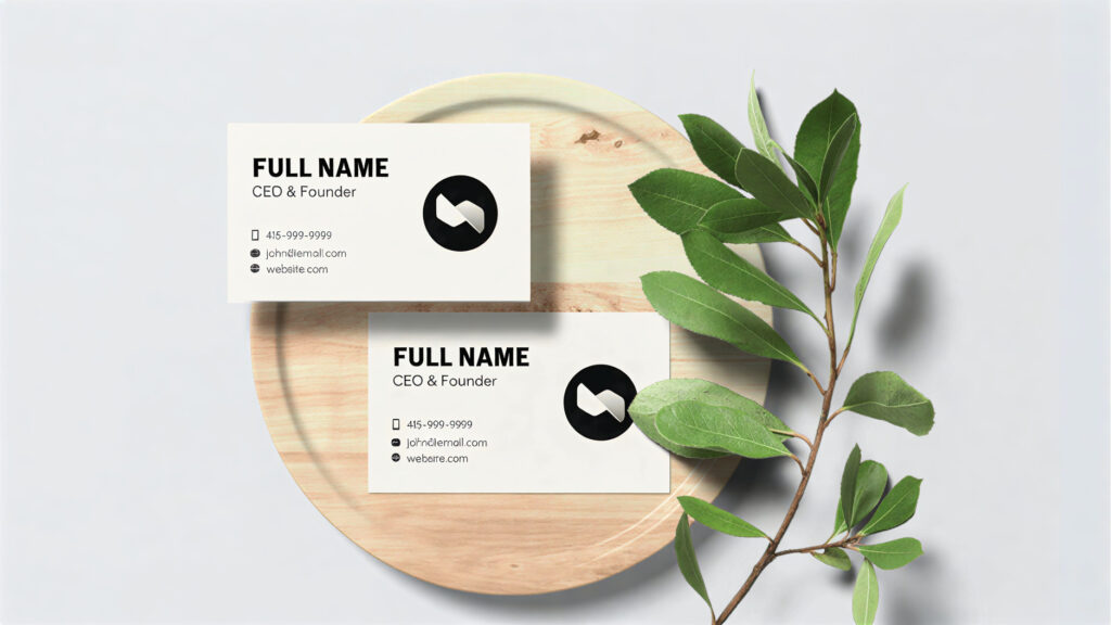
Professional Studio Lettermark by Design.com
Universal Khaki
Continuing on with this muted and neutral theme is Sherwin-Williams’ Color of the Year, which is Universal Khaki.
The color “embodies the satisfying simplicity at the core of contemporary comfort.”
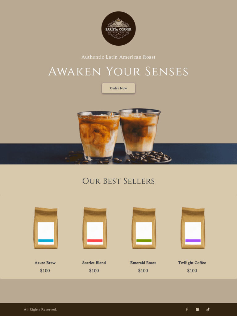
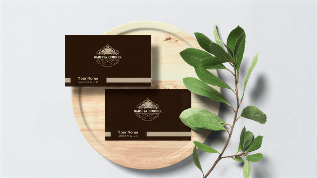
This warm, earthy tone is a classic color that pairs well with any color palette, whether it is a stark white or a dusty pink.
Coffee Cup Cafe Barista by Design.com
Coffee Bean Shop by Design.com
Coffee Shop Brewery by Design.com
Universal Khaki adds a sense of coziness, sophistication, and timelessness. We can see this as the top color choice for brands in the real estate, hospitality, and home decor industries.
Transformative Teal
We’re now going into a deeper color with Coloro + WJSN’s Color of the Year Trend, which is Transformative Teal.
Transformative Teal is described as a fusion of dark blue and aqua green, and is meant to represent the period of change and redirection.
It is also reminiscent of the colors found in nature, which is fitting for the increasing sustainability push in the market.
It’s a great color to use for most businesses, as teal is seen as an all-around color that can fit any target market, industry, or vibe.
You can check out our selection of teal logos and see what it would look like on your website and business cards.
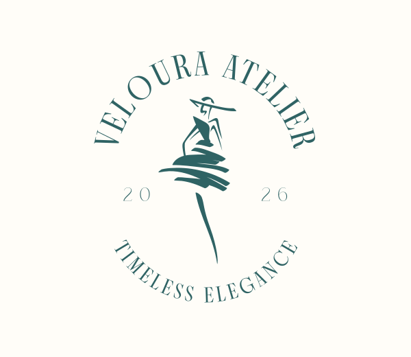
Elegant Fashion Dress by Design.com
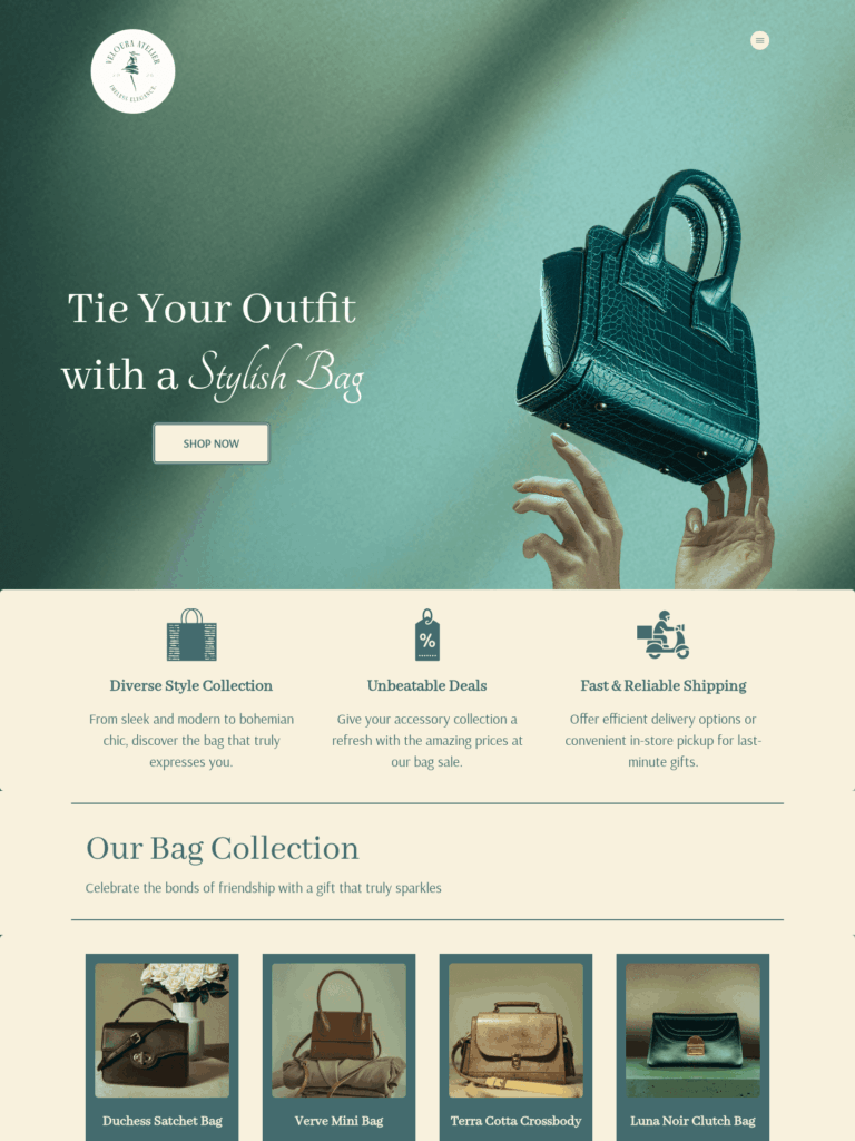
Fashion Handbag Sale by Design.com
Fashion Beauty Woman by Design.com
Adventurer
Another step in the darker and moodier tones is Little Greene’s Color of the Year called Adventurer.
Adventurer is in the middle of plum aubergine and burgundy. It is described as a regal and reassuring color, and can give a touch of luxury while still keeping the design cozy, comforting, and intimate.
Using Adventurer on its own can be perfect for high-end brands or businesses that want to be seen as bold and daring.
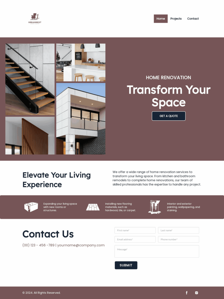
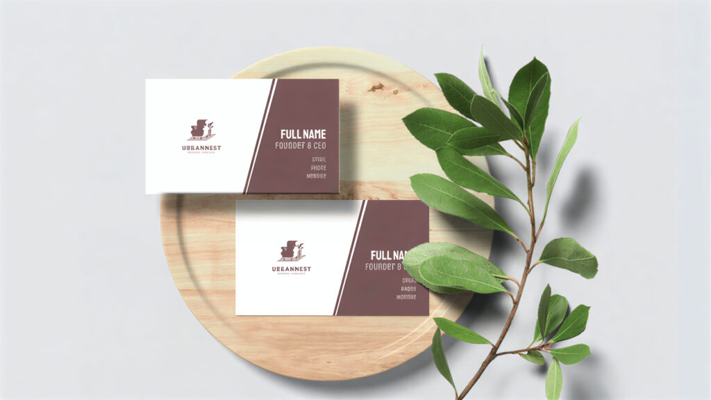
But if you want to tone down the powerful image and make it a bit more accessible, you can pair burgundy logos with earthy pinks or muted greens for a more lighthearted vibe.
For example:
Furniture Armchair Sofa by Design.com
Home Remodeling Specialist by Design.com
Furniture Outline by Design.com
Warm Eucalyptus
Last on the list is Warm Eucalyptus which is Valspar’s Color of the Year.
It’s a muted cool toned green color that is the embodiment of serenity, peace, and calmness. It’s perfect for wellness brands, spas, or skincare lines.
It’s also a great way to add more organic or eco-friendly tones to your brand without being too in the nose.
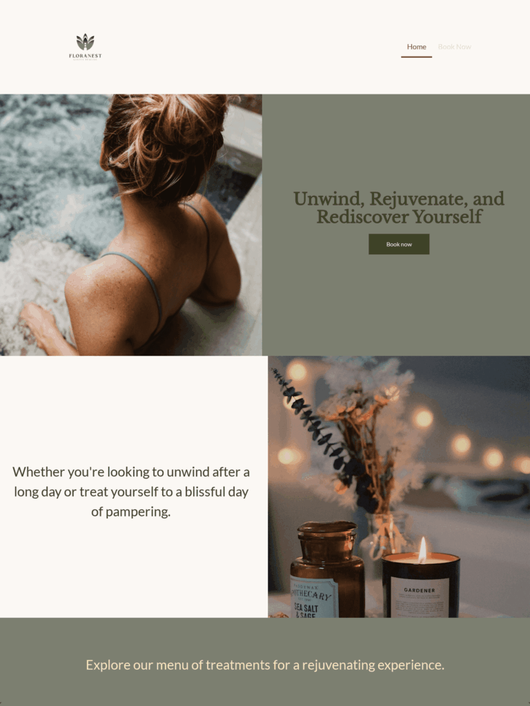
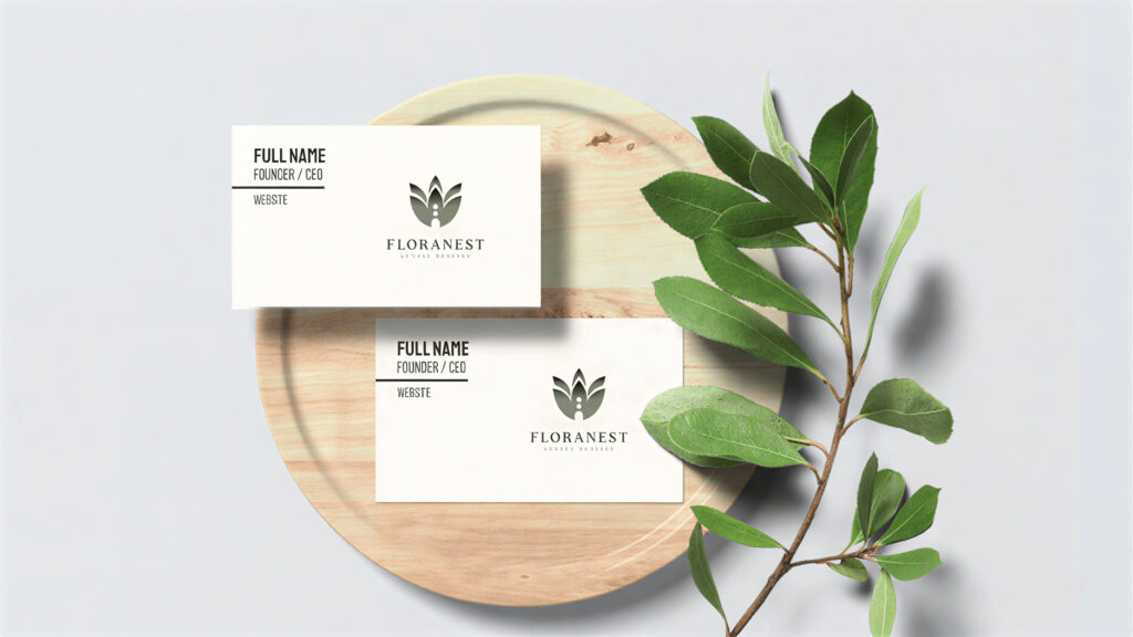
Here’s what a muted green color palette could look like:
Lotus Wellness Home by Design.com
Oasis Spa Retreat by Design.com
Wellness Yoga Meditation by Design.com
How to choose the right color palette for your brand
With all these wonderful colors, how do you know which is right for you? Here are some of our tips:
Identify your brand personality and values
The first step is to know what emotion, personality, or values you want your brand to represent. Do you want to look trustworthy and reliable? Cute and charming? Or bold and driven? Once you know that, it’s easier to find the right color.
If you’re having trouble figuring out your brand personality, use the Aaker model of brand personality framework as a guide.
Know your audience
Next, look at your audience. Age, gender, location, race, educational background, or even personality can dictate the type of color they prefer. For instance, people aged seventy and above only like the colors blue and white, while people 35 and under like colors like green, purple, and orange.
Choose the color that your audience prefers. After all, you want your brand logo to look appealing to your audience!
Research any cultural meaning behind the color
Colors don’t mean the same across all cultures.
For instance, red is viewed as the color of luck in China but as the color of danger in the Middle East. Green is a color of vitality in most countries but is seen as the color of death in South America.
Before using your chosen color palette, thoroughly check its cultural meaning. You don’t want to come across as culturally insensitive or ignorant.
Consider your industry or niche
Just like cultural context, it’s best to consider your industry and its common associations as well.
For instance, black is a common logo color, but you never see it in healthcare, as black can symbolize death and mourning.
Tech and finance companies rarely use orange or yellow, as they can come across as too childish or immature. Muted or dark palettes are absent in children’s brands, as they are too boring for the kids’ eyes. And so on.
Of course, this doesn’t mean you can’t use a color just because of your industry. It’s all about the context or usage. For example, a money app tracker for kids can use orange or yellow. But a banking app logo for older generations is still best suited to use blue.
Check your competitor’s colors
Some colors are popular in specific industries. For instance, the retail and food industries often use red, while health brands use green. You can align with the popular color or use a different one to stand out.

An example is the food delivery app Foodpanda. They use a bright pink logo, which is uncommon in an industry filled with red, orange, and yellow.

Another is FedEx, with its unique color scheme of purple and orange.
Don’t just rely on one color
Successful brands have a tiered color palette that they use across different materials.
They have a primary color, which is used for their logo and branding assets. They have a second color, which is typically used as the background color for their website or marketing materials. The last is an accent color, which is used for CTAs or website buttons.
Why is this important? Well, think of it this way. If your main palette is red and green, can you use those colors all over your marketing materials? It will be too harsh for your audience if your website is just all in red, for example. You’ll need to add some white or black as background color to balance it out.
Having an accent color like yellow, orange, or pink can also be great for your CTA since the change of color can make the button stand out.
Use the color wheel to build a cohesive color palette
Don’t know how to choose a great color palette? You can refer to the color wheel for ideas.
For instance, analogous colors (those that sit next to each other on the wheel) can help you find colors that look harmonious and cohesive with each other. This could be red and orange, or blue and green. They may be two colors, but they still give a unified look.
Or you can go for complementary colors or those that sit opposite each other on the wheel. This could be blue and orange or purple and yellow. These combinations create a high contrast and give a more dynamic look, perfect for brands that have a bold or quirky brand identity.
Make sure the color is accessible
No matter how beautiful your color palette is, it’s useless if it’s not accessible to people with impairments or disabilities.
Test your color palette first. Read through the Web Content Accessibility Guidelines (WCAG) 2 and see if you meet their standards. You can also use tools like WebAim Contrast Checker, Google Lighthouse, Stark plug-in, or colorblind simulators to help measure color accessibility.
Consider various situations and placements for your logo as well. Try out different background colors with it. Is it still legible? Can you still see the details? Does it look washed out? This is especially useful if you plan to do seasonal branding in the future, where you’ll likely change your logo’s color palette or background.
Conclusion
A great logo design isn’t just about aesthetic appeal – it’s about emotional connection.
Color psychology, with its roots in understanding the emotions, perceptions, and impressions one associates with a specific color, may well be your secret weapon in choosing a meaningful and emotionally resonant color palette for your audience.
Ready to apply what you learned about colors? Try it out in our logo maker tool now. You can also check out our business card maker, Facebook cover maker, or AI flyer generator to make beautiful marketing assets that use your new color palette.